Ranking All the Current Dodgers Uniforms From Worst to Best
Dodger blue is arguably the most iconic color in North American sports history, but how do the Dodgers' uniforms stack up to one another?
Welcome back to another edition of Just Baseball uniform rankings! It’s time to take a break from writing about silly things like on-field results and player performance and focus on what really matters: fashion.
This is my first uniform ranking, and I’m going to be honest, I feel a little conflicted about the whole thing. It’s a fun exercise, don’t get me wrong, but a team’s uniforms are supposed to be a set. They work together to create that ballclub’s overall look. The best team uniforms complement one another – they’re not meant to be in competition.
The four different uniforms the L.A. Dodgers wear work together in perfect harmony, and that’s precisely what makes them so great. They all feature the iconic “Dodger blue” as a principal color. They all use that recognizable cursive lettering. And of course, they all have bright red numbers underneath the script. The best thing about the Dodgers’ uniforms isn’t discernible from any one individual jersey; it’s the way they all go together to form a whole greater than the sum of its parts.
And with that being said… It’s time to pit them against each other anyway. That’s what you’re here for, after all.
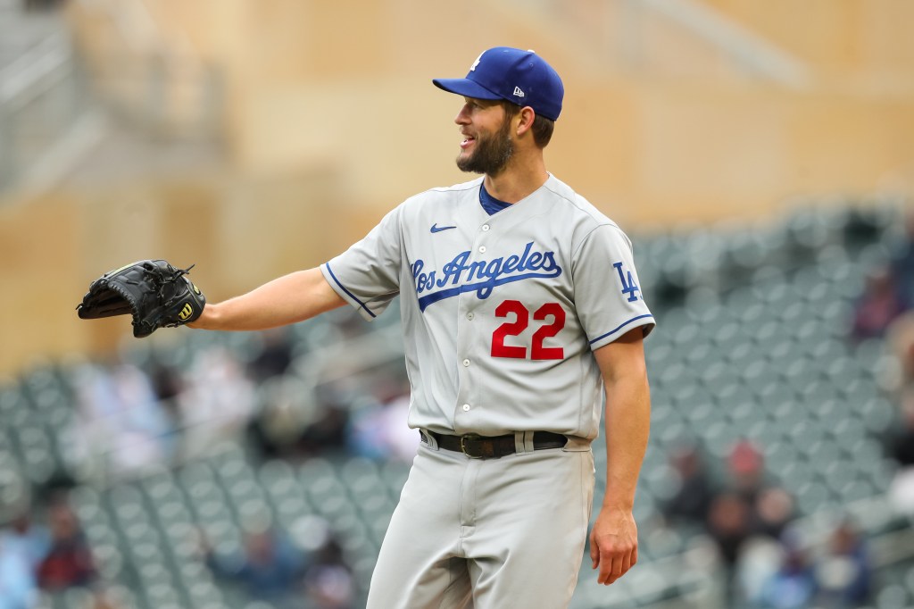
4. Gray Alternates
I don’t hate gray uniforms. In fact, I really enjoy watching a team in road grays face off against a more colorful home opponent. It’s a nice combination. Yet on their own, it’s hard to get very excited about uniforms in the world’s most boring color.
These are fine, you know? I always like Dodger blue, and the signature red numbers on the front give them a little more color. But gray is gray. What more can I say?
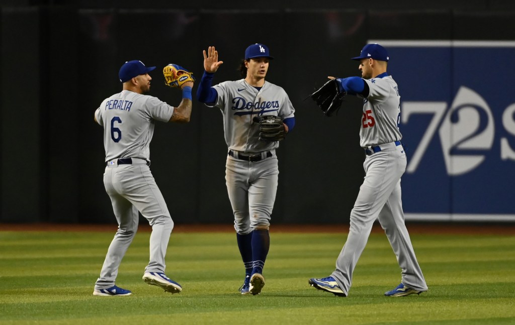
3. Road Grays
As you might have noticed, these are basically the same uniforms as the last ones – they just say “Los Angeles” on the front instead of “Dodgers.” To be honest, I can’t even remember why I ranked these ones ahead of the others. I guess I like the L.A. script a little more?
The fact that these two uniforms are so similar is actually the most interesting thing about them. Indeed, it’s bizarrely ambiguous which is technically the Dodgers’ road look and which is their alternate.
The Dodgers’ Wikipedia page says the “Dodgers” ones are the road jerseys and the “Los Angeles” ones are the alternates. The MLB.com team shop says the opposite. The Baseball Hall of Fame uniform database agrees with the team shop.
I’m inclined to trust the team shop and the Hall of Fame database, and yet it seems like the team prefers the “Dodgers” uniforms to the “Los Angeles” look:
Perhaps I’m being pedantic. It doesn’t really matter which uniform is the “official” road look and which is technically the alternate. But you can’t blame a guy for trying to find something interesting to say about two nearly identical gray uniforms.
2. City Connects
Let me make myself perfectly clear: I’m talking about Dodgers City Connect uniforms with white pants. None of that blue-on-blue, pajama-looking nonsense:
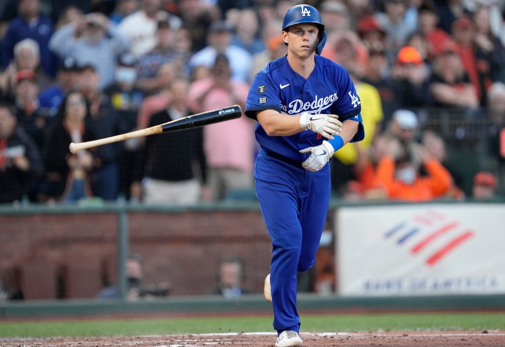
When the Dodgers debuted their City Connect look in 2021, they were wearing blue from cap to toe. Dodger blue is iconic, but this was just too much. Thankfully, the team came to the same conclusion, and the players are wearing white pants with the blue tops this season.
As far as City Connects go, these are pretty boring. They’re basically just solid-colored alternates. I get that the Dodgers were never going to do something too out there (they like their classic look), but these hardly feel like City Connects at all.
However, that doesn’t mean they’re bad uniforms! Solid-colored alternates are some of the best jerseys in the game, from the Rockies’ purple to the Athletics’ green. Dodger blue is a gorgeous color, and these are gorgeous uniforms. Plus, the Spanish is a nice touch.
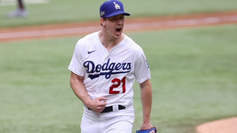
1. Home Whites
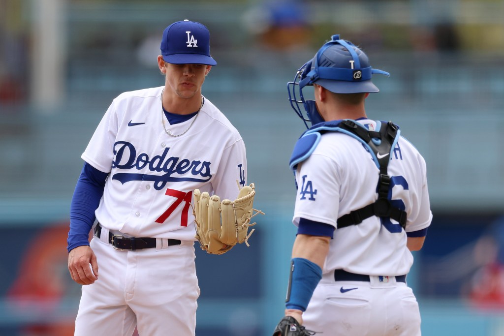
These are the best uniforms in baseball.
They don’t have the best colors; that honor goes to the Rockies’ purple alternates, or perhaps the Marlins’ teal throwbacks.
They’re not the most creative either; that would have to be one of the City Connect jerseys, perhaps the Padres’ neon look.
But these are classic in the true sense of the word. If I had to pick one jersey to represent the prototypical baseball uniform, it would be the Dodgers’ home whites. If I had to pick one jersey to preserve for future generations, it would be Dodgers’ home whites. And if I had to pick one jersey to show the aliens who want to understand this thing we call “baseball,” you better believe it would be Dodgers’ home whites.
They’re simple. Elegant. Cool. And they also have a real history behind them.
The Dodgers have been wearing these jerseys, or at least a similar look, for decades. For all intents and purposes, this is the uniform you picture when you think of Jackie Robinson integrating Major League Baseball – arguably the most important moment in the game’s history.
These are the best uniforms in baseball, simple as that.

Written by
Leo Morgenstern is one of the managing editors for Just Baseball. He is also the managing editor at Jays Centre. His writing has appeared all over…