Ranking the Current Rockies Uniforms From Worst To Best
As the only team with purple jerseys, the Colorado Rockies stand out from the pack. Here's how their current uniforms should be ranked.
“In order to be irreplaceable one must always be different” — Coco Chanel
If there is a “different” team in Major League Baseball, it is surely the Colorado Rockies, and even though Coco Chanel was referencing fashion, not baseball, she got at a core truth. Fashion should make the wearer stand out.
The Rockies stand out all right — in any number of ways — a fact reflected in varied degrees by their uniform choices.
Despite all their weirdness, the Rockies remain a conservative organization. As Phil Hecken of UniWatch notes of the Rockies’ uniforms, “Consistency has been their hallmark and rather than making wholesale adjustments, they’ve been content over their history to make mostly tweaks and to add a few alternate looks.”
The throughline in all the “tweaks” is a commitment to purple (taken from “purple mountain majesties”) that is a cornerstone of their look. In fact, they are the only MLB team to feature purple in their uniforms. It is, as Chanel would probably point out, different.
With all this in mind, then, here’s how the Rockies’ current uniforms should be ranked.
Bring It Back: The Black Vests
If you ever want to get into an argument with a Rockies fan, ask for their feelings on the organization’s classic black vests, which were retired two years ago. You will find this topic elicits strong emotions.
(Full disclosure: I am unabashedly in favor of a revival.)
Black is always a good choice — it’s the “skinny black dress” of uniforms. The vests are unique and a bit retro, and they remind fans of an iconic Rockies moment: Todd Helton’s celebration that launched the team into the 2007 World Series.
Also, the Rockies need to bring back their purple-pinstriped pants, like, yesterday. They’ve been abandoned in favor of plain white pants with purple piping, which is, well, dull.
4. City Connects
The Rockies announced their City Connects with great fanfare in 2023.
For me, these have too much going on. The license plate logo; the hat that doesn’t fit the rest of the design; the ski lift tag on the sleeve; and so much green. To reiterate, the design centers on a license plate, which is certainly a choice one could make.
This season, the Rockies are wearing white pants with these jerseys for day games (a suggestion from Chad Kuhl last season) and green pants for night games. Still, this one just doesn’t work.
3. Purple Pinstripes
This is the Rockies’ attempt to create a classic, and they’ve been with this design since the beginning. Their purple pinstripes were an attempt to enter the baseball fashion dialogue of iconic looks with a Colorado twist.
I mean, it’s fine. Pinstripes are slimming, which is good. It’s very safe, very whatever.
2. Road Grays
These uniforms grew on me. Look closely because these road grays have a lovely violet undertone.
The gray has a warm vibe and the purple pops against that background. Most road grays are just too dull; these, however, liven up an old look.
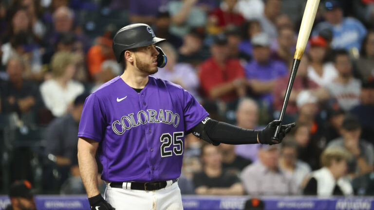
1. Purple Jerseys
This is the Rockies’ best look. Period.
The purple jersey is unique in MLB. The color is smooth, and these tops work either at home or on the road with gray pants, so it’s versatile.
Those are my choices for the best Rockies uniforms. Leave your suggestions in the comments.

Written by
Renee Dechert writes about baseball -- mostly the Colorado Rockies. Find her writing on Just Baseball, Purple Row, and Pitcher List.