Ranking All Current Padres Uniforms From Worst to Best
Just Baseball continues its uniform rankings series, featuring none-other than the San Diego bleeping Padres
The 2023 San Diego Padres may be the equivalent of a radiated toaster, but at least they are rocking some pretty good fits in the process.
Some famous Greek philosopher, I believe, once said “If you’re gonna be crap, you might as well look good while you’re being crap” and the Padres have channeled that into the very fiber of their being. With so much going for them, from the location of their franchise in sunny San Diego, to their grandiose Petco Park, and to their revolutionary idea of spending money on good players, they’ve managed to only be good at this one thing.
They may be playing about as effective as Wolverine without his healing factor, but at least the claws (uniforms) still look cool.
Just Baseball is currently in the midst of doing some lovely uniform rankings and I — being the residential (depressed) Padres fan — have been tasked with ranking the Friar’s attire. For my money, the Padres current crop of uniforms ranks among the best in MLB, but which is the best of the best? Let’s find out.
5. Alternate Camouflage Uniforms
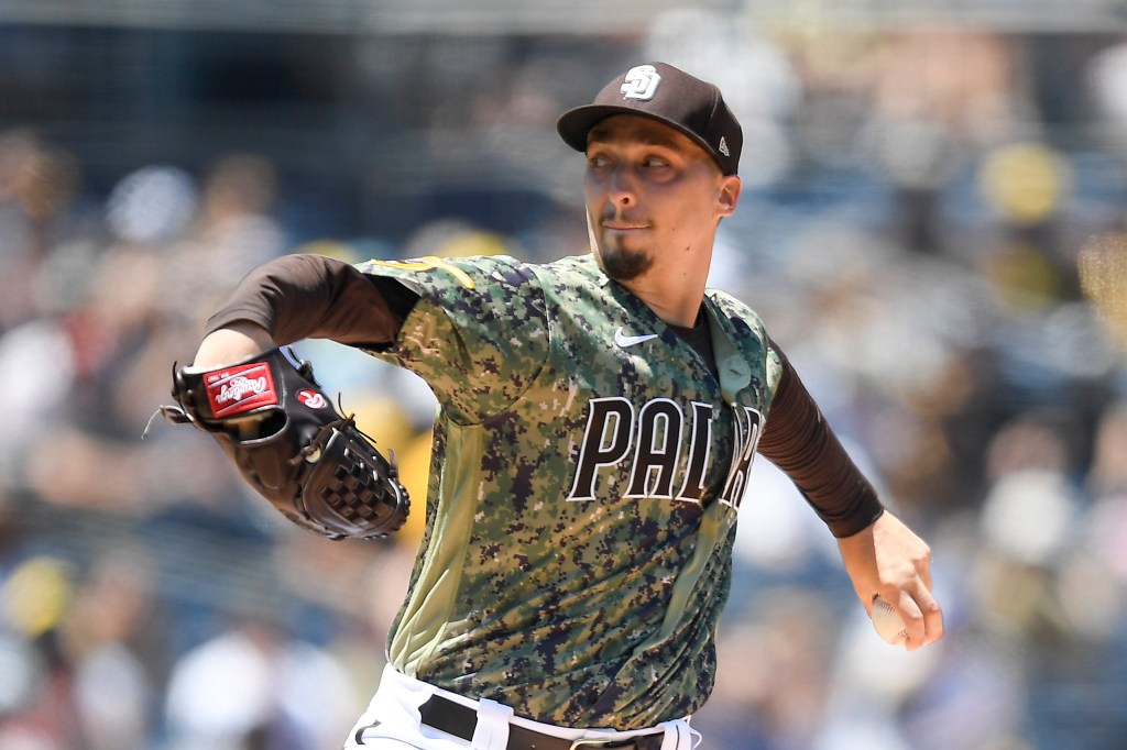
This is the difficulty with deciding the best of the best: someone has to be ranked the worst of the best. For my money, it’s the Padres camo uniforms, which are brought out for every Sunday Padres home game. It’s, of course, a tribute to our armed forces, which feels especially appropriate given that San Diego is a major hub for the Navy and Marines in particular.
The reason for this ranking is three-fold:
- Simply put, they aren’t the only camo uniforms in sports. There have been in others in college football, for example, that seem to have more juice.
- These aren’t even the best Padres camo uniforms and feel like they’re doing too much compared to more simplistic designs of the past.
- Most importantly — and I can’t emphasize this enough — the white pants simply do not work with them. The color clash is too noticeable.
I won’t pretend to know exactly what would be the ideal look for uniforms meant to honor the military. But these don’t quite do it for me, either. Still, I’d take these from an aesthetic standpoint over many of the other boring uniforms that other boring teams (the Rangers) display so prominently.
4. Alternate Solid Brown Uniforms
A few years ago — in what can only be described as a crusade to be as wrong as possible — a friend of mine mocked these uniforms for just being “Poo and Pee.” Gross, surely, but also a rich idea coming from a Rangers fan who was satiated by the revolutionary color scheme of red, white, and blue. Worry not, dear reader, for I am more than ready to release these texts if I’m in the mood for revenge.
In terms of the actual uniforms, though, they get the job done. Not quite as good as some Padres uniforms of old, but the brown fits nicely. And while this is even more subjective of an observation, I find them to look even better if a player is wearing a chain of any sort. Like, they really exude a Golden vibe to them.
They don’t have quite the Pizazz as other uniforms and, again, the combination with the white pants isn’t ideal, but they’re solid nonetheless.
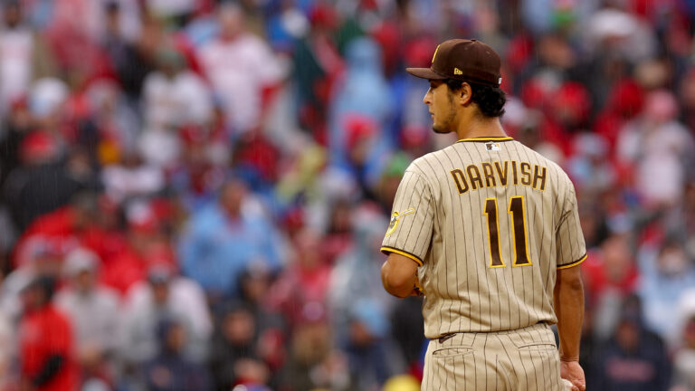
3. Away Uniforms
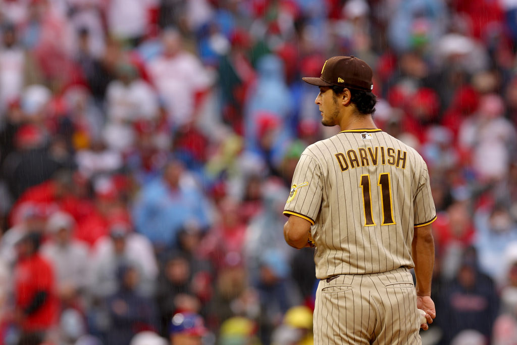
Oh yeah, now we’re in business. These have HEART. They have HONOR. And best of all? They have…I don’t know…a soul?
The biggest thing for me with away uniforms is, as I’ve written about with the Yankees before, I need to feel like there was an attempt there. Sure, the more gray-ish, faded coloring of these aren’t going to elicit the most powerful of energy. But the fundamental design of the uniforms are solid, especially with the stripes.
They could’ve easily gone the Yankees route and removed the stripes, making it just a simple entirely-gray tone with a regular brown font for San Diego. They showcase the team’s colors in a less in-your-face way, which is what’s typically expected from a road uniform. Plus, these get an edge above the other uniforms for not having the white pants that don’t mix well with the top.
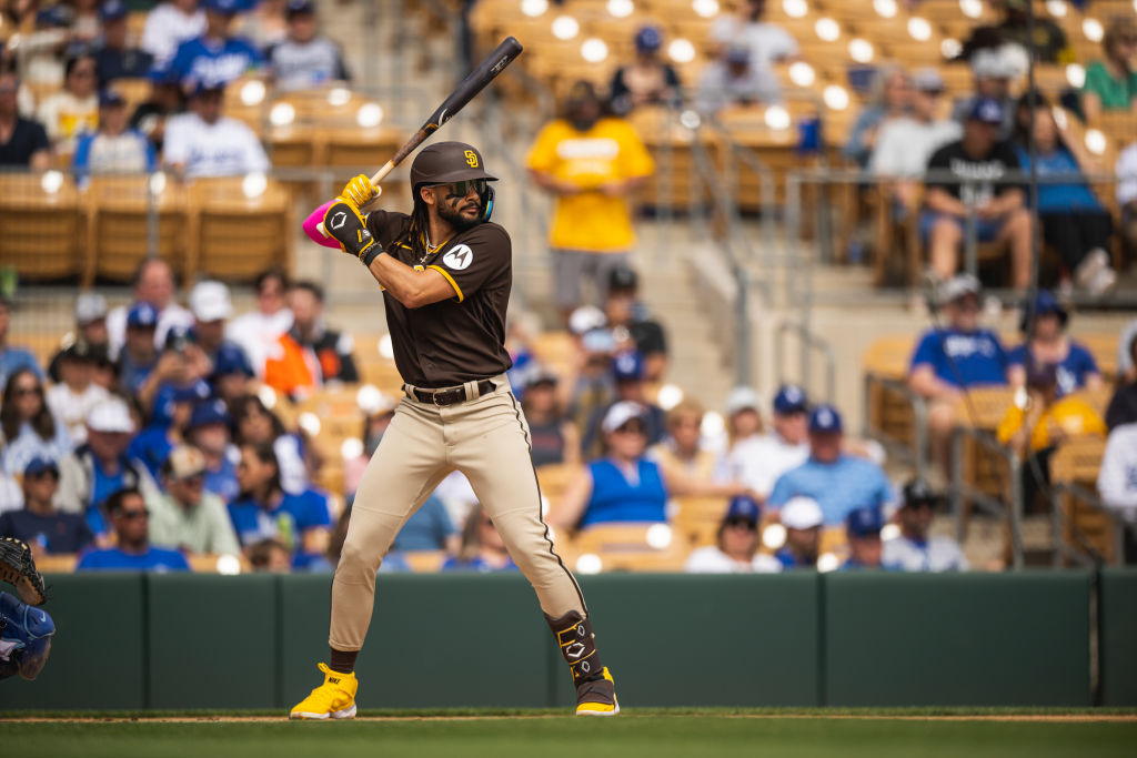
2. Home Uniforms
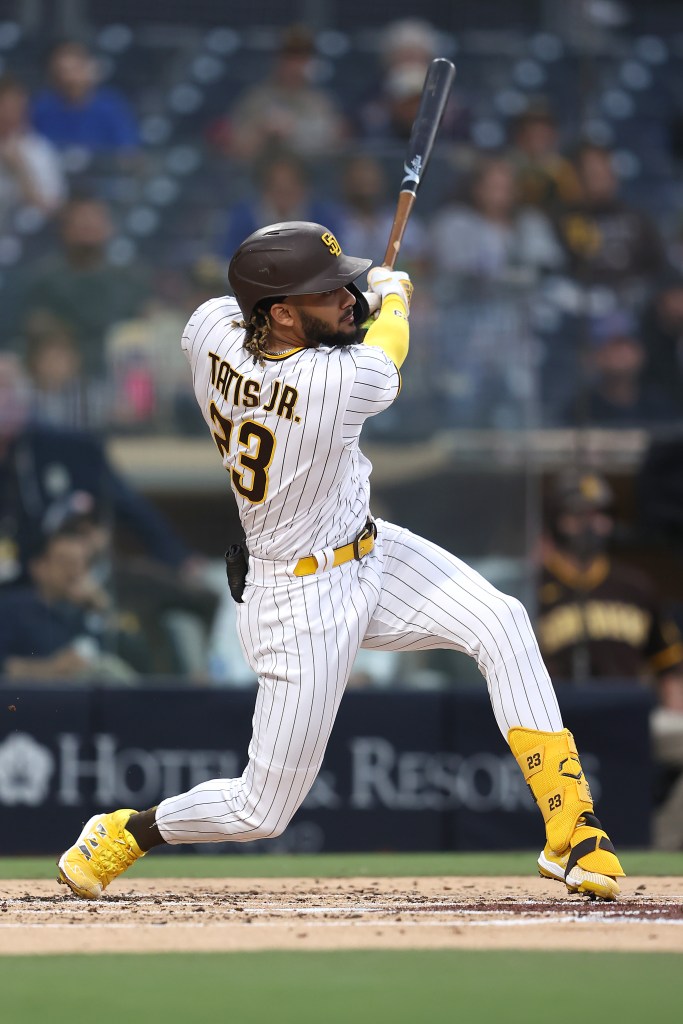
Oh, YES please. Much of the Padres home uniforms are the same as the away ones — but since the design is so solid already that’s not a bad thing. I was almost tempted to rank the Away ones higher, but there’s something about the pants here that get me riled up. White pants have taken a beating from me in this article, but the Padres take on it makes them standout.
With the stripes on the side, it feels complete. Most other clubs have white pants that don’t add an extra flourish, making the look feel a lot more homogenized. While it’s understandable to an extent, and the Padres color scheme lends itself better than most to do this kind of display of stripes and gold, they still deserve credit.
They aren’t necessarily better than Padres uniforms of the past, but they’re an excellent modern look that will become more iconic if the team is able to, maybe, potentially but highly improbably, live up to the hype of their talent and headline-producing splashes.
1. City Connect
MLB’s City Connect campaign has produced plenty of unique looks. Sure, in a cynic’s eyes it’s another cash grab from the league that has so many owners masquerading as Oliver Twist, but they’re also just a cool gimmick. Baseball needs more cool gimmicks!
The Padres City Connects are no exception, featuring a splashing of equal parts red and green as an homage to the city’s diverse coastal culture. They have extreme Baja Blast energy but in a good way. Unlike the more safe looks of teams like the Dodgers and Angels, the Padres City Connects are more daring — an appropriate attribute given how bold the team’s front office has been these last few years.
They feel like a party everyone is invited to, and every time I see them I want to order a stack of empanadas, pour myself a glass of ice tea, and just have a grand-spanking good time — even if it’s just by myself on a Friday night watching some ball.
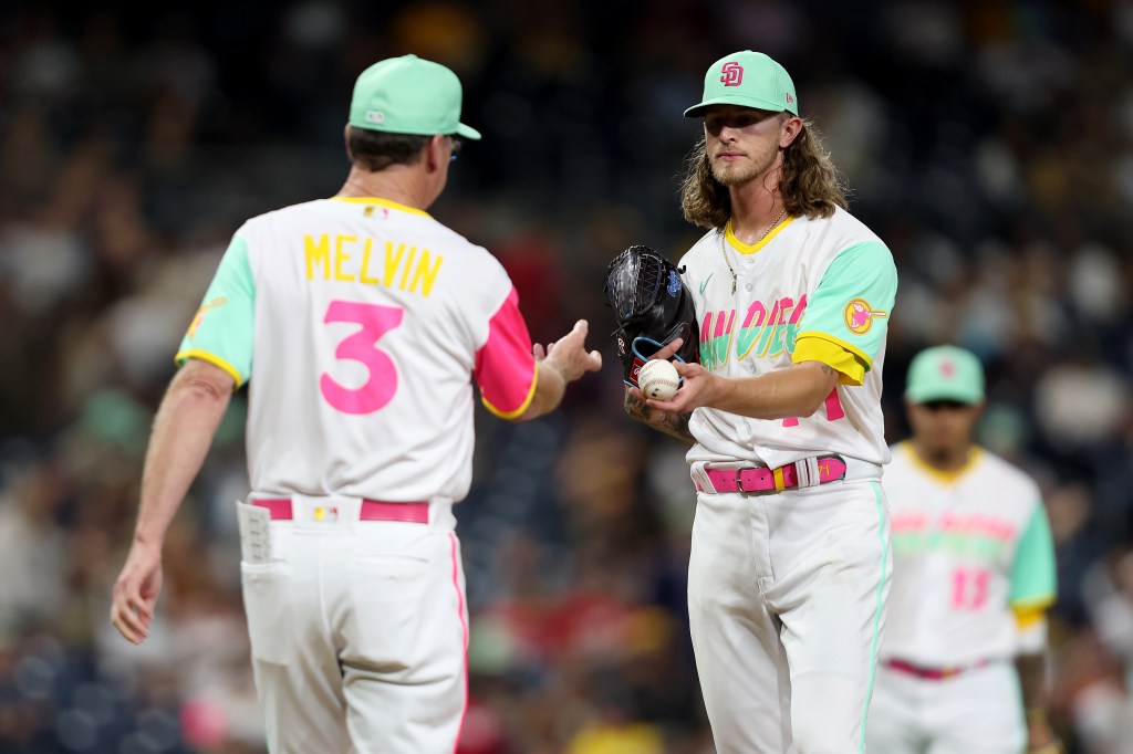
Plus, as a sort of twisted adage for the uniforms top-ranking, they also work if you’re not a Padres fan, too. From afar, one could clean some comedic value from the uniform. Seeing them lose and someone like, say, manager Bob Melvin have to give a press conference as if he had just gone to his nephew’s surprise 6th birthday party at a McDonald’s Play Place. Stuff like this is cannon fodder for people that consider themselves, quite simply, Haters.
That’s the San Diego Padres for you in a nutshell: a crazy, possibly ill-advised, all-inclusive party for both haters and lovers to enjoy in perfect harmony. Even if they’re a disaster, there’s some comfort in knowing they’ll be a tasteful disaster.

Written by
Despite his best efforts, Javier keeps falling back in love with baseball even when it doesn’t love him back. He's a writer of pop culture for…