Ranking All Five Current Mariners Uniforms From Worst to Best
From the City Connects to the Northwest Green Alternates, Just Baseball presents our Seattle Mariners uniform rankings.
Prior to the 2023 season, the Seattle Mariners eliminated their gray road uniforms, as they prepared to introduce a “City Connect” jersey. While we would argue that the Mariners actually had one of the better road grays in baseball, Nike’s controversial “4+1” rule has limited teams to four uniforms, plus a fifth if it’s part of the CC program. And it’s hard to argue with the uniforms that the Mariners elected to keep over the grays.
With that in mind, here’s a ranking of Seattle’s five current uniforms from worst to best:
No. 5: City Connect Uniforms
Introduced in May of 2023, the City Connect uniforms for the Mariners rank as the worst of their current options, but that’s more reflective of how good the rest of their looks are than anything. While we’re still not entirely sure whether the black pants work with the blue tops, the Mariners should be applauded for not just going blue-on-blue or black-on-black. Additionally, the black sleeves under the blue uniform tops look excellent. And who doesn’t love the trident Mariners logo?
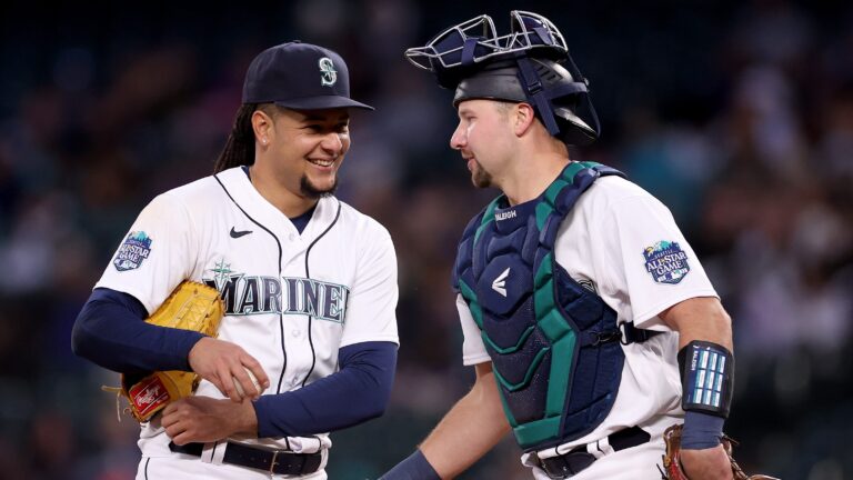
No. 4: White Home Uniforms
If someone said the Mariners should have eliminated the white home uniforms over the gray road ones, we wouldn’t be mad. But while this is the simplest of Seattle’s looks, it’s very clean. Bonus props to the Mariners for the 2023 All-Star Game patch on the right sleeve, which looks great.
No. 3: Navy Blue Uniforms
Let me preface this by saying that I’m a card-carrying-member of the anti-navy blue uniforms club. But while teams like the Houston Astros, Cleveland Guardians and Boston Red Sox have underwhelming navy blue tops, Seattle’s are pretty sharp. The tops don’t look cheap, and the navy blue is a good contrast with the Mariners color scheme. These tops, while still worn for some home games, have replaced gray as the primary road uniforms for Seattle.
No. 2: Northwest Green Alternate Uniforms
When you have a color as bold as what the Mariners refer to as “northwest green,” there are always going to be some detractors. But count us among the fans of these loud uniform tops. This look was initially introduced in 1994, and is worn as an alternate for both home and road games. We would say that the northwest green tops actually look better with the road gray pants, as opposed to the white ones donned for home games.
No. 1: Sunday Home Alternate Uniforms
*Chef’s kiss* This is such a beautiful uniform. Introduced in 2015, the Mariners wear these uniforms for Sunday games played at what’s now known as T-Mobile Park. Cream uniforms are almost always sharp looking, and these do a perfect job of paying homage to the past while not abandoning the Mariners current logos or script. As far as alternate uniforms go, these are one of the best in baseball.

Written by
Tim Kelly is a contributor to Just Baseball. Tim has been on the Philadelphia Phillies beat since 2020, serving as the Editorial Director for PhilliesNation.com. Additionally,…