Ranking All Five Current Braves Uniforms From Worst to Best
The Braves are one of MLB's most iconic franchises, with a look that has defined a generation of watching winning baseball in Atlanta.
As we continue our series ranking each MLB team’s current uniform rotation, we find ourselves longing for the cream alternates that the Atlanta Braves wore at home in the not-so-distant past, which have seemingly fallen victim to Nike’s controversial “4+1 rule.”
Still, Atlanta has five uniforms in their current rotation that were fun to rank for this exercise:
No. 5: Navy Blue Alternate Tops
The Braves drastically upgraded these uniforms in 2019, when they filled in the script on the front of the uniforms and the numbers on the back red. They looked like a Spring Training uniform top — and not a very good one — when it was navy blue writing on a navy blue uniform. I’m personally not a fan of navy blue uniform tops, but these are significantly better than teams like the Houston Astros, Cleveland Guardians and Boston Red Sox.
No. 4: City Connect Uniforms
If these uniforms were new, perhaps they would be higher on the list. The reality is they are a worse version of the primary home uniforms that the Braves initially wore from 1972-1975.
Those uniforms were worn as an alternate as recently as 2022. They’ve replaced the diagonal “Braves” script across the chest with a number on the right ribcage, and “The A” on the left side of the chest, which looks like a knock-off uniform that would be sold outside the stadium.
And for as fond as we are of Atlanta’s current logo, the lowercase “a” was mean to be worn on these hats. The color scheme here is still excellent, but they are a clean downgrade from the originals, which you can see below:
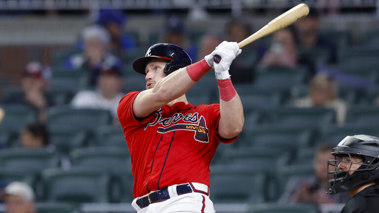
No. 3: Red Alternate Tops
Do the Braves need red uniform top? Probably not, especially considering how many teams in the National League — the Cincinnati Reds, Philadelphia Phillies, St. Louis Cardinals, Washington Nationals and Arizona Diamondbacks — utilize some form of red as their primary color.
But these red tops, worn for Friday games at Truist Park, are still a nice alternate when worn sparingly. They’re also much better than the initial red uniform tops that the Braves worn for Sunday games at Turner Field from 2005-2013.
No. 2: White Home Uniforms
Simply put, these are one of the cleanest primary home uniforms in baseball right now. The cursive “Braves” script across the front of the uniform is excellent, and it matches very well with the navy blue “A” cap that features a red brim.
No. 1: Gray Road Uniforms
It’s popular right now to hate on gray uniforms, which is why teams like the Seattle Mariners and Tampa Bay Rays have altogether ditched what were once their primary road uniforms. But while the Braves wear the navy blue tops fairly frequently on the road, they have arguably the best grays in baseball. “Atlanta” across the chest and the red numbers on the back give this gray uniform plenty of life. These uniforms make you think of turning on TBS and seeing John Smoltz, Greg Maddux and Tom Glavine mowing down opposing hitters in the 1990s and early 2000s.

Written by
Tim Kelly is a contributor to Just Baseball. Tim has been on the Philadelphia Phillies beat since 2020, serving as the Editorial Director for PhilliesNation.com. Additionally,…