Ranking the Best Uniforms in Major League Baseball
The definitive list of the best jerseys in Major League Baseball
I love jerseys. They create an identity for a team and a city that fans can unite around.
I love the aesthetic a good uniform matchup can create on television. When the Packers and 49ers meet up in a late season matchup, it just feels different. When the Yankees and Dodgers meet up, the history crawls through the screen at you.
Over the years I have put together a pretty impressive jersey collection. My love for the unique colors and logos appealed to me, even from teams I have no affiliation with. In college I have become the guy people go to when they need a cool jersey to wear for a night out.
Clearly, I pay a lot more attention to these things than the average sports fan should.
My love for jerseys led me on a quest, one I have tried to conquer for years while sitting on the couch with my dad watching games. I wanted to figure out who has the best uniforms in Major League Baseball.
After a painstaking evaluation process, I have created a comprehensive (and correct) six-tiered list, ranking every team’s uniform in Major League Baseball.
The Bad (30-29)
30. Arizona Diamondbacks
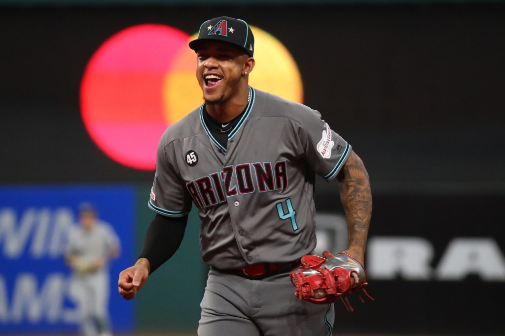
The D-Backs nearly needed a class of their own for their uniforms. They are somehow better than they were a few years ago, when they had the weird designs on the shoulders, caps and back of pants. But Arizona’s mistakes began when they went away from the purple and green and opted for their weird red and black combo.
Also, they included a weird electric blue for some reason that just totally does not go. There is a really simple solution to their issue: bring back the purple and green from the Randy Johnson days. Until then, they will be sitting at the bottom in any further uniform ranking I make.
29. Houston Astros
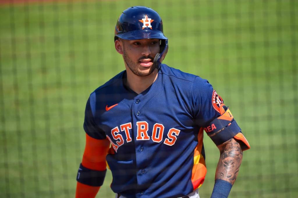
I thought I liked these coming in but the more I thought about it, the more they just do not do it for me. The road grays with the orange and navy are okay, but that is about as good as it gets. The orange alternate should be good, but it just is not. The navy looks like when MLB The Show glitches and makes a team wear their batting practice uniforms. I just do not get what they are going for with the stripes under the sleeves. Just not good.
The Bland (28-22)
28. Tampa Bay Rays
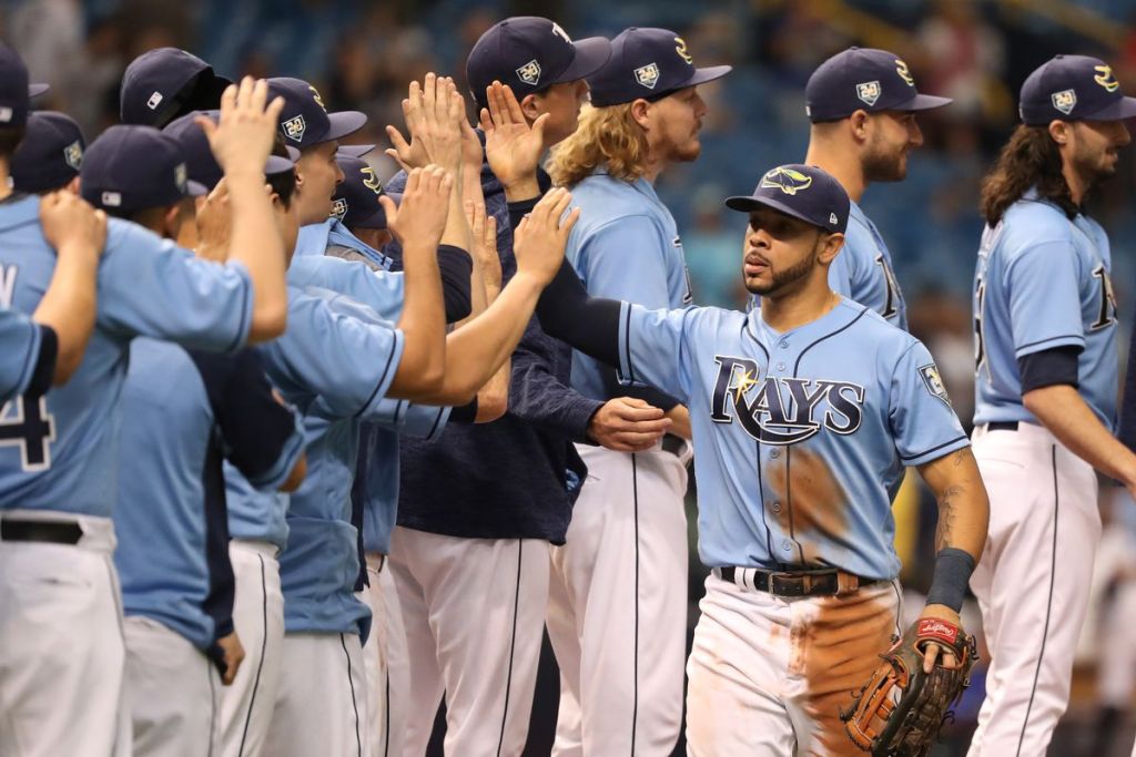
The Rays’ Sunday baby blues are good, but there is so much better in that category. The home uniforms have nothing to them and the road grays are not good. The navy uniform needs more contrast too, they just do not get it done for me. I love the throwback Devil Rays uniforms, but they barely wear them for more than just a series. Go back to those and now you are cooking with gas.
27. New York Mets
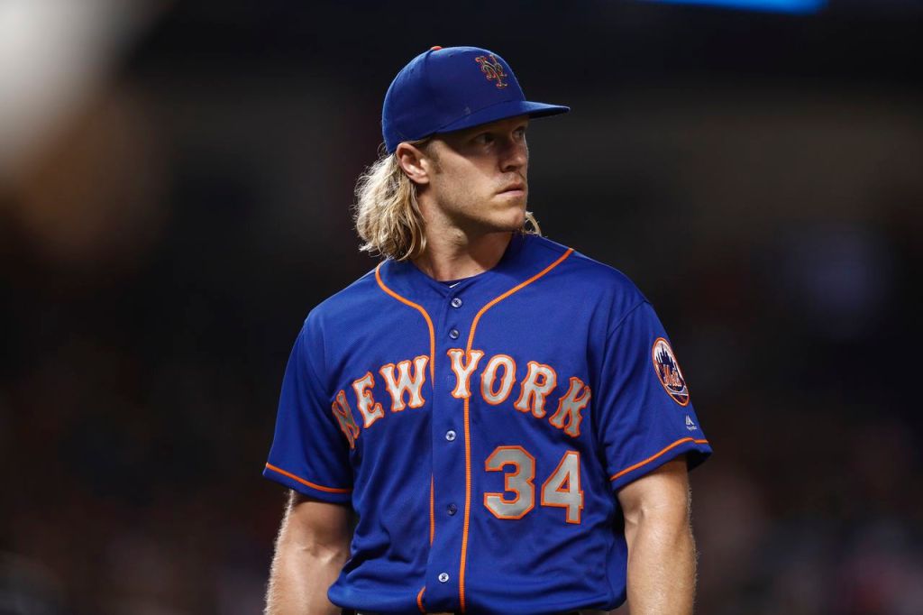
It is hard to rank a team with pinstripes this low but there is just something off about the Mets uniforms. The homes are great and the black alternates are even better, but the rest are just not good. The blues that say “New York” say it in some weird silver that does not come off well on TV. I think the Mets are one of the teams that wears pinstripes that probably should not, the white uniforms from the early 2000s are really good. This year they wore the “New York” home whites they wore after 9/11 and if I made the calls that would be their primary home uniform. If it was, they would be a lot higher.
26. Detroit Tigers
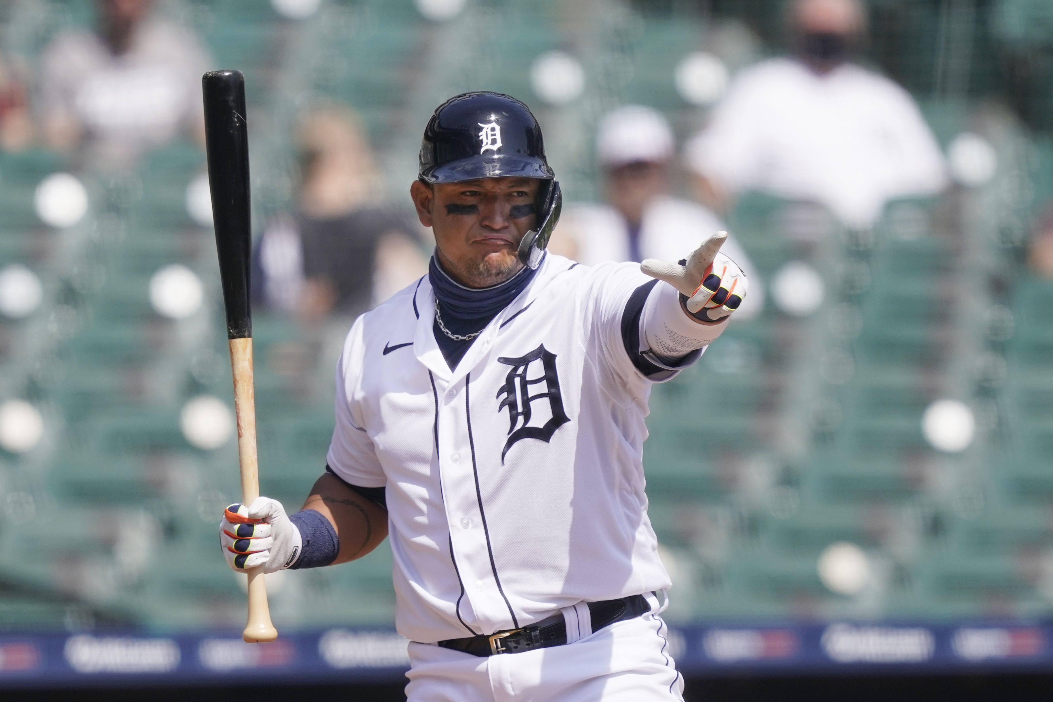
I love the old English ‘D’ but the home uniform is just so bland. There is literally nothing to it. The road gray is good but in a two-uniform set it just does not do enough to make up for the boring home look. Bring back the ‘D’ that has the tiger walking through it and Detroit is in business.
25. Texas Rangers
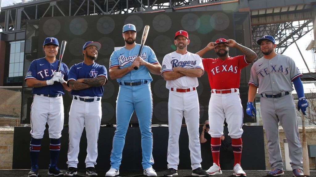
The Rangers may have been in “The Bad” section if it were not for their baby blue set. It is just splendid. However, the rest is just kinda meh. They have both a red and a blue jersey, but neither have much life to them. The grey is very boring and the home looks better with the script “Rangers” than former block “Texas,” but still does not move the needle.
24. Cleveland Guardians
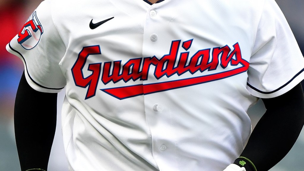
Good colors, boring uniform. These may be the best uniforms in the city and they actually represent Cleveland pretty well: bland. The red is good, the navy is fine, nothing else really excites me. The grey is pretty bad. I was hoping they would try something new with the rebrand, but that just did not really happen. They just replaced the former name with Guardians and I am not really crazy about the new logo.
23. Cincinnatti Reds
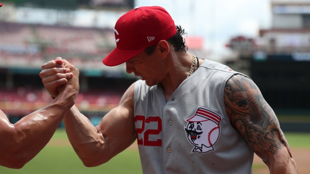
This is a disappointment because the Reds are such a classic franchise, but they just do not have a lot going on. The home uniform is a lot like the Tigers: not a whole lot to it with a classic logo. Red and white is such a good combo that could have been used a lot better here. The red jersey is good, but not enough to move the entire set up into the next tier. They should bring back the sleeveless jerseys just for fun.
22. Washington Nationals
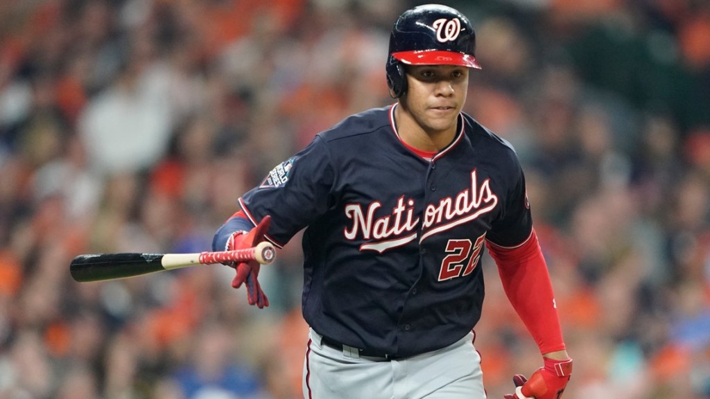
I was really close to putting the Nats in the next tier up but I had trouble convincing myself their uniforms are actually good. They definitely should be better though. The red needs to have more to it and so does the navy set. I love the stars and stripes alternates, but not sure they wear it enough for consideration. I really think the road set is kind of ugly and the home uniform is pretty bland. It is hard to mess up red, white and blue and they did not mess it up, they just did not really do enough to go anywhere beyond here.
The Good That Should Be Better (21-18)
21. Los Angeles Angels
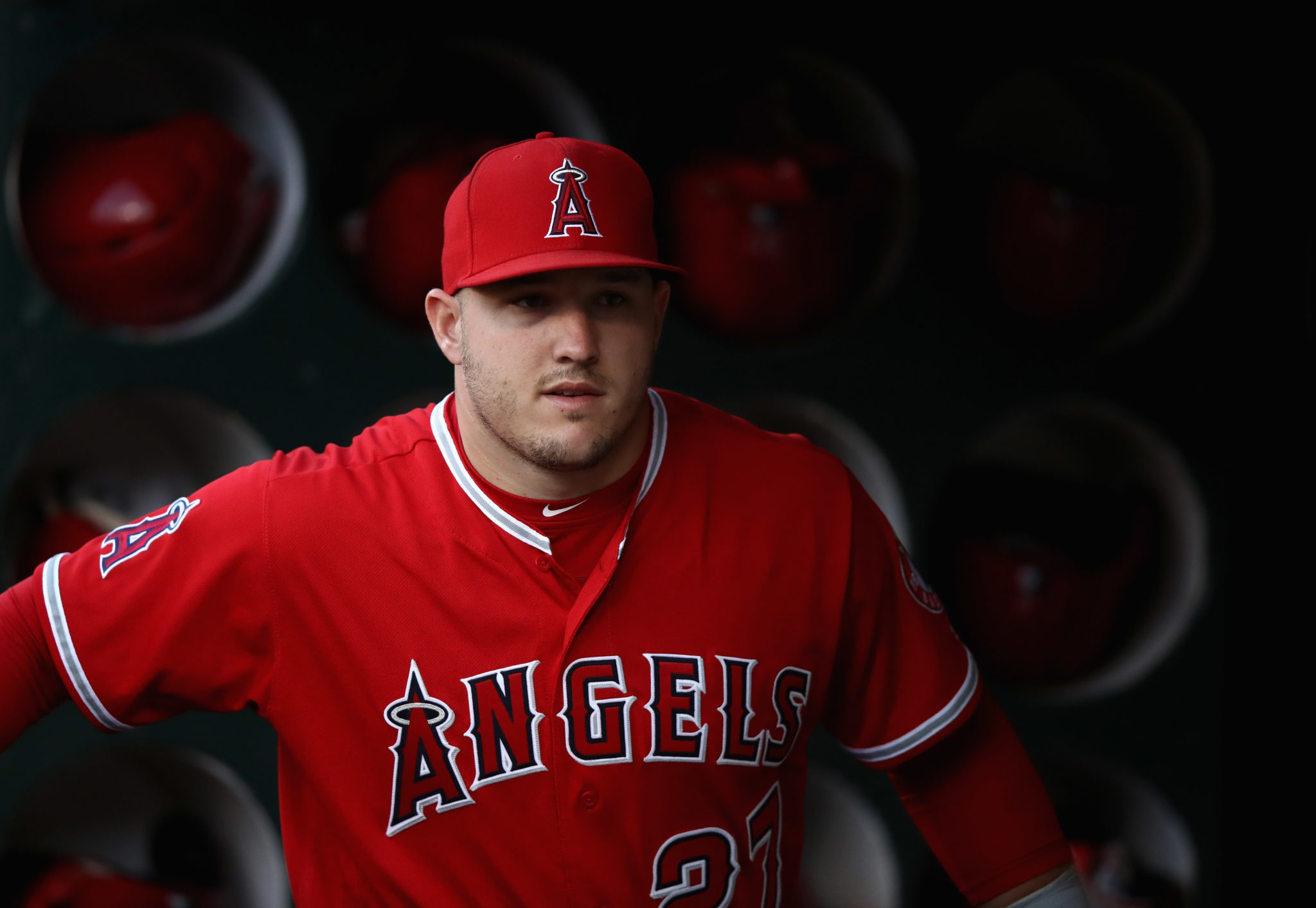
The Angels are the first team I would say looks good no matter what they wear. But do they really have a difference-making uniform?
Red is my favorite color and their red jersey is really good, but there is something missing. Same with the home whites. I really wish they would use more throwbacks because those California Angels uniforms from the mid 90s are tremendous. Mike Trout can easily turn this into an iconic uniform if he does some winning in the next part of his career, but for now these are a missed opportunity at something great.
20. Miami Marlins
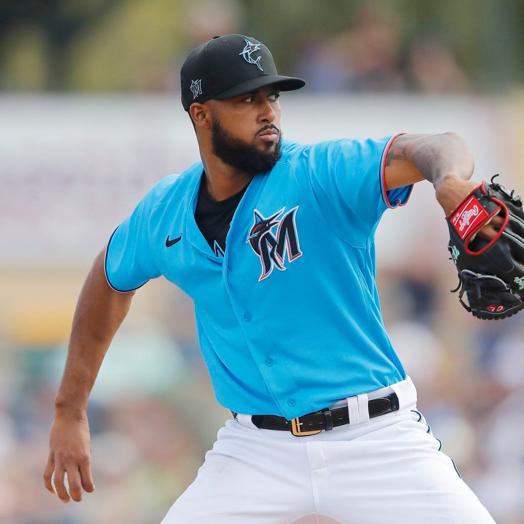
If I made these rankings about four years ago the Marlins might be bottom of this list. Their recent rebrand saved them from an all-time bad uniform set across any sport. The Marlins do have a good set and the only reason I say they should be better is because they do not wear their electric blue jerseys. They have a great uniform they wear all spring, but have yet to bring it into the regular season rotation. The home whites are really good and the road grays are sneakily awesome. If they wore that blue they would shoot up the rankings, but for now they stay here.
19. Kansas City Royals
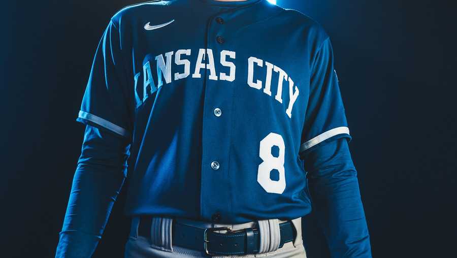
They made some tweaks to their uniforms before the season and they are positive changes. They made things a little more classic and simple which is always good. However, these classic uniforms fall short of some others. I do not love the new blue “Kansas City” and I feel like the baby blues are missing something, despite being really good. I do not feel great about where I put the Royals, but I cannot find a reason to put them higher.
18. Baltimore Orioles
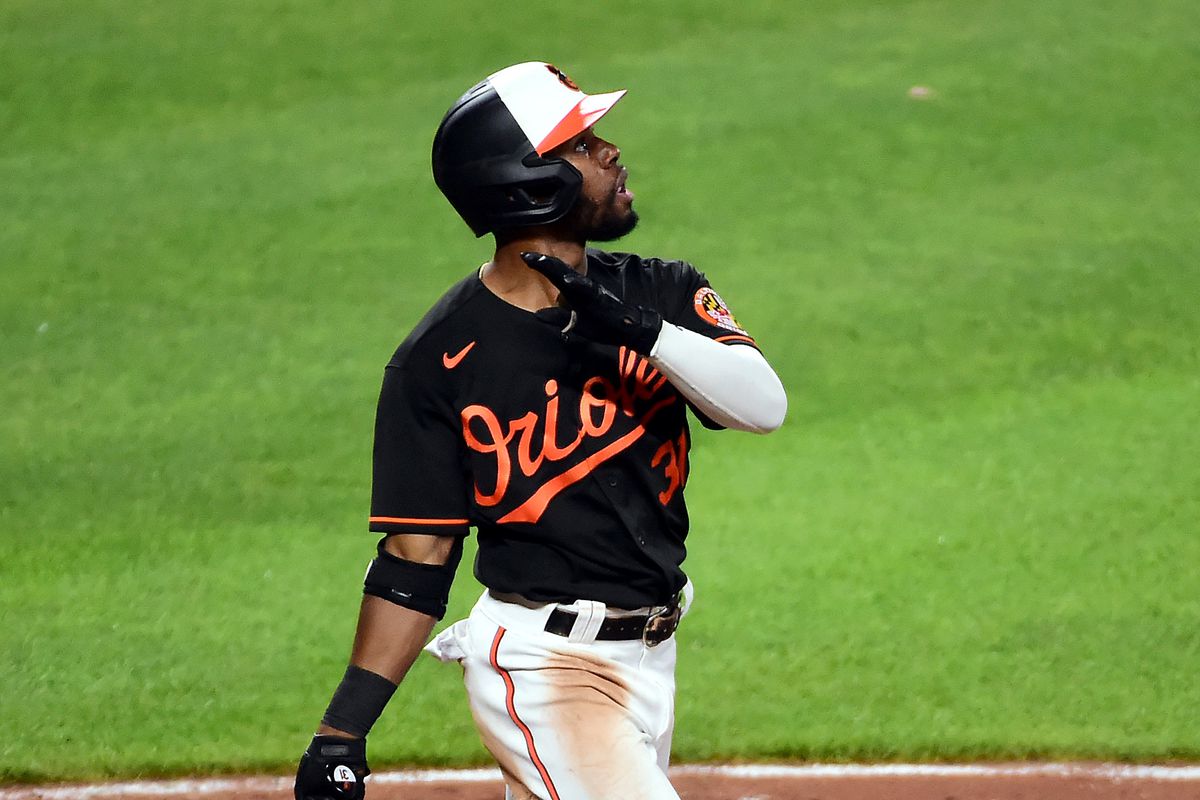
The O’s have great, great colors. Orange and black is a personal favorite combo and I love the cartoon bird as much as anybody. The Orioles are a classic franchise with a classic ballpark, but their uniforms just do not really crack that next level with some of the other classic franchises. I think bringing back the cuffed sleeves from the Cal Ripken days would do a lot for this set. The orange is good, the black is okay but should be better, and the other sets are just kind of there. I was really close to putting them in the next tier, but wanted to take a stand that these colors have been done a bit of a disservice.
The Good (17-10)
17. San Diego Padres
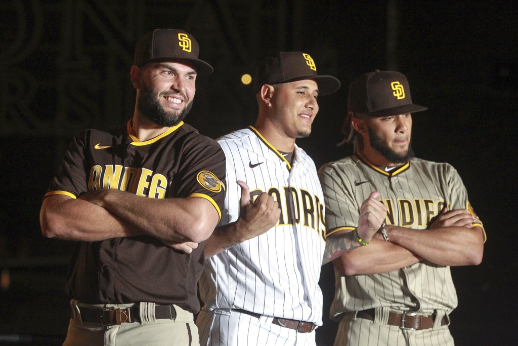
I think a lot of people will find saying the Padres uniforms are good to be controversial, but I think that is malarkey. They are obviously awesome because they are so ridiculous. And the home whites are actually one of my favorites! When I heard they were going back to the brown and yellow I was very skeptical, but the Friars did a really good job with them. The brown road jersey is great, and the road alternates are different from anything any other team has. They are good but they are still 17th. Basically, there is a whole lot better out there. Just goes to show there are a lot of really good uniforms in baseball.
16. Chicago White Sox
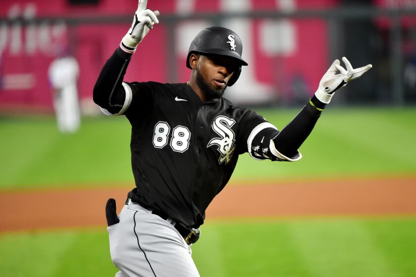
Black and white is almost cheating. It is almost impossible to look bad wearing those colors. The pinstripes are great, the black and white looks great on gray, and the black alternate is wonderful. Not really much else to say, this is just a sharp set of uniforms.
15. Colorado Rockies
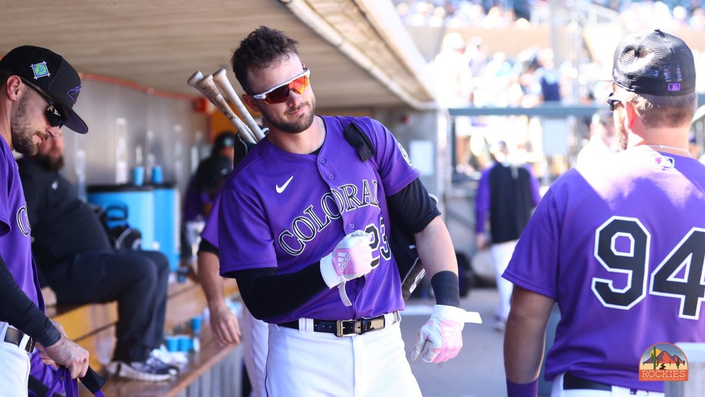
These would maybe be a tier up if it were not for the black road alternate. The idea is great but the execution is not. Other than that, a wonderful set of uniforms. Purple and black is another awesome color combo and the home pinstripes work really well. The purple also looks so good on the grey. The difference maker in this set is the purples. Oh my, those gorgeous purples. By itself, that may be my favorite uniform in the entire sport. It is just a perfect jersey.
14. Milwaukee Brewers
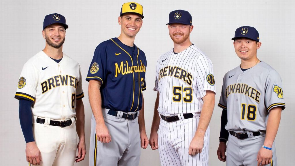
The Brew Crew are another team that benefitted mightily from a rebrand. Going classic with their new jerseys was a great idea and without the change they would be in the cellar on this list. The new block lettering home uniform is awesome, the pinstripe alternate is a bit unnecessary but still looks good. The gray is good and so is the navy, though the two-tone hat holds it back a bit. The best decision they made? Making the glove logo their primary. Did you know it’s an ‘M’ and a ‘B’?
13. Toronto Blue Jays
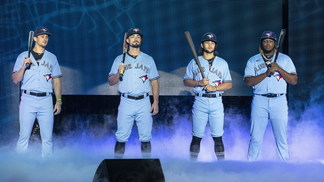
Yes. Just…yes. A perfect example that the right move is just go back to the classics. While I feel nostalgia for the gray and black of the mid-2000s, this set is so much better. The numbering is iconic, and the blue and white is just perfect. The baby blues? Epic. This a team that is going to compete going forward and look good while doing. With some of the most exciting young players in the game, it is only right they have a fantastic set of uniforms.
12. Seattle Mariners
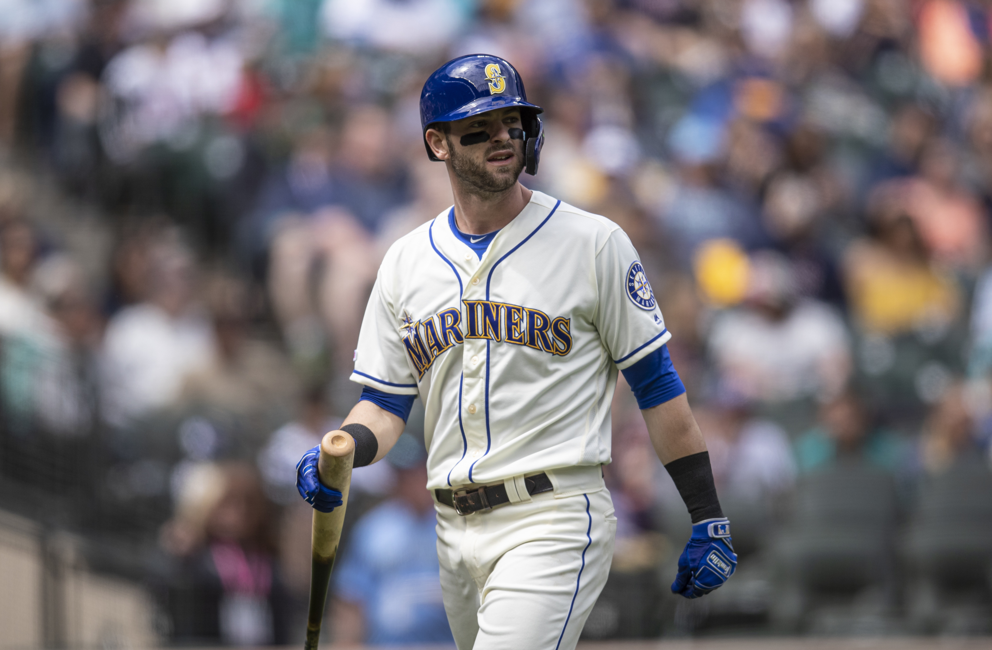
If the M’s navy uniform was just a little better they would be a tier up, but it just barely misses the mark. They have a really good and unique color combo and their home whites are sneaky good because of it. The navy and aqua also looks better on the road grays than one might imagine. Plus, the aqua alternate is another one of my favorites. That and the Rockies’ purple are probably the best alternates in the league. Do not sleep on the white throwbacks from the blue and yellow days either, a really nice addition to a really good set.
11. Pittsburgh Pirates
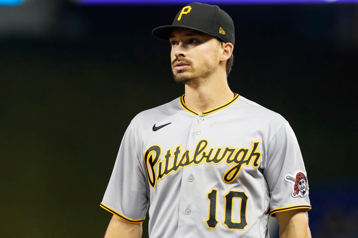
The Buckos made some slight tweaks to their classic set before 2020 and nailed it. The script text is awesome and the piping around the collar and sleeves is really good too. One of my favorite things in sports is Pittsburgh’s teams all wearing black and gold. In my eyes, every city should have an identity with a color scheme like that. Black and gold is already such a great combo, and adding the prestige and meaning behind it makes it that much better.
10. Boston Red Sox
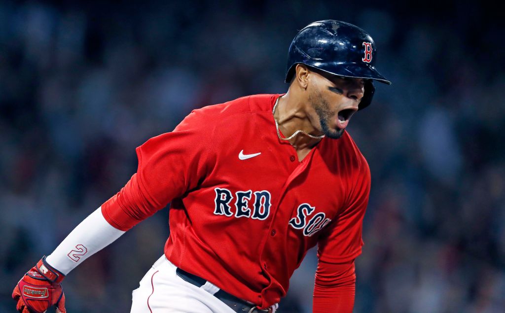
The Sox obviously have an iconic set but it just does not quite match up with some of the others. The navy rules, the red had to be good and is, and everybody knows that “Red Sox” text when they see it. For some reason they stopped having red on the letters in their road grey uniform and it holds them back. Other than that, simply iconic.
The Underrated And Exceptional (9-7)
9. Philadelphia Phillies
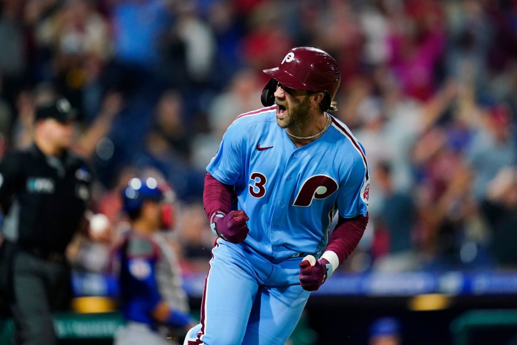
The first of two NL East teams in this category, the Phillies do not get enough credit for having really good jerseys. Pinstripes are always good and the “Phillies” script is awesome. Red is also a unique pinstripes color and totally works. Red and grey looks really good together, and the recent addition of a red jersey is awesome. What makes these underrated are the alternate whites. With a slight cream tint and the awesome blue and red caps, they are just awesome. The lettering and numbers on these are also great. What makes these exceptional is the return of the baby blue with maroon. That classic ‘P’ is one of my favorite logos in sports and the combo is not only unique, but awesome.
8. Minnesota Twins
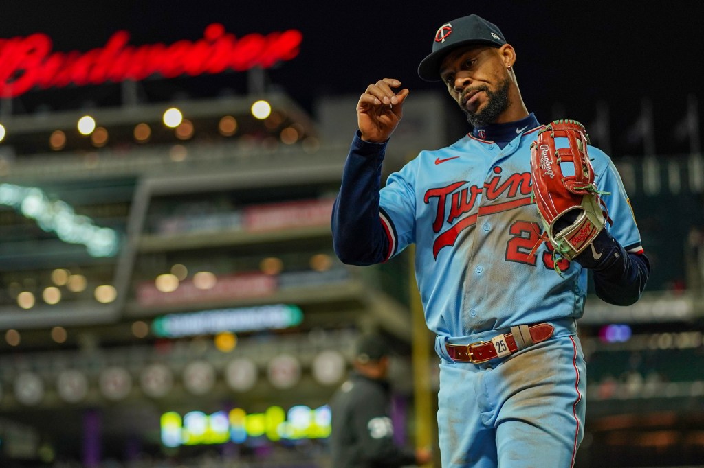
The Twinkies may have the most underrated set in sports. An awesome logo, a great and unique mascot and well designed jerseys give them a huge boost. This should be a better-marketed team, but they do play in Minnesota.
I was really glad to see Carlos Correa sign with the Twins, mainly because now people might pay attention to just how awesome these uniforms are. There is legitimately not a bad uniform here. The navy and red detailing looks awesome on the home whites, and are good on the grey as well. But what really sets this one apart are the alternates. The red is great, the navy is epic and the baby blues are electric. Adding a baby blue throwback makes any set better, but it is hard to say anybody did it better than the Twins. I could talk for days about these uniforms. So good.
7. Atlanta Braves
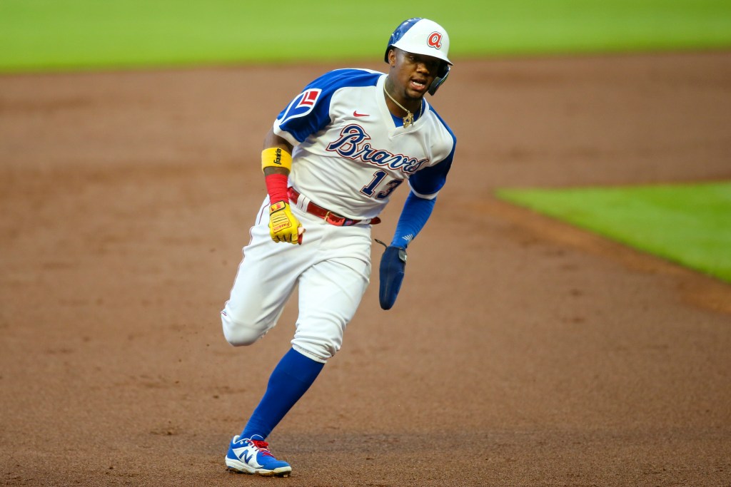
The Braves nearly cracked the top tier but for some reason I found that people do not love these as much as me. I think they may have the best road uniform in all of baseball. There is something that is just so good about how their navy and red piping looks on a grey uniform. Same thing with the home whites, they have a perfect amount of color on them.
The alternates win out again here, though. The Sunday cream uniforms are a nice switch up and look great, the reds are mouthwatering and the navy is gorgeous. Add in some epic throwbacks from the Hank Aaron era and great baby blues and they add up to a stunning set of uniforms.
The Best (6-1)
6. Chicago Cubs
You will find a common theme in this tier: iconic franchises. The Cubs do pinstripes as well as anybody short of the Yankees and they look even better in the special setting that is Wrigley Field.
Another common theme here: simple.
Simplicity is key to all the great uniforms across any sport. The circle “Cubs” logo on the breast of the pinstripes is as simple and perfect as it gets. Plus, Cubbie blue is just a gorgeous color. I used to not love the road grey but they have grown on me and are really good. The alternate blue is another iconic uniform and has barely changed over time, and that is really what makes a uniform iconic. If a uniform transcends time, it will always be one of the best.
5. San Francisco Giants
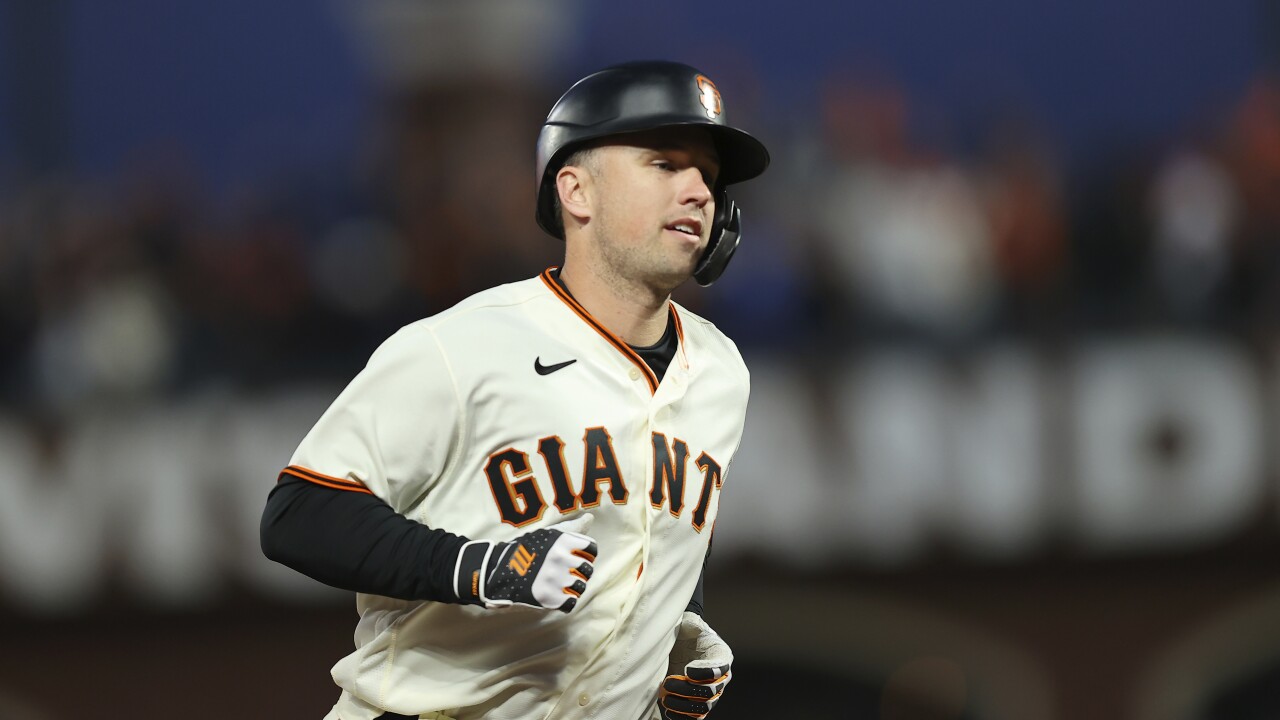
The Giants have changed their uniforms more than the other teams in this tier, but they are still tremendous. They set themsleves apart by being the only team that wears a cream primary jersey, and they are so, so good. The road uniforms are great and as I mentioned earlier I love orange and black. The black alternates look really good under the lights at Oracle Park and the oranges are simple yet gorgeous. They hit the mark where the Orioles and Astros just miss with the use of orange.
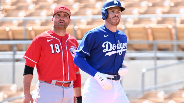
4. Los Angeles Dodgers
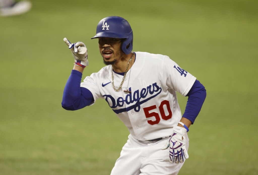
The next two may be the best and most iconic uniforms, but I could not top this list with two-uniform sets. The Dodgers home uniform is absolutely perfect. The red numbers for no good reason are great. They have been the same forever and if they ever change it will be a travesty. Iconic, perfect, all the words. Just cannot be the best without a little more variety.
3. New York Yankees

Not a whole lot to say here. The pinstripes make all the noise but the Yanks also have an awesome road uniform. The navy and white piping is complemented so well by the grey. It would have been boring to put the Yankees first, but they have perfect uniforms. This may sound sacrilegious, but I would love to see them implement a navy alternate just to try something new.
2. St. Louis Cardinals
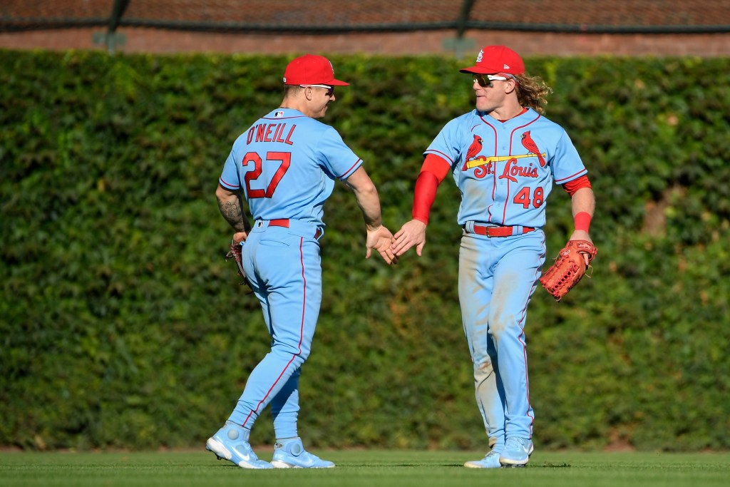
Another perfect home uniform. Not quite as simple as the Cubs, Dodgers or Yankees, but the Cardinals on the bat logo is great. The red caps, socks and sleeves against the white uniform are a chef’s kiss. What takes the Cards to the next level over the other classics is the addition of alternates. Their cream Sunday uniforms are a nice change from the typical home whites. And then there are the baby blues. For as good as other teams do them, nobody does them better than the Cardinals. Simple and elegant, the red is a perfect match. Simple, iconic, perfect. Put a red jersey in the rotation and they may be the best.
1. Oakland Athletics
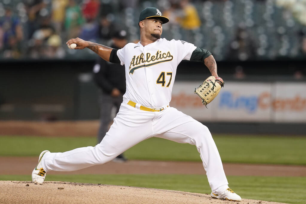
Picking this was really tough but remember, this is based on the whole set. What makes these the best?
Green and yellow.
There is something about that home white with the green and yellow details, especially when worn with white shoes. Their road grey is second for me to the Braves and is maybe the only road uniform that matches up to the home. There is just something about green and yellow. The same way the Packers look so much better than everybody else in the NFL, the A’s do it as well in baseball.
What sets them apart from the rest of this tier are the alternates. They somehow pulled off an amazing yellow uniform in baseball, and the two different green uniforms are both fantastic. The dark green with the “A’s” on the breast is as good as an alternate gets. They have never changed, they look fantastic, they are simple and they are iconic.
There is no other way around it, the Oakland Athletics have the best uniforms in baseball.

Written by
Ethan Budowsky is a University of Florida graduate with a degree in telecommunications. He currently works as a Multimedia Journalist for WCJB TV20 in Gainesville. Before…