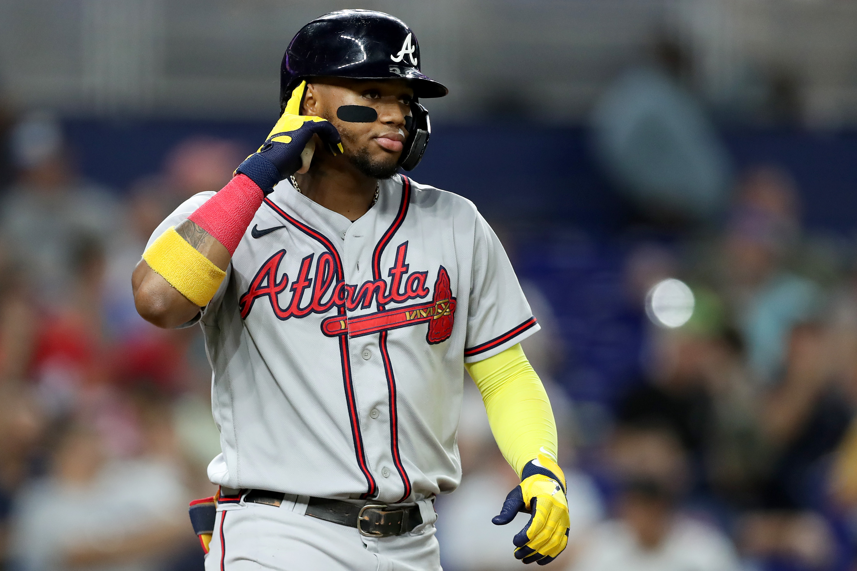
2024 MLB Uniform Rankings
Iconic looks. New jersey sets. Where do your favorite team's threads rank in Major League Baseball fashion hierarchy?
It is my favorite time of the year. Sure, Spring Training is underway and that means baseball is back. That is awesome, but it has nothing on the real best time of the year: jersey-ranking season.
That is right, it is time to rank the best uniforms in Major League Baseball, and never have uniforms been a hotter topic. Fanatics has recently taken over production of MLB uniforms and it has caused quite the stir. Fans are very upset and players are angry as well. Many are saying the new uniforms look cheap, with smaller name plates and poor stitching.
As a uniform junkie, this is extremely concerning to me. Not only does it make me much less inclined to purchase jerseys, but it seems like they will be less attractive on the field as well.
I can go in-depth about why this is such an issue, but no need to go there now. Hopefully, player complaints will force a change and the jerseys will return to being high quality. Until then, we are just going to pretend like this is not an issue for the purposes of this article.
I will be ignoring the nameplates, numbers and styling and just going based off pure uniform design. We also do not include City Connect uniforms as part of these rankings. The good news is there are still so many great uniforms in Major League Baseball that make ranking them extremely difficult.
So many are so good in fact, that I decided to dump tiers for this year. We are just going straight 1-30, and there are numerous changes because I go back-and-forth on so many sets each year. That is how good baseball uniforms are, one day I might think the Mets have better uniforms than the Brewers, and the next I may think the opposite.
While some of the changes on the list are minor, we do have a few major shakeups. For the first time since Just Baseball has been ranking uniforms, we have a new worst jersey set in the league! The Arizona Diamondbacks FINALLY revamped their uniform set and they did a great job. They are out of the cellar and you may even be surprised to see where they ended up.
Three teams, the Yankees, Marlins and Nationals, made minor tweaks to their set. The Fish and Nats each introduced new uniforms and made changes to another. One worked, one did not. The Yankees did something nobody should do and it cost them.
No need to waste any more time. Let us jump right in, beginning as always at the bottom.
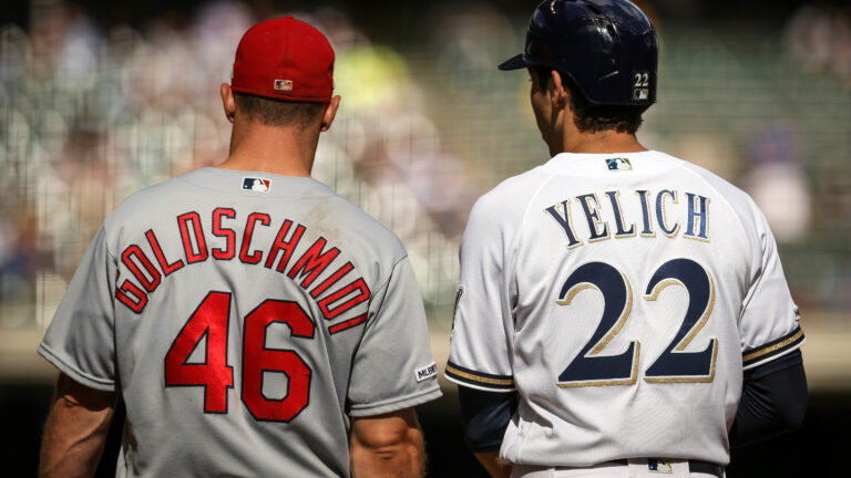
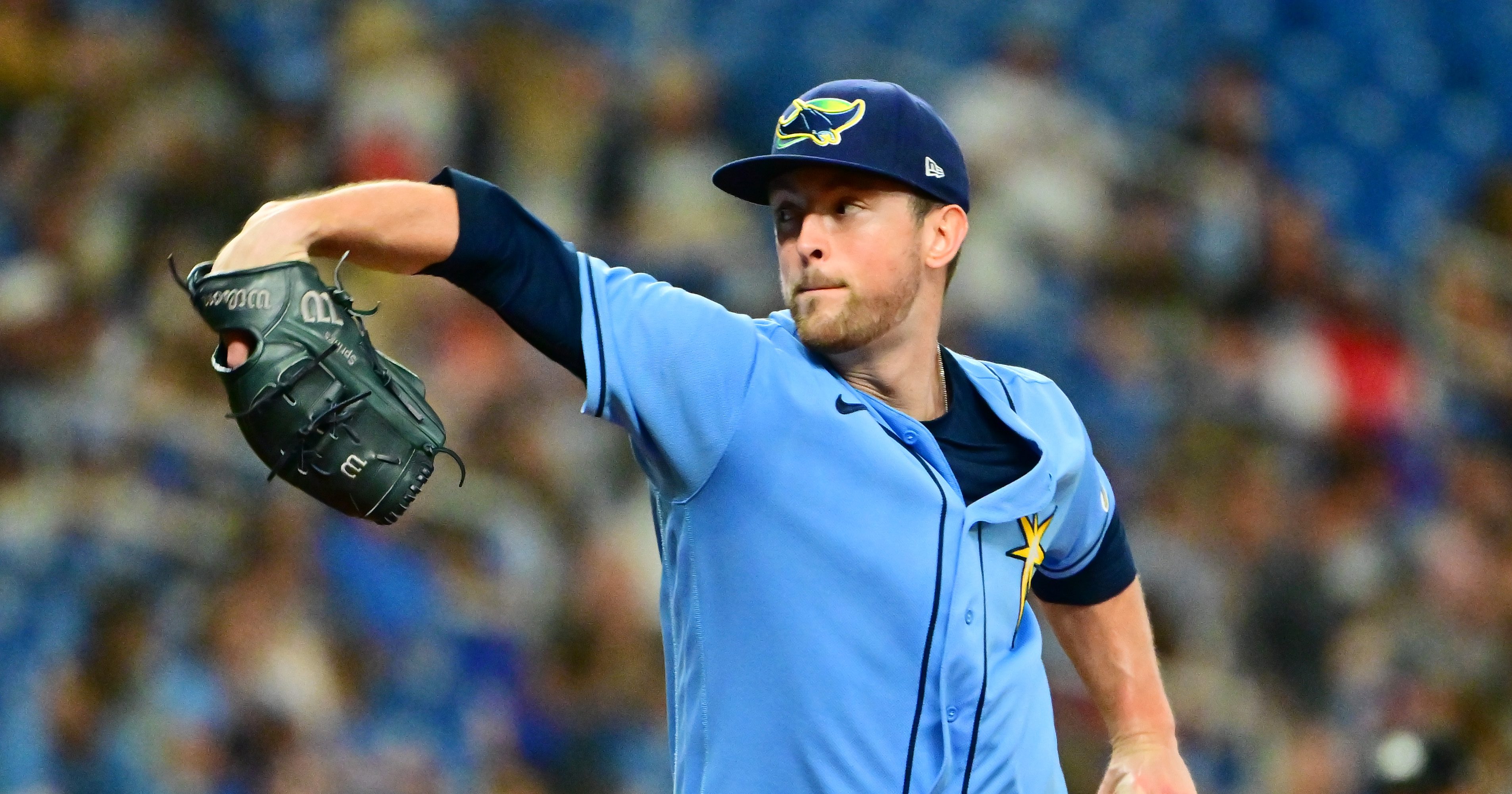
30. Tampa Bay Rays (Last Year: 28)
With the Diamondbacks finally out of the cellar, one team had to fall into it. I could have just dropped the Astros down a spot from 29, but I realized I have been making a mistake all these years.
The Rays uniforms are terrible, and they are fully deserving of taking over the mantle of last place. I think the reason the Rays uniforms are so terrible is because they should be so much better. Navy and light blue is one of my favorite color combos, and the Rays use it so improperly. I have high expectations for the Rays and they fall so far below those expectations.
The home whites are blah, the grays are a snooze fest, and navy letters on a navy uniform of course make no sense. They even managed to make a baby blue uniform boring. As with so many teams, if the Rays just went back to what worked in the 90s they would have some of the best uniforms in the sport. Instead, they continue to try and make these work and continue to fail.
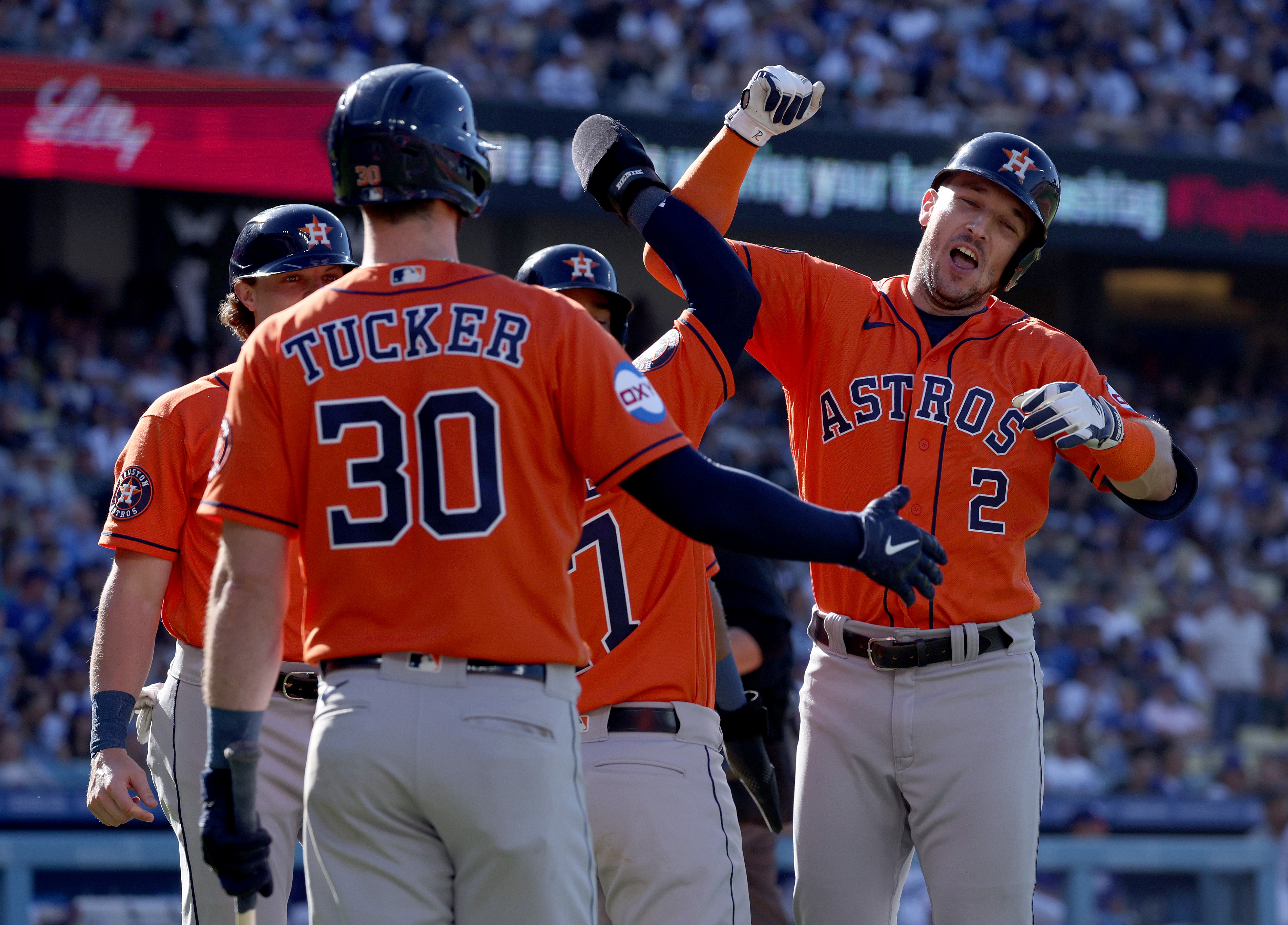
29. Houston Astros (Last Year: 29)
The Astros yet again barely escape falling into the bottom spot in our uniform rankings.
If you manage to make Ethan Budowsky hate orange-and-blue uniforms, you are doing something very wrong. Despite all the winning the Astros have done in these uniforms, the look has never been very good. Making a good orange baseball uniform is admittedly a tough task, but the Astros failed where the Giants and Orioles succeeded.
I will again say the navy uniforms with the stripes down the side make no sense. They look like batting practice uniforms being worn during the season.
The Astros are kind of like the MLB’s Patriots: lots of winning, a major cheating scandal, and doing it all in very mediocre uniforms. Bring back the old Astros look, the maroon pinstripes were awesome! Maybe it is just my nostalgia for mid-2000s baseball, but I think they would improve so much by going back to them.
28. Cleveland Guardians (Last Year: 27)
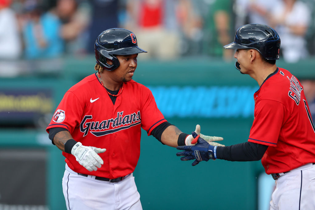
The Guardians are another team I considered dropping into last place this year. I was really hoping Cleveland would go in a different direction after the name change, and instead they did the bare minimum. They ripped the old logo and word mark off, and slapped an incredibly boring new logo and word mark on. Navy and red are great colors, and they are just wasted here.
These are some of the most boring uniforms in all of sports, and the only reason they are not last is because they do not deserve such a distinction. They are so boring that they are not even polarizing, they are just kind of there. Now that I think about it, they are kinda perfect for Cleveland. I wish their new logo was something much better than a baseball with a ‘G’ over it, but oh well.
27. Washington Nationals (Last Year: 23)
The Nationals never had great uniforms, but minor tweaks to this year’s set have only made them worse. The Nats added a new alternate jersey that looks more like a soccer jersey than a baseball jersey. I like the pullover idea, but the logo looks like the Washington Senators and the shoulders are gross. This was a good idea that was executed very poorly, and the set takes a hit because of it.
The Nats also made changes to their home uniform, going with a block “Washington” word mark across the chest that looks cheap. The red, white and blue piping on the collar and the cuffs is great, but the word mark does not match what should be a vintage look. It also looks like the Minnesota word mark from the Kirby Puckett-era Twins, which is really weird. I actually kind of like the gray uniform, but the set takes an overall hit from these changes
26. Cincinnati Reds (Last Year: 26)
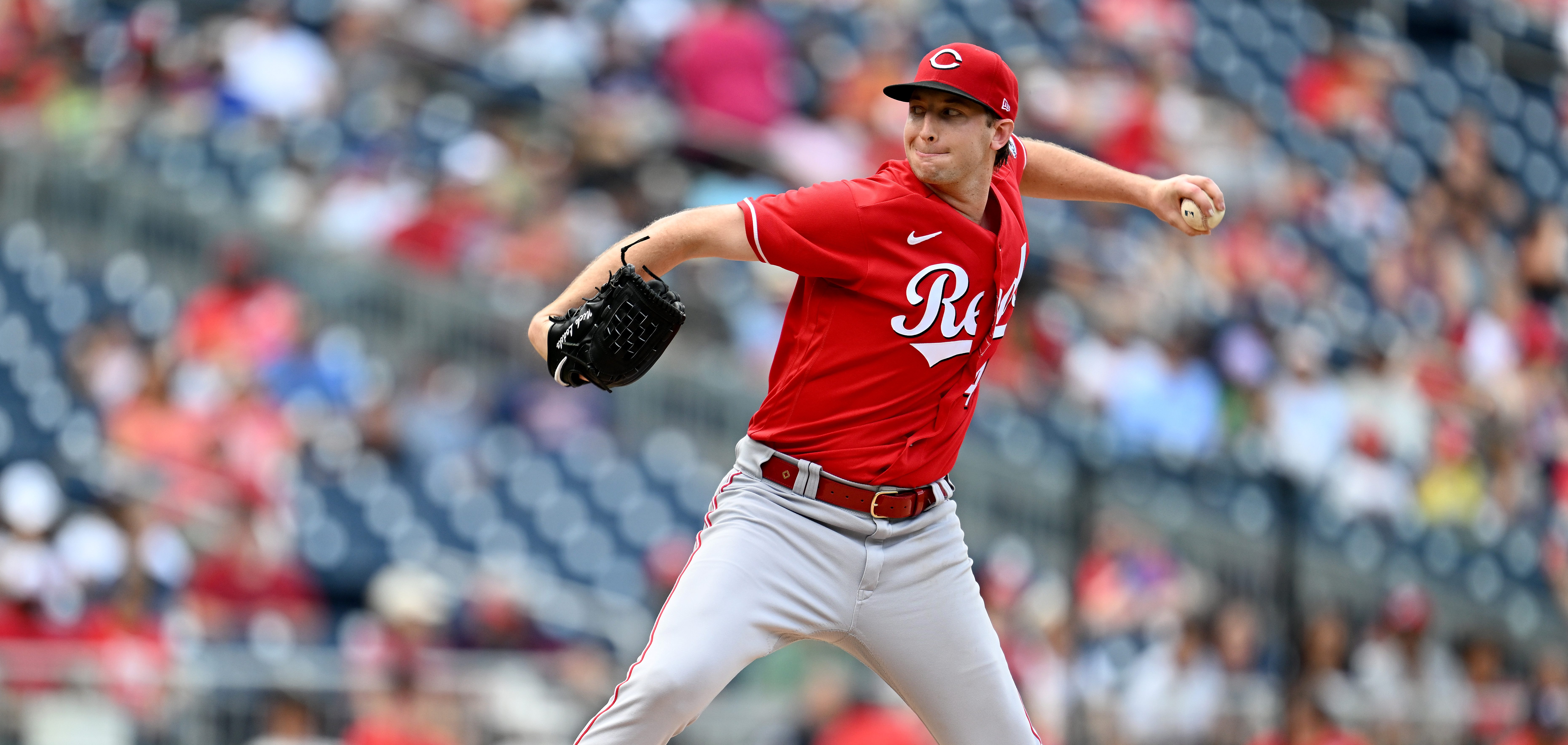
These should be so much better. A classic franchise with a ton of history and a great color combo not being in my top five seems ridiculous. Unfortunately, the Reds uniforms are just boring. The Big Red Machine pullover look with just a breast logo and no piping is much better. I wish the Reds utilized striping similar to that era of uniform, if so they would be much higher on this list.
The best uniform the Reds have is the red alternate, which has a boring word mark that makes it a middle-of-the-pack alternate look. We do not count City Connect uniforms here, so I wish the Reds had a black alternate we could count. I think this set could really benefit from a simple black uniform, maybe with the alternate Mr. Red logo on it. Until they make some changes, these will continue to dwell near the bottom of the league.
25. Detroit Tigers (Last Year: 25)
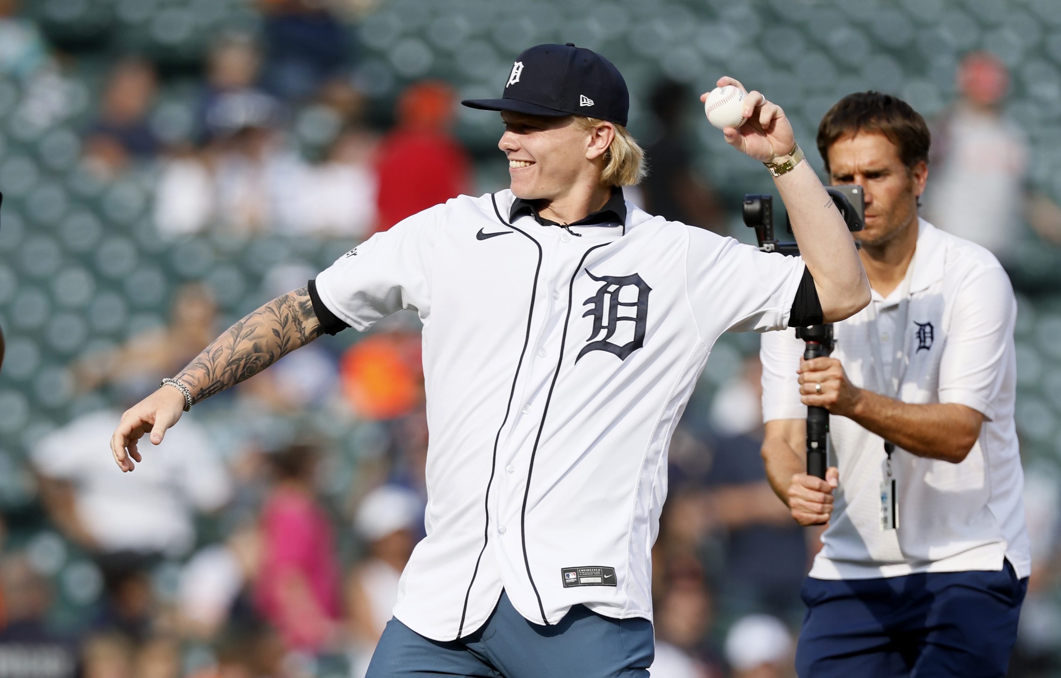
Another classic franchise that should have better uniforms. I love the idea of these so much, but the execution is just poor. The ‘Detroit’ word mark across the road uniforms is awesome, but for some reason they just do not look that good on the field. Another orange-and-blue look that just fails to hit the mark.
There is one way to make these uniforms so much better, and probably launch them into the top 15: put the logo with the tiger walking through the old English ‘D’. That would make these home uniforms absolutely fantastic. They would add a splash of color that would spice them up just enough to stop being boring. I will advocate for this change every single year until it happens, and until it does they will continue to be ranked right around here.
24. Los Angeles Angels (Last Year: 22)
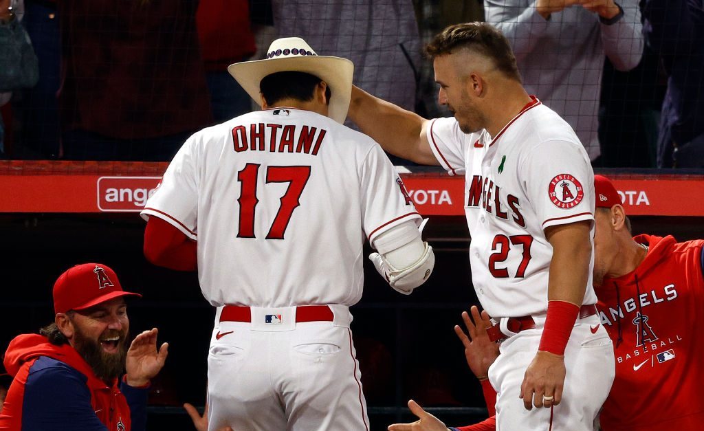
A lot of these uniforms that I am ranking down here are not even bad. I think a better word for them would be misused. I think the Angels uniforms are pretty solid, but they should be so much better. Just like the Reds, they do not take advantage of a classic color combination that should lend itself to great uniforms. Grey and red are not great together, the home white is just kinda there, and the alternate red is okay.
I wish so much that Mike Trout had a better uniform to spend his career in. I of course also wish he had a better team to spend his career on. Like about 95% of teams in the league, the Angels could benefit so much from going back to an old look.
The California Angels had such great uniforms, and one of the best logos of all time. With Shohei Othani now across town, this uniform is even less iconic, dropping it down a couple spots this year.
23. Minnesota Twins (Last Year: 20)
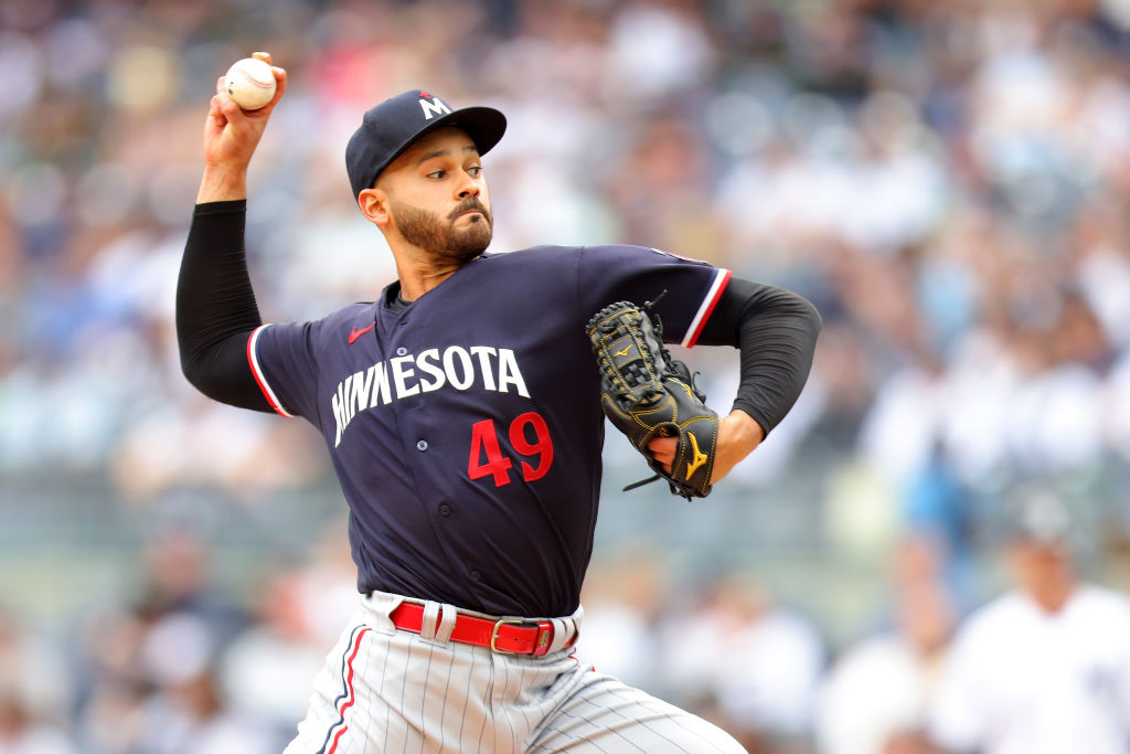
These took a nose dive last season after a rebrand and the free fall continues. The Twins had a fantastic uniform set and they just totally botched it. They simplified something that did not need to be simplified, taking away script word marks from the alternate blue uniforms. They also took out their best look, the red alternates with some gold piping on them.
I gave these a shot this season and I think the home white is nice, I like the grey pinstripes, and the off-whites are good too. However, I also grew to realize these are probably worse than I first thought they were when they changed. They are missing a little bit of character that previously made them great, and I hope they will eventually bring it back.
22. Texas Rangers (Last Year: 24)

I nearly gave these even more of a boost this year, but then I remembered the blue and red uniforms. I like that the Rangers brought the script word mark to the home jersey, a major improvement.
However, the word mark on the blue and red alternates is still bland and holds back what could be a great uniform. The Rangers have a tremendous baby blue uniform, it is just a fantastic look.
However, there is just something missing here. I think winning a World Series in these uniforms really helped the Rangers jump a couple spots this year, but it is still only two spots. I tried to put them higher, and just could not bring myself to do it. If I had still had tiers, these would have been the first in the “Good That Should Be Better” tier. It frustrates me how much better they should be.
21. San Diego Padres (Last Year: 16)
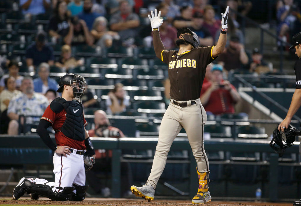
The Padres take the biggest tumble this year of a team that did not make changes to their uniforms. I think I finally realized that I have been trying to convince myself these are great, when they are really just okay. One thing I do know is the Padres home uniform is absolutely awesome.
That is an undeniable fact. I am pretty much a fan of any pinstripe uniform, and the brown and yellow is so unique it makes them great.
The problem is I have been trying to talk myself into the tan road uniforms and the brown alternates, and they are losing me. I thought I really loved them, but the more I think about it the more I realize they are just too far out there. It hurt me to drop these down, cause I have been an advocate for years, but I think I must conform and admit these are just not that good.
20. Miami Marlins (Last Year: 21)
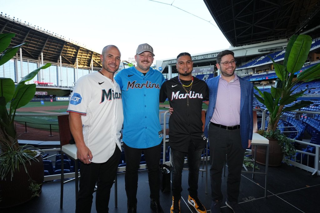
The Marlins made a big tweak to their black alternate uniform that I have been calling for since they introduced them. They finally changed the word mark on their black uniform from black to white to make it pop more. It is a good fix, but somehow it still could have been a lot better.
I think the Marlins missed by not adding some piping to the uniforms to add another splash of color. However, it is still a significant improvement from last year.
The best thing the Marlins did this offseason was finally add their best uniform to their regular-season rotation. That is right, the electric blues are coming to loanDepot Park this season and I could not be more excited.
The Marlins decided to go with a word mark across the chest rather than a logo on the breast and I think it was the right move. I wanted to move this set up more than just one spot because the blue gives it a huge boost. However, there were just too many good jerseys in front of it to leap over.
19. Kansas City Royals (Last Year: 19)
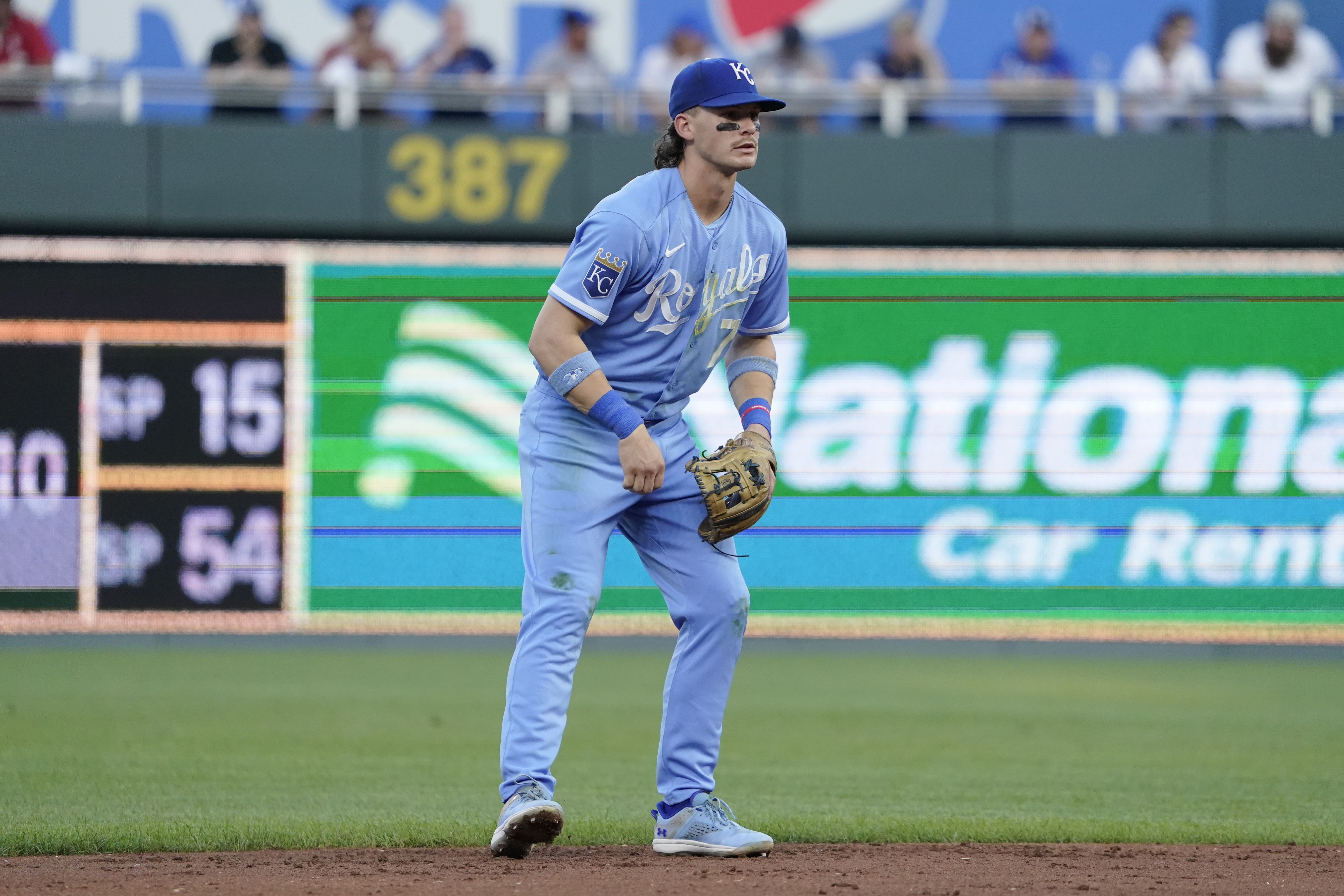
Every single year I want to rank the Royals uniforms higher and just cannot bring myself to do it. Such a classic look, these are nearly iconic. Based off my tastes, one may think these would crack the Top 10. However, I just cannot put them up in that territory for some reason. I tried to move them up this year because they brought back baby blue pants, but again there were just too many good sets ahead of them.
I think the road greys are missing some detail, and the royal blue alternates are a little bland. The home uniform is an absolute classic and those baby blues are to die for. I love that they made them all baby blue last year, and fans were happy about that change as well.
This is a classic set and the recent changes were solid ones. I want to rank them higher, but this is where things start to get good and some good uniforms have to get boxed out.
18. Baltimore Orioles (Last Year: 17)
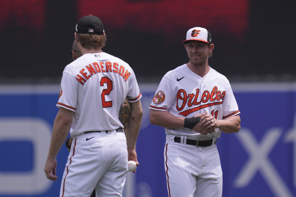
A one-spot swap here as I dropped the Orioles below the team they were ahead of last year.
These are very similar to the Royals in that Baltimore has a classic look that should be much better. For some reason, I just cannot put these much higher than right in this area. The home look is great and the orange uniforms are pretty good.
On the other hand, the grey uniforms are just okay and the black uniforms are kind of nowhere. Black and orange should be way better than it is, but I think the Orioles word mark may need some white outline on it.
Everything is better with the cartoon bird and the tri-colored hats. Maybe as the Orioles continue to do more winning these will become more iconic and move up the rankings in a few years. The O’s dropping a spot is more about moving up the team in front of them than dropping them down.
17. New York Mets (Last Year: 18)
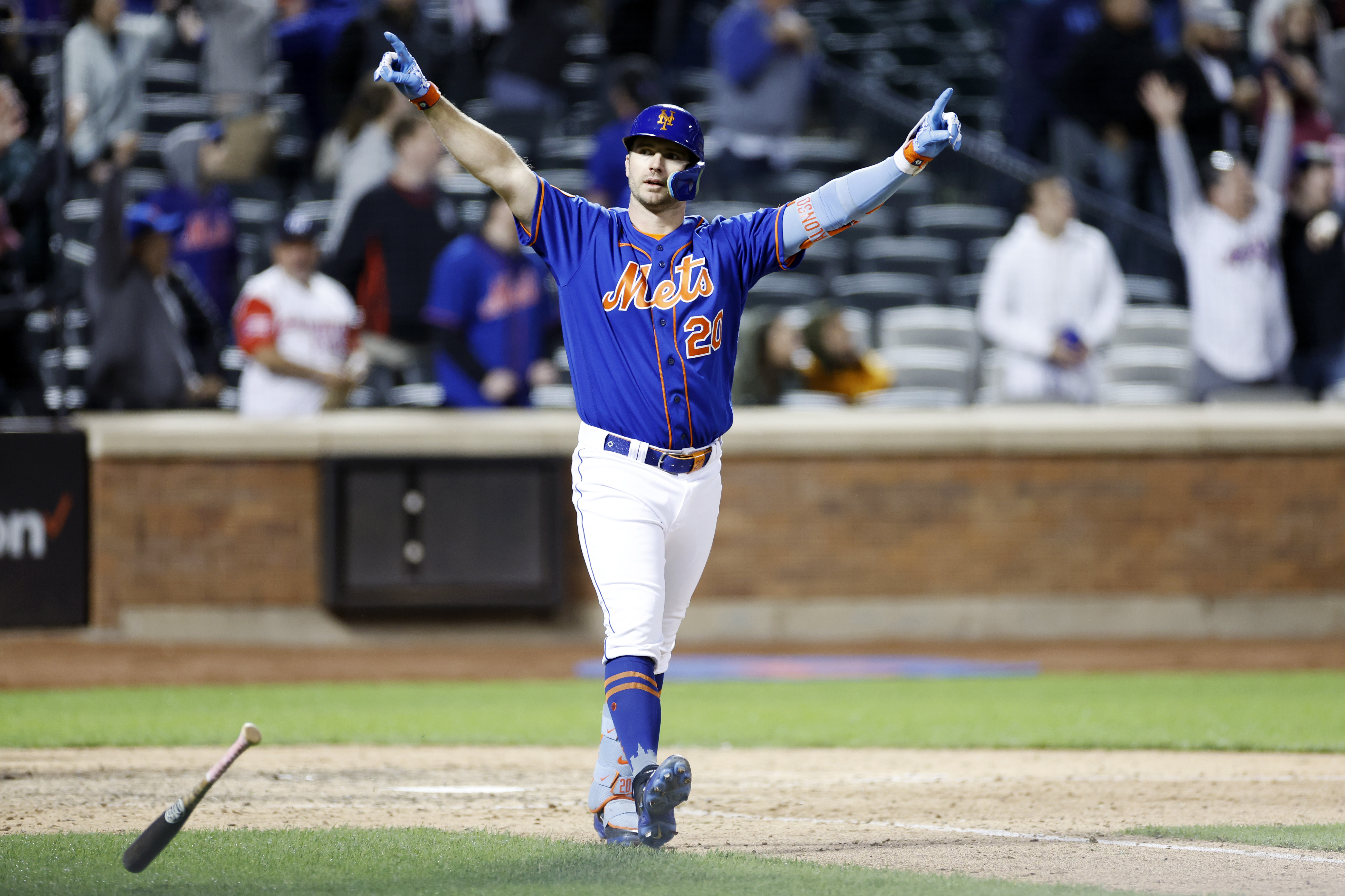
The Mets were our biggest risers last year, jumping up nine spots after I totally ranked them wrong in 2022. They jump another spot this year as I just continue to realize these are really good. Finally, a team that nailed an orange-and-blue look.
Already having a great pinstripe uniform, they dumped the weird blue uniform with the grey word mark and added a tremendous black jersey. The Mets have absolutely nailed their uniform improvements recently and they continue to deservedly move up the rankings.
The only improvement I would make here is putting New York on the home uniforms. Bringing back the look they wore after 9/11 as a Sunday alternate would be an awesome addition to the set. I would look for the Mets to go up again next year, because these never stop growing on me.
16. Milwaukee Brewers (Last Year: 14)
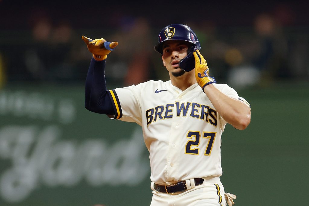
Another drop in the rankings that is really more about movement in front than the jersey set itself. The Brew Crew updated their uniforms a few years ago and it was a major success.
Going back to the ‘MB’ glove logo was a great choice, and I love the block lettering on the uniforms. The home cream look is great, as are the pinstripes of course. The grey road uniform is also awesome and I just love the way they use their colors.
The only reason I dropped these a tad is because I have soured on the navy uniform. First of all, I do not like the two-tone hat, it is a little overzealous. Second, I wish they stuck with the block lettering and something about the word mark does not mesh with the jersey here. I think all three of the other looks are great, but the navy just barely misses the mark for me.
15. Arizona Diamondbacks (Last Year: 30)
Ladies and gentlemen, I am about to say something unbelievable. The Arizona Diamondbacks have good uniforms! One of the most shocking storylines of this offseason is that the D-Backs changed their uniforms and absolutely nailed them.
At first, I thought they simply did enough to get them out of last place, but as I have looked at them more and more I have realized these are flat out good. Heck, they might even be great.
The D-Backs did what pretty much every team with bad uniforms needs to do: they went simple. Arizona joins the Giants as the only teams with off-white home uniforms, as they add a cream look to the set. These new home uniforms are awesome, with the simple ‘A’ logo on the breast. Super clean and simple, these are nearly perfect. The new road uniform is great and I love the Arizona word mark. Once again, much cleaner and simpler than what we have seen in the past.
The alternates are surprisingly really sharp, even with the infusion of the electric blue that comes out of nowhere. I still really do not understand why this color is part of their branding, but they finally made it work. The black uniform is awesome with a sharp logo and simple piping.
The red uniform underwent a shocking improvement from what they were before. Without seeing them in action I could not put them much higher than right here, but these may have Top-10 potential. We will see based on how they look in action how high they rise up next year.
14. Chicago White Sox (Last Year: 12)
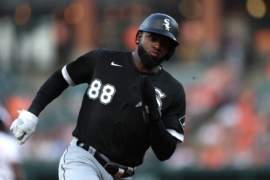
The White Sox drop is a part of a little re-arranging in this area of the rankings. As I looked over my rankings from last year, I realized I had to do a bit of shuffling. The White Sox have really good uniforms, but I think the teams I’ve moved in front of them have some slight advantages. The best uniform in this set by far is the black alternate, with the grey and white stripes on the sleeves.
A classic pinstripe look is the anchor of a simple set of uniforms that are also really good. It is really hard to mess up black-and-white uniforms in baseball. I mean it would take a real catastrophe for these to be anything other than awesome.
It is worth mentioning, even though we are not taking City Connects into contention, that the White Sox have by far the best one. They are good enough to move the Sox up a few spots if they were counted as part of the rankings.
13. Colorado Rockies (Last Year: 15)

As I went through my rankings from last year I realized these were too low. Considering the Rockies have my favorite alternate jersey in the league, they are a serious Top-10 contender.
The only team in the league with purple, the Rockies infuse the color perfectly into their unique set of uniforms. The purple alternate with black-and-silver lettering just could not be better.
They officially eliminated the black vests this year, and the one thing holding this set back is the need for a better black uniform. It is good, but it could be way better with a bit more purple and some slight tweaks to striping.
The home pinstripes are awesome, one of my favorites in the league, but again could use a hint of purple to maximize them. I love the road grey uniforms, which incorporates more purple, and they are probably the second-best look in the set. I love the Rockies uniforms and I love their colors, and they could be even better with a few slight changes.
12. Blue Jays (Last Year: 13)
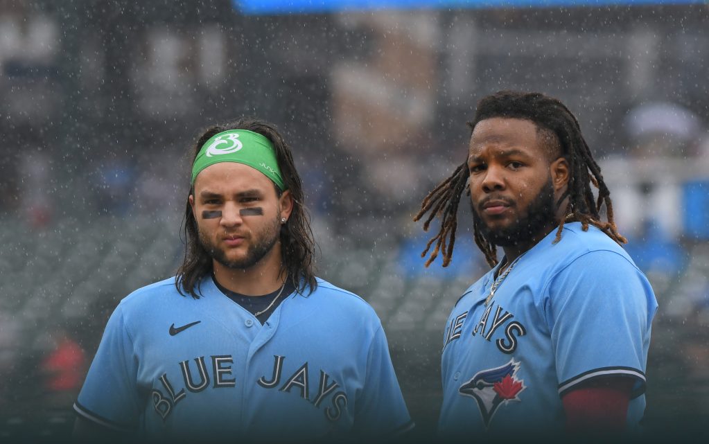
I nearly put these above the team in front of them and depending on the year they could easily crack the Top 10. I will admit I am nostalgic for the grey-and-blue Jays of the mid-2000s, but these have those beat by a mile. The Jays were one of the smart teams that modernized a classic look and did it beautifully. It all starts with an awesome baby-blue look that takes you back to a different time.
The Jays use their team-specific font throughout the jersey and it works perfectly. I also love the variety in this set and I really do not think there is a bad look. The royal blues are tremendous, the home whites are sharp and the reds are a special touch. These jerseys really connect the Jays with Toronto and I love how they brought a classic look into the modern era.
11. Red Sox (Last Year: 9)
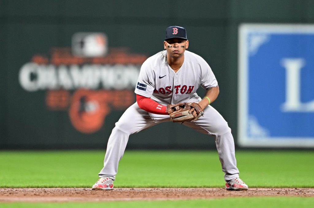
I am not really sure what prompted me to drop these, but something inside me said they were ranked too high. The red alternates are one of my favorite jerseys in the league and the navy alternate is good as well.
The home look is as classic and clean as you are going to get in today’s league. I also like the road jersey that has a red work mark much better than the ones with navy. A cuff on the sleeve would do these jerseys wonders.
Something about these just felt off to me this year. Maybe they need a bit of a touch up. Maybe they have just fallen down in favor behind some of the sets in front of them. Either way, I just could not bring myself to rank them ahead of some of the teams they were in front of last year.
Thankfully for the Red Sox, City Connects are not included, otherwise those abominations would have tanked their standing among the best uniforms in the league.
10. Pittsburgh Pirates (Last Year: 10)
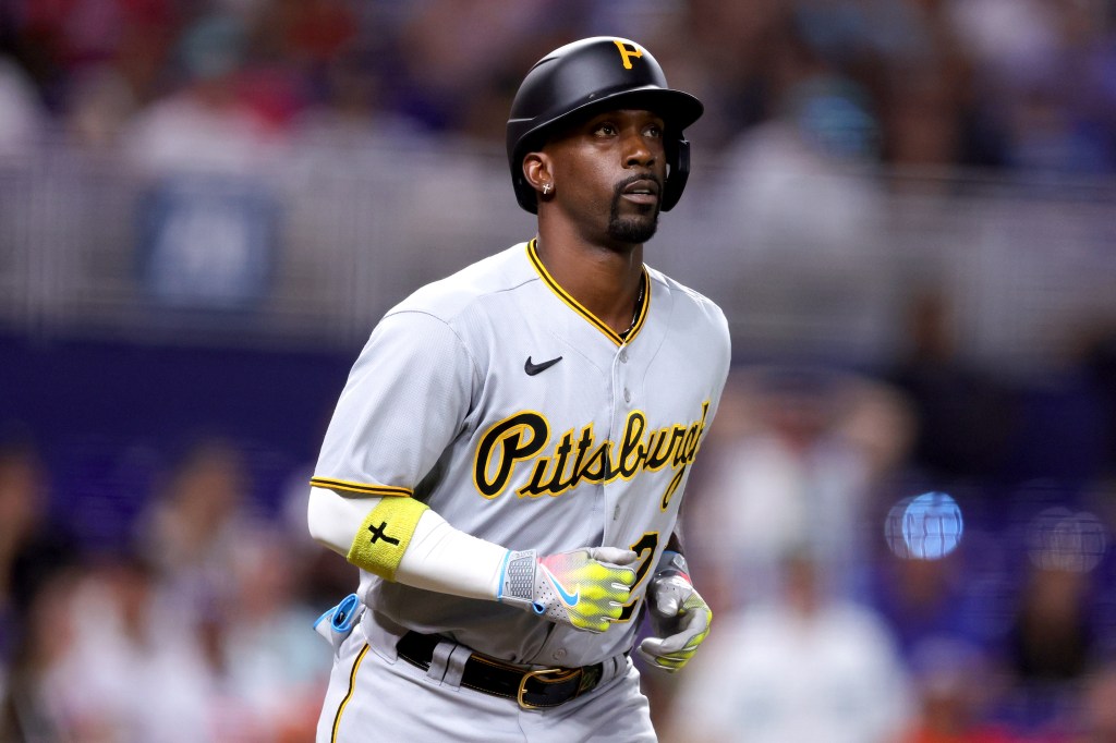
I did a full ranking of this set of uniforms last year and they are really fantastic. First of all, the Pirates have two black uniforms and both are equally awesome. Much like the Jays, the Pirates a few years ago took a classic look and brought it into the modern era. The striping on the sleeves and collars are much better. They also instituted a classic-script word mark that everybody should love.
One improvement I wish they would make is matching the home word mark with the road ones. If they put ‘Pirates’ in a script font, these would be special. The black alternate with just the yellow ‘P’ on the chest is classic and one of the best around.
The black-and-yellow identity of Pittsburgh is one of my favorite things in sports branding. It definitely raises the level of all three teams’ uniforms in the city. I would love to see the Pirates institute a throwback look, with the yellow “We Are Family” pullovers making a comeback.
9. Seattle Mariners (Last Year: 11)
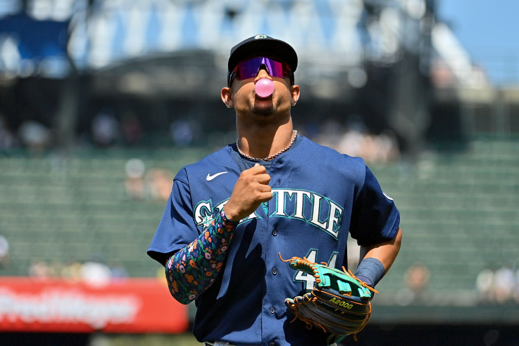
I basically flipped these with the Red Sox and I did it because they have the far superior color combo. Not only is it unique, but it is absolutely gorgeous. In fact, it lends itself to what are probably two of the five best alternate jerseys in the sport.
I would put the aqua alternates just below the Rockies purple in a thorough ranking. The navy is nearly just as good, and the two colors are just a perfect fit.
The home whites are extremely underrated and would easily crack my Top 10 when ranking home uniforms. Just as underrated is the road look, as the aqua-and-navy blend perfectly with the grey. I also love the word mark on these, with the compass in the ‘S’ that feels super nautical.
The Mariners connect beautifully with their identity through their uniforms, making them without-a-doubt a Top-10 look.
8. Philadelphia Phillies (Last Year: 8)
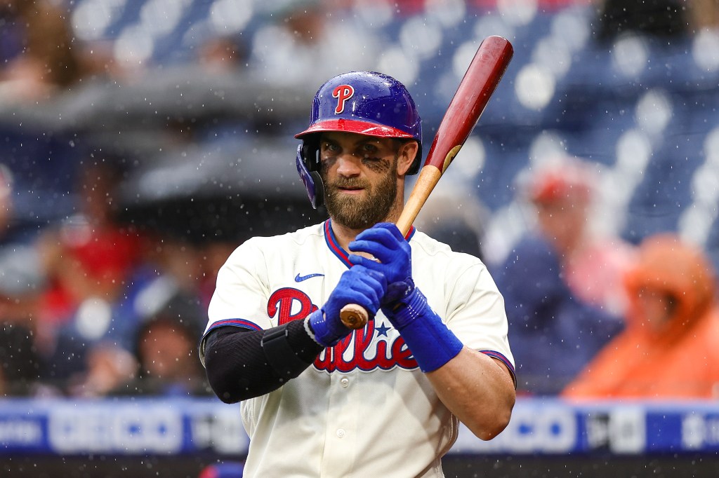
The Phillies are dumping the red alternates this year and, as you can see, it does not effect their standing too much. These are still an awesome uniform set, with some great alternates thrown in. Of course the best is the baby blue and maroon set, which to me is the best uniform in the sport. If I were the Phillies, I would make this my full-time home uniform.
Not that the Phillies do not have a great home uniform, because they do. The only team with red pinstripes in the league, these were made for Ethan Budowsky. Just as good as the baby blues are the cream Sunday alternates, with the red-and-blue hats and helmets.
More teams should incorporate off-white looks into their uniforms, just look at what it did for the D-Backs this year. I will miss the red uniforms, but I would welcome them returning down the line with a few changes. However, the Phillies have more than enough good uniforms to cover off the loss.
7. Atlanta Braves (Last Year: 7)
I considered flipping these below the NL East rival, Phillies, but these are too good to drop. The Braves have my favorite road uniform in the game, and the home whites are so clean.
Not only that, the 90s Braves made them iconic and they are pretty much unchanged from that time. This is up there among the best home-road sets that you will see in the league.
The alternates are only better. The Braves nailed their red alternate, something many other clubs have failed to do, and the navy is also tremendous. They utilize their color scheme and logos so perfectly in all of their uniforms, but these two are as good as a pair of alternates get.
The best jersey of course is the Hank Aaron-era throwbacks. At this point they are part of the uniform set so I will count them, and they give the whole look a huge boost. I like that they incorporate them for special occasions rather than full time, because these really are so special. They deserve the distinction of only being worn a few times a year.
6. New York Yankees (Last Year: 3)

The Yankees did the one thing you can simply never do: they messed with perfection. One of my favorite cliches is “if it ain’t broke, don’t fix it” and the Yankees could have used that lesson here.
The Yanks are changing their road uniforms this year, going with a much simpler vintage look. While they are still good, removing the navy-and-white striping on the sleeves is a huge mistake. I LOVED the Yankees road uniforms before, and now I just like them.
The reason the Yankees did not fall farther is because they are anchored by the most iconic uniform in the sport, and maybe all of sports.
What else is there to say about the pinstripes? They are a perfect uniform, there is literally nothing wrong with them. The Yankees feel like they should be higher, and maybe in action the road uniforms will be great.
However, I just could not let the Yanks get away with messing with one of my favorite road uniforms in the game.
5. Los Angeles Dodgers (Last Year: 6)
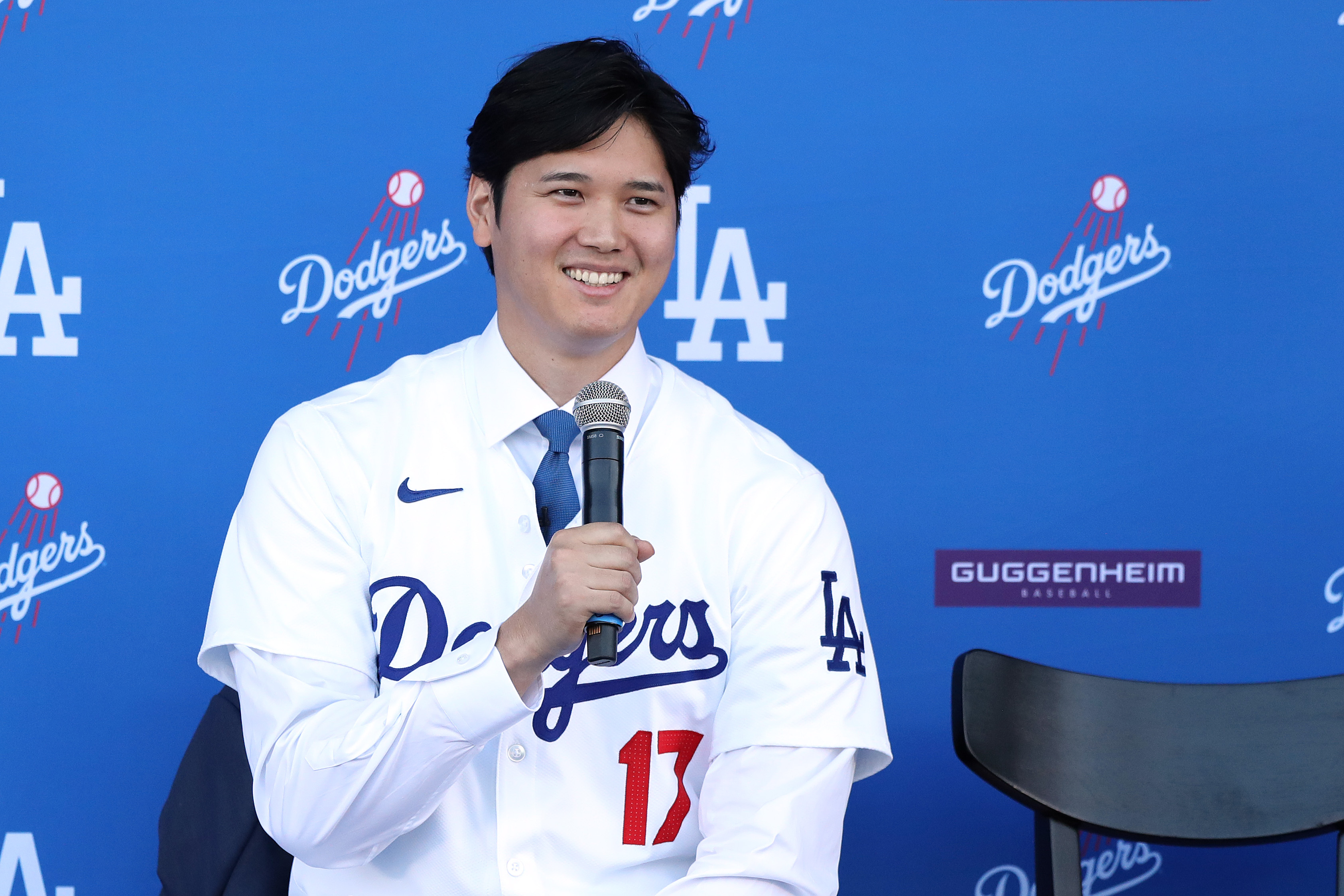
Finally! FINALLY! Shohei Ohtani will be wearing an iconic uniform this year worthy of the talent he is. I cannot wait to get that first look at Shohei Ohtani in the Dodgers’ perfect home uniform this season. These leap up a spot this year as the result of the Yankees drop, and Top 5 feels right for the Dodgers. The home uniform with a blue word mark and red numbers may be the best in the game. The road uniform is great as well, but definitely plays second fiddle to the home uniform.
The only reason the Dodgers are not higher is because there is too much variety in the sets above them. I love the classics, but I also like being able to change things up. As you will see, all four of the top teams have multiple great uniforms in the set, where as the Dodgers just have two. I just could not bring myself to rank a two-uniform set any higher than fifth.
4. Chicago Cubs (Last Year: 4)
We are knee deep in iconic uniforms at this point in the list and nothing screams baseball like the Cubbies’ pinstripes on a sunny day at Wrigley Field.
A perfect logo mixed with a perfect blue on the pinstripes. There is just something special about seeing those uniforms trot out in front of those ivy walls. The Cubs have a great road uniform that much like the Dodgers mixes a blue word mark with red numbers on the front.
What puts the Cubs above the likes of the Yankees and Dodgers is they have a great third uniform in their set. The blue alternate with the cub walking through ‘C’ is just awesome, though I wish they wore them more at home with pinstripe pants.
They have done it on a few special occasions, but it would be cool to see them incorporated more for mid-week night games. Either way, the blue on the road is one of the best looks in the league, and helps elevate an already iconic set beyond some of the others behind it.
3. San Francisco Giants (Last Year: 5)
I could flip-flop these last two sets based on the day, but the Giants get the nod ahead of the Cubs this year. Not only beautiful, the Giants uniforms have the advantage of being unique that helps launch them into the Top 3.
Before the Diamondbacks changes this year, the Giants were the only team with a full-time off-white home uniform. They just so happen to also be one of the best-looking home uniforms in the game. I do kind of wish the Giants would drop the names and go back to just numbers on the back.
The Giants use orange and black much better than the Orioles and that is especially true on their alternate uniforms. The black uniform with an orange ‘SF’ on the breast is awesome, and has only grown on me over the years.
The real beauty among the alternates is the orange, with a script word mark and just a little touch of gold in the outline. The sneaky-good uniform in this set is the road grey. I love the way the orange-and-black striping goes with grey and I like the “San Francisco” across the chest. I do think these could be even better by returning the ‘SF’ logo to the breast.
2. Oakland Athletics (Last Year: 2)
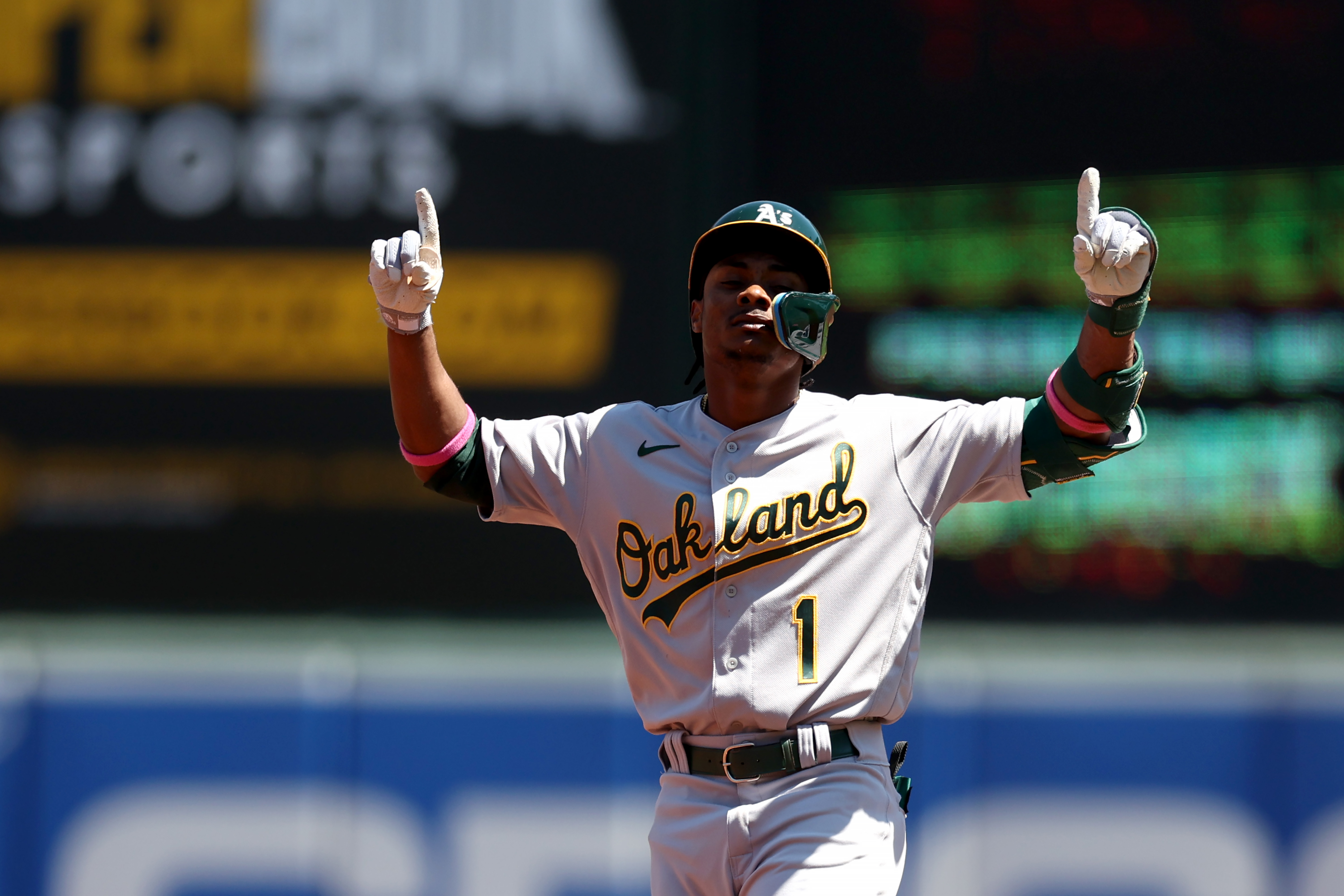
No change in the Top 2 this year. The A’s hold steady in the second spot, with just an all-around incredible uniform set. The home whites are a challenger for best in the league as yellow and green are used perfectly.
The only team to use yellow and green, the classic color combo is just delightful for a baseball uniform. Nothing pops more than the home whites though, especially with the classic white shoes that have become such a part of the A’s image.
The rest of the set is great as well. Green and yellow goes great with the road grey, and the alternates are good too. Both the light- and dark-green alternates are clean looks that just feel like baseball. So many things are upsetting about the A’s potential move to Las Vegas, but if they even dared to get rid of the uniforms it would be a million times worse.
Please, Major League Baseball, whatever you do, save these uniforms. It is bad enough the A’s may leave Oakland, but these uniforms going with them would be a disaster.
1. St. Louis Cardinals (Last Year: 1)
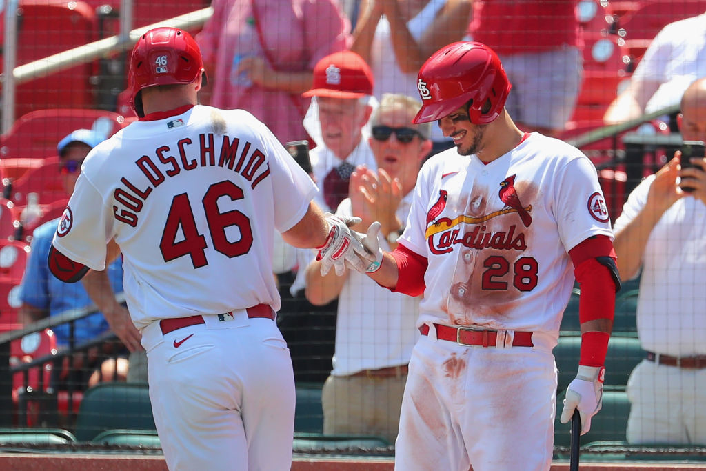
No change here, in 2024 the St. Louis Cardinals’ uniforms reign supreme. They are the best uniforms in baseball, and I really do not know what any team can do to beat them.
The home whites are pristine, an absolutely perfect baseball uniform. The red details with red word mark on the white uniform is just such a clean look. I especially love when they wear them with the navy-and-red caps and helmets. The road grey is a great look, and the Sunday creams they wear at home may be even better than the home whites.
As with most sets that include a baby-blue look, these are the best of the bunch. Probably the second-best uniform in the league, these are impossible to make any better. Red striping, piping and helmets is a perfect match for the baby blue. I especially love that they wear them with baby blue pants as well. It is just so difficult for any team to beat this look. I am not sure how it can be done.
So long as they do not change anything, these will likely be in the #1 spot for years to come.

Written by
Ethan Budowsky is a University of Florida graduate with a degree in telecommunications. He currently works as a Multimedia Journalist for WCJB TV20 in Gainesville. Before…