What Went Wrong with MLB’s New Nike Uniform Change?
All 30 teams are getting a makeover this year courtesy of Nike, but the new uniforms are not being received well in spring training so far.
Those of us who could spend hours talking about our favorite and least favorite MLB uniforms are happy that the general baseball world is focused on jersey aesthetics as pitchers and catchers have reported to Spring Training this week. Unfortunately, these aren’t great circumstances for uniforms to be at the forefront of the conversation.
All 30 MLB teams have switched this year to Nike’s Vapor Premier jerseys, with the goal of the new template being “to improve mobility, moisture management and fit, while keeping sustainability in mind.”
MLB sent out a press release earlier this week that featured quotes from Nolan Arenado, Ronald Acuña Jr. and Adley Rutschman touting the breathability and lightness of the jerseys, which they got to wear in last summer’s All-Star Game.
“The Nike Vapor Premier jersey is soft, light and comfortable. It’s almost like wearing my favorite shirt out on the field — and so easy to move around in,” Arenado said last July.
But as fans have begun to see what the jerseys — which are produced by Fanatics, but the brain child of Nike — actually look like, there’s been widespread criticism of the Vapor Premier template this week.
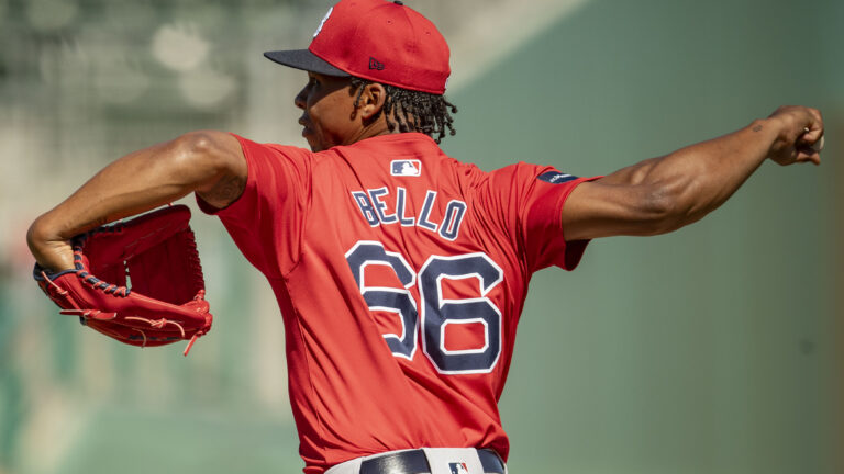
The most noticeable differences on the jerseys can be seen on the back. The MLB logo has been lowered, without much of an explanation for why the move was necessary. That’s forced the name plate to be lowered. Additionally, the name on the back of the jersey is now written in a smaller font, which is curved, whether your last name is five letters long or 15.
This isn’t unique to one team, it’s universal across the sport.
Fans aren’t the only ones upset at the changes. While Arenado was complimentary of the Nike Vapor Premier jerseys last summer — what was he going to say? — a few of his Cardinals teammates aren’t fans.
“I don’t like them,” pitcher Miles Mikolas said to Jeff Jones of The St. Louis Post-Dispatch. “Everyone should write about it.”
Other unnamed Cardinals players referred to the Vapor Premier jerseys as looking “cheap” and “generic,” per Jones.
What this comes down to his Nike — who replaced Majestic as the MLB’s on-field uniform provider in 2020 — trying to fix what wasn’t broken. They immediately put the swoosh on the front of the jerseys, which, in the grand scheme of things, isn’t that big of a deal.
And if they wanted to update the material used for the jerseys, that’s understandable, although they clearly didn’t do a good enough job getting player input on the new material.
But the City Connect program, outside of a few nice jerseys, has largely been a disaster. The “4+1 rule” has led to the elimination of some popular alternate jerseys.
The lowered MLB logo on these jerseys was not a necessary change, and the curved lettering looks straight out of a jersey purchased from DH Gate, not something meant to be worn by Shohei Ohtani, Aaron Judge and Francisco Lindor in a few weeks. But they will be.
For those who want to see some return to the prior jersey format, the best hope is that players continue to complain about the new threads, and perhaps there are even some instances of them tearing during games. But short of Chris Sale getting ahold of 30 pairs of scissors, this is probably what the jerseys will look like at least for 2024. If there’s enough backlash in 2024, perhaps some tweaks will be made in 2025.

Written by
Tim Kelly is a contributor to Just Baseball. Tim has been on the Philadelphia Phillies beat since 2020, serving as the Editorial Director for PhilliesNation.com. Additionally,…