2023 MLB Uniform Rankings
Iconic looks. Recent touch-ups. Where do your favorite team's threads rank in Major League Baseball fashion hierarchy?
Well, well, well, here we are again. Spring Training is less than a month away, and you can almost see all the beautiful uniforms around the league taking the field. That can only mean one thing: it is time to rank which teams look the best when they do take the field.
I have always been a sports fan that cares a lot about uniforms. My dad and I have spent hours discussing how teams look while watching sports. It is far too common that I will be watching a game, and the only observation I will text him is something along the lines of, “Penn State Football has the best uniforms in the world,” or “Cowboys’ navy’s. Good.” Or, maybe, “the A’s have a perfect uniform.” I have never known why I care so much about uniforms; maybe I have just watched so much sports in my lifetime I needed something else to care about.
Nevertheless, it is a topic I can go on and on about for hours.
All of that talk about uniforms in my lifetime has led to this. I did this last year, and it was an absolute blast. Now, you may be asking why I need to do it again this year?
Could the uniforms around baseball really have changed enough to warrant an update?
Well the answer is yes, we absolutely need to take another look, as MLB did some rebranding this year and as you will see, I was not a big fan. I also spent a lot of time thinking about my own reflection of the list I wrote last year and the adjustments I needed to make to it.
Before we begin, I should clarify: these rankings only include jerseys each team wears every year. If teams have a throwback in their consistent rotation (i.e. the Braves and Phillies) those count. One-off throwbacks do not. Alternates count, but I did not include City Connect jerseys or any other special edition jerseys.
No need to wait any longer! We begin at the bottom.
The Bad
30. Arizona Diamondbacks (Last Year: 30)
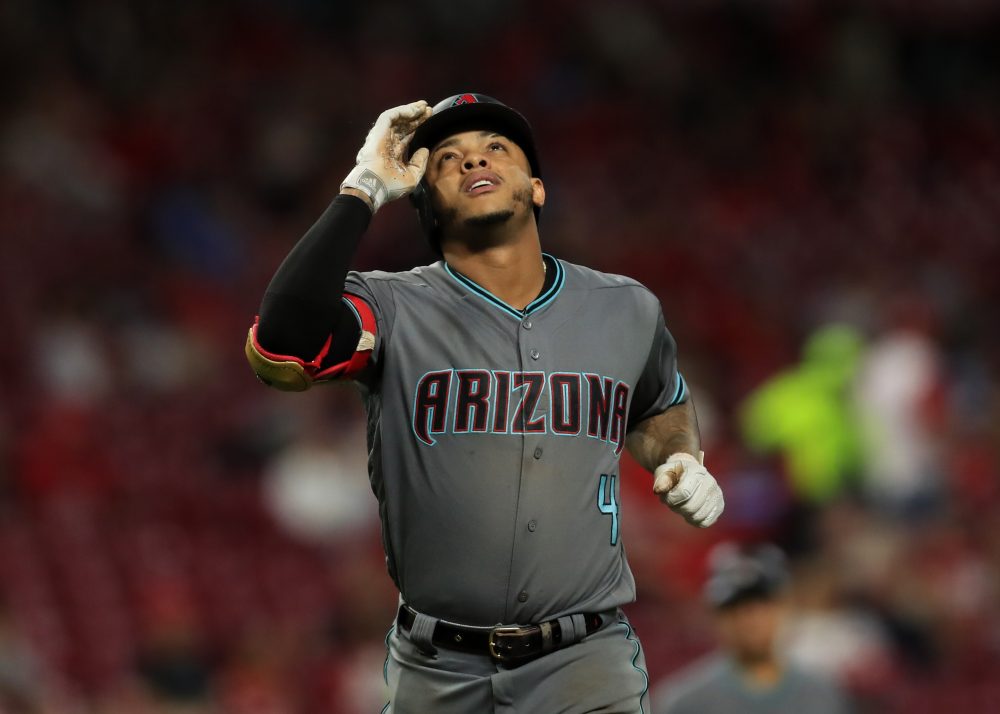
No changes necessary here. These have been bad for a long time and remain terrible. It is a shame because the D-Backs used to have such tremendous uniforms in the days of Randy Johnson and Luis Gonzalez. Ever since they went to the maroon and black look, their jerseys have been nowhere. The good news is they got rid of that awful snake skin on the caps, shoulders and back of the pants.
They really need a big change here, and there is an easy solution: go back to what worked!
So many teams across sports have just gone back to the classic uniforms and immediately upgraded. Arizona does not need to overcomplicate this, bring back the green and purple! Until then–or unless another team does something catastrophic–they will remain in the cellar for years to come.
29. Houston Astros (Last Year: 29)
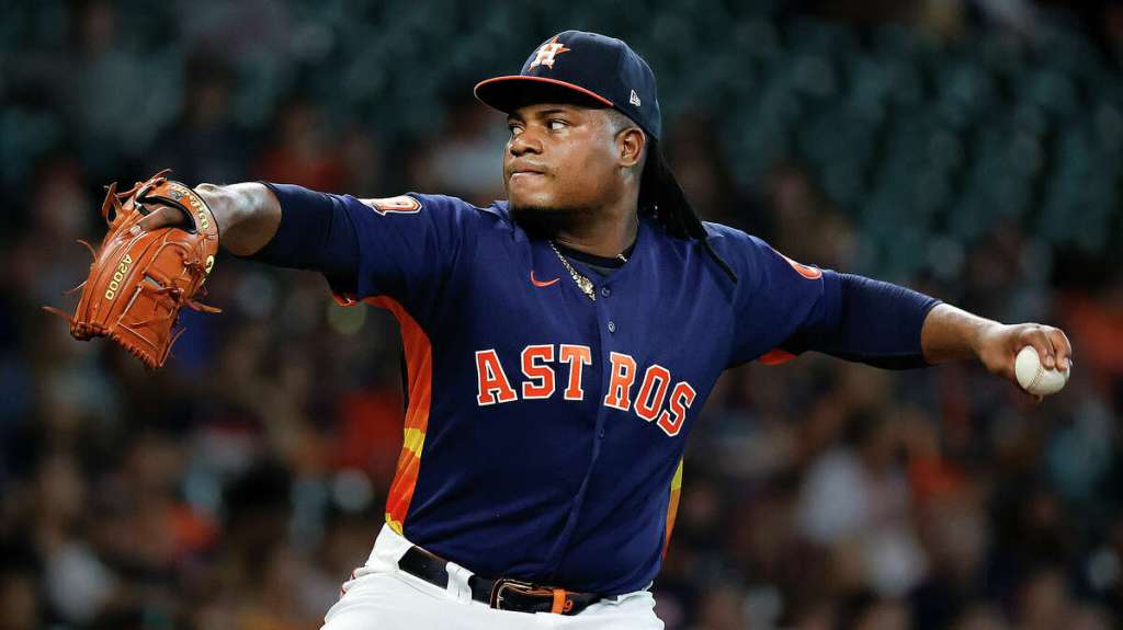
It may be nostalgia or I may just be crazy. Either way, I miss the Astros uniforms from the days of Oswalt, Clemens and Biggio. The maroon pinstripes with the “Astros” across the chest? Yes, please! It is not often a World Series Champion looks awful while winning, but the ‘Stros tested that last year. Those navy uniforms are just garbage. What is going on under those sleeves?! Looks like a batting practice uniform.
The road grays are kind of nice, the home jersey is nowhere, and the alternate orange should be way better than it is. I used to think they were great, but have really soured on them. It is hard to say the Astros should go back to what worked, because what worked for them in the past? Their vintage uniforms are iconic in a bad way, they stunk in the good ones and these are just bad. Not sure where they go from here.
28. Tampa Bay Rays (Last Year: 28)
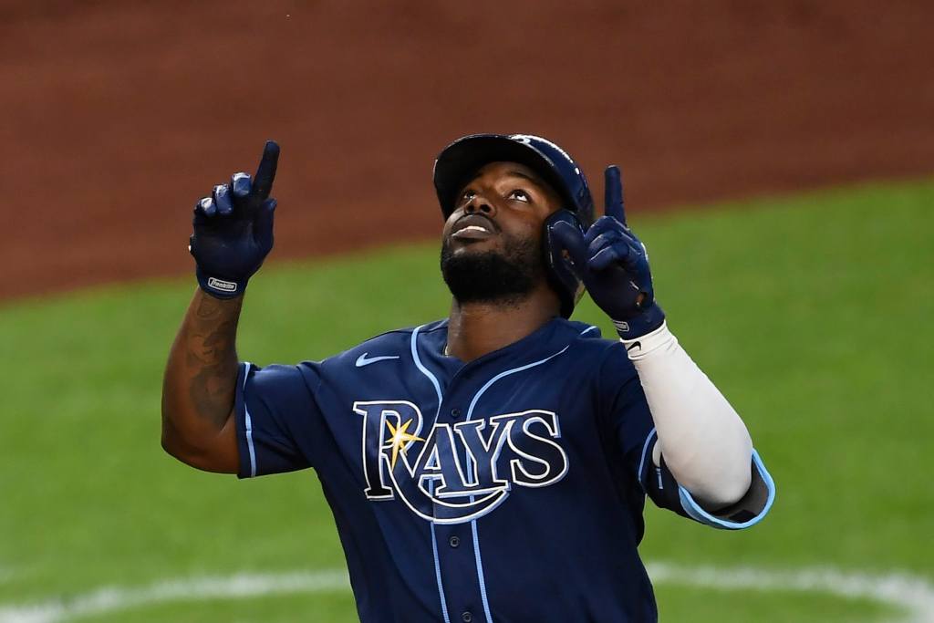
No change in terms of ranking but I did drop the Rays a tier here. I thought about it, and these are just bad. The home whites are so boring. The navy is really bad. I mean, really bad. The road grays are nowhere and they somehow got the baby blues wrong! How do you get baby blue wrong?! I thought I loved the Rays baby blue for a long time, but the more I looked at them the more I realized they just do not get the job done.
They are in a similar position to the D-Backs. Go back to the Wade Boggs days! Bring back that awesome black pull over. And while they are there, become the Devil Rays again! Those 90s uniforms were awesome. But please, never go back to the days of green from the early Evan Longoria and Carl Crawford years. That is one way to unseat Arizona.
The Bland
27. Cleveland Guardians (Last Year: 24)
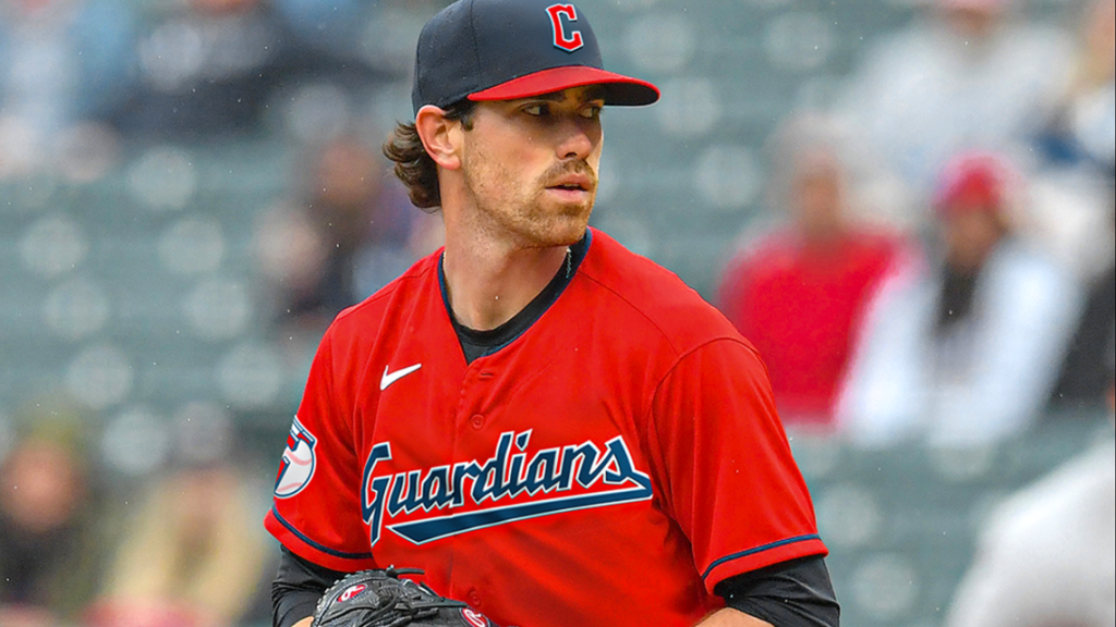
Our first changeup! The Mets were here last year but you will see eventually it was a good year to be a Metropolitan. As for the Guardians, why did they not change something when they rebranded?! I was so excited to see if they would try something new and they instead kept the look from their previous nickname, and slapped a new logo across it. BO-RING!
26. Cincinatti Reds (Last Year: 23)
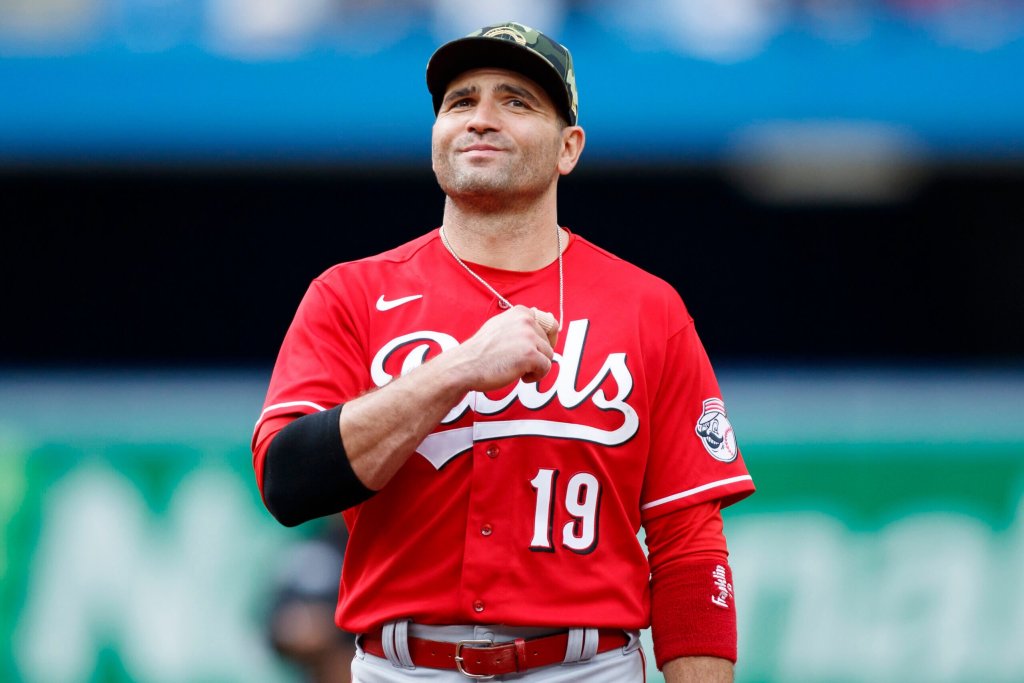
Something about Ohio huh? Another drop from last year and it is because I just realized these are so much worse than they should be. This is the Cincinnati Reds we are talking about! The Big Red Machine! Why do they not look awesome?!
The Reds are like the Miami Dolphins right now. Their jerseys are fine, but their old ones were so unbelievably better that they are just calling out for them to go back!
Give me some piping on the home jersey. How about a little color on the cuff of the sleeve? Red is my favorite color and I think these jerseys are just lame. They missed a great opportunity to have a really awesome red alternate. I also think they should throw a black uniform into this set. Take us back to the days of Rose and Morgan, make it a little more modern, and you are cooking with gas.
25. Detroit Tigers (Last Year: 26)
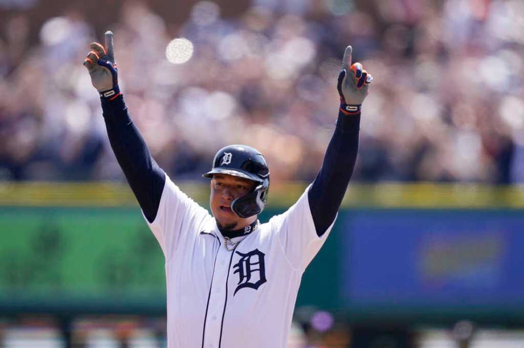
The Tigers get a boost thanks to their neighbors taking a drop. I want these to be better so badly. I love the old english ‘D’. Orange and blue runs through my veins. The old logo with the tiger walking through the ‘D’ is arguably my favorite logo of all-time.
Can’t always get what we want. That home uniform is just so boring. If it were not for such a boring home uniform these road grays would carry the Tigers to a much higher ranking. But ugh. There is just nothing to it! Give me some orange, give me back the tiger coming through the letter, give me anything more than what they have now.
24. Texas Rangers (Last Year: 25)
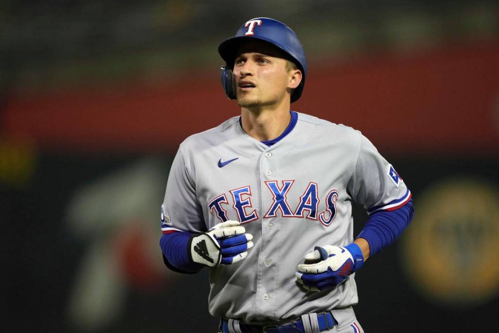
This is another set that is held down by a boring jersey, but in this case there are two. The baby blues are fantastic. Exquisite. Tremendous. Chef’s kiss. The home whites are really good too! I love the script Rangers, the striping down the pants. Everything. They rule.
Everything else in this set…meh. They have an alternate blue and an alternate red, both with boring font on the front and not much else to it. Same with the road grays. Simple fix here: put the script text on everything. These would take a leap up the rankings with that one simple solution. Until then, our Rangers are middling around. Not anything they are not used to in Arlington.
23. Washington Nationals (Last Year: 22)
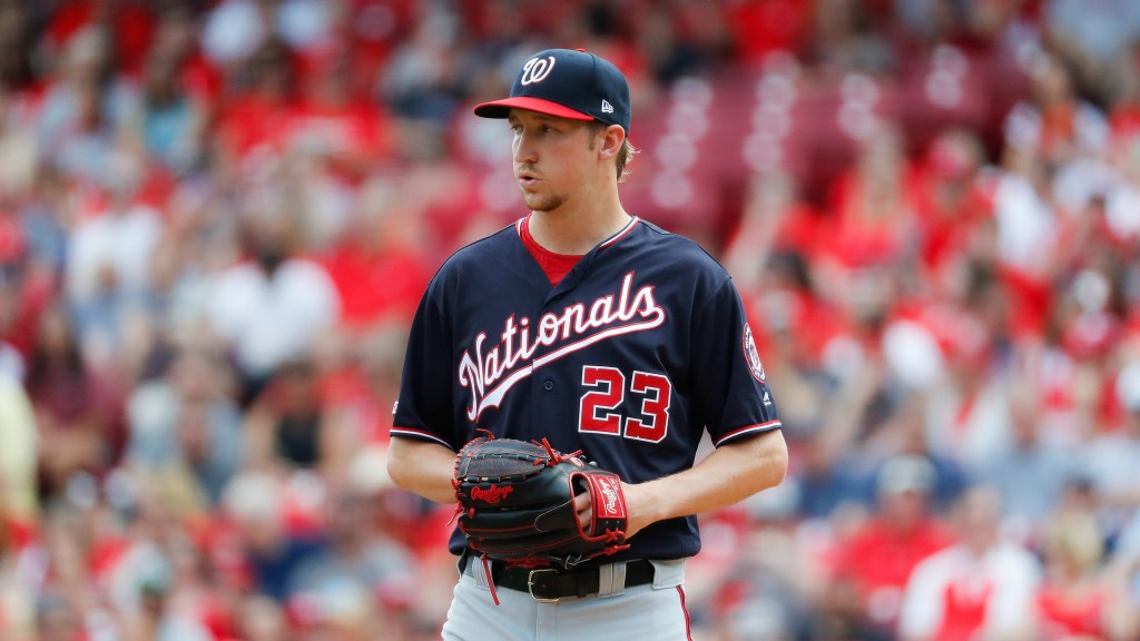
So close. So, so close. A great logo. Great colors. Washington D.C. They got it all! Not quite. Something about this set just barely misses the mark. Maybe it is the road grays, or the red alternate that is just kinda lame, or the navy’s that carried them to a World Series that are pretty eh. These are really close to being in the next tier up, but the reds, home whites and navy’s are just too bland to argue that they have a good set of uniforms.
22. Los Angeles Angels (Last Year: 21)
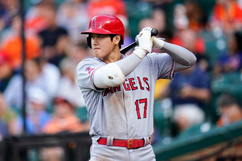
The Angels join the Rays and drop down a tier. I had these in the “Good That Should Be Better” tier last year, but then I realized they are just bland. Fitting for the Angels! The red and white look is good but there is not much to either the home white or alternate red. I actually surprised myself with how nice the gray set is when I glanced at it again.
I think I railed against the best player of our generation not playing in an iconic uniform last year, so I will save my breath this year. Instead, let me be the first to officially campaign for bringing back the California Angels look! Jim Edmonds looked so great in that jersey. That logo rules and the colors are much better with navy mixed in. I think you are noticing a trend, I want to live in the 90s.
The Good That Should Be Better
21. Miami Marlins (Last Year: 20)
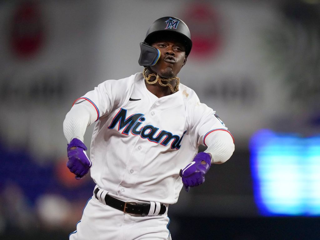
This is not hometown bias. This is the first uniform set out there that I actually consider to be a good set of uniforms. Top to bottom. The home white is very nice. The road grays are probably the best in the set. The black is nice but needs a little fine tuning, and oh boy those electric blues. Whew buddy.
One problem. They refuse to wear them! They have a gorgeous uniform sitting right there and they have never worn them in the regular season! That alone would move this set up a good amount of spots. The thing that could launch them towards the top? Go back to black and teal. Boom. I just fixed all of the Marlins problems. Well, I would still need to trade for a center fielder to do that.
20. Minnesota Twins (Last Year: 8)
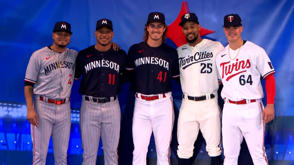
WHY, MINNESOTA?! WHY?! Did nobody ever tell you if it ain’t broke don’t fix it?!
Last year the Twins were in the “Underrated and Exceptional” tier. They were one of my personal favorite uniform sets in the league. Another rebrand gone wrong!
I want to be clear: I do like the Twins rebrand. I think the new home white is great, the cream jersey is awesome, I love the return of the pinstripe grays. But what they had was so wonderful and they threw it all away! There is a divide in this rebrand, the jerseys with script on them: YES! The jerseys with block lettering on them: NO! They also have not said whether the baby blues will be in rotation and they dropped the red alternate that I loved. I will be thinking about this one for years.
19. Kansas City Royals (Last Year: 19)
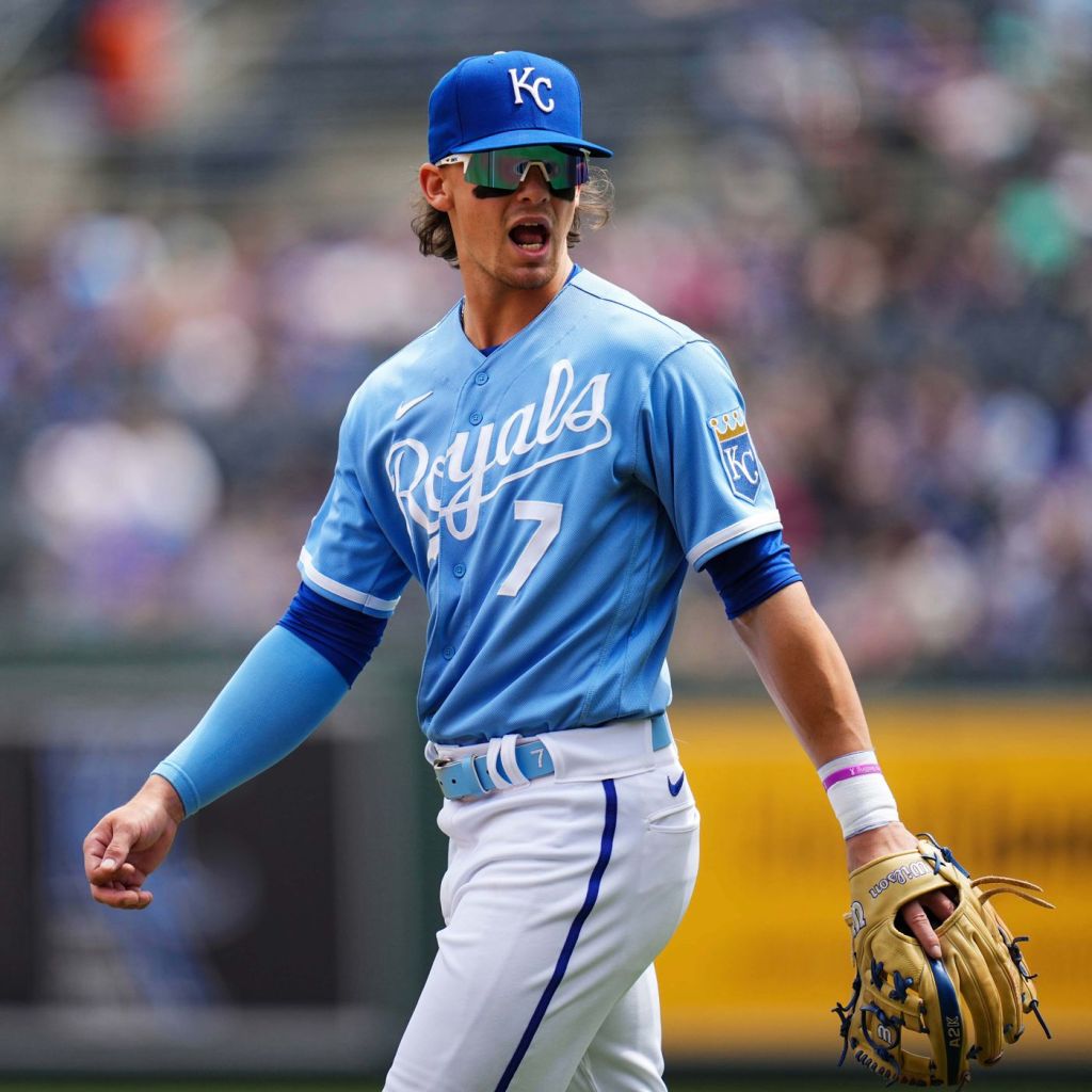
The Royals rebrand from last year brings the same issue as their division rival, Minnesota: script good, block bad!
With that said, this is truly an iconic uniform. So why are they down here? They fixed something that was not broke! Their rebrand was once again fine, but messed with something that was already great. I just love the vintage Royals look and I want it back.
Sneaky take here? Bring back the Mike Sweeney Royals vest jerseys. Yeah. I did just drop a Mike Sweeney reference on you.
18. New York Mets (Last Year: 27)
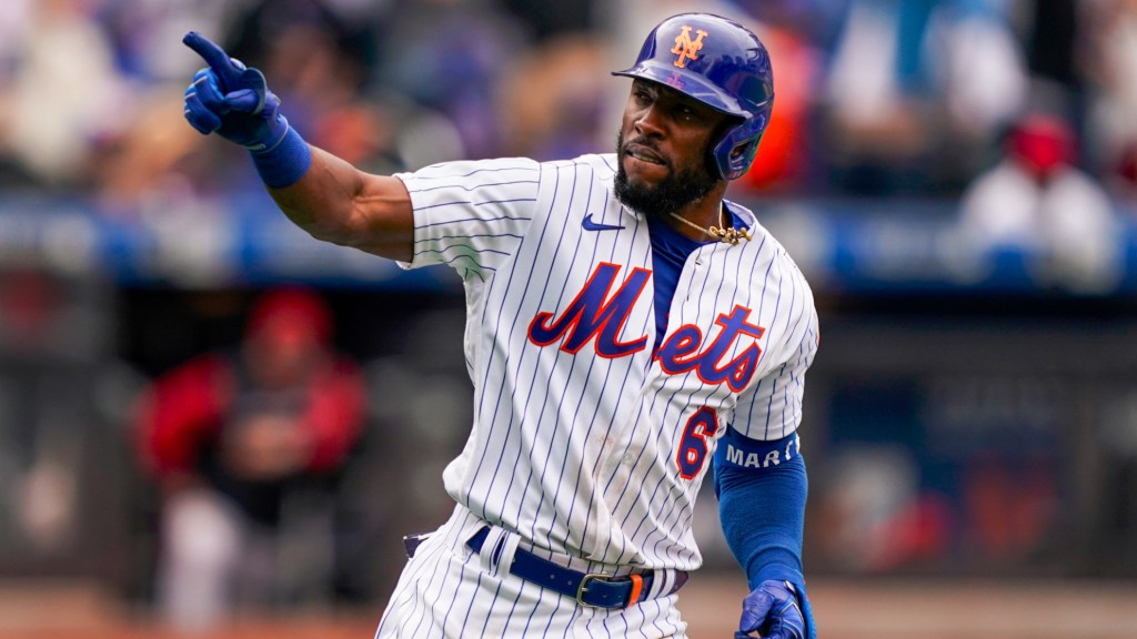
I spent a lot of time watching the Mets last year and about 30% of the time I spent watching them I was kicking myself over how low I ranked them last year. That was my bad. I will be better in the future. Have I mentioned I bleed orange and blue?
The Mets are our biggest riser this year, and it is with good reason. They have a very nice set of uniforms. Especially that black uniform. One of the best alternates in the league. There is only one problem, the blue set that they wear that says “New York” does so in a weird gray that comes off terribly on television. Eliminate those and the Mets are a lock for the top 10-15 on this list.
17. Baltimore Orioles (Last Year: 18)
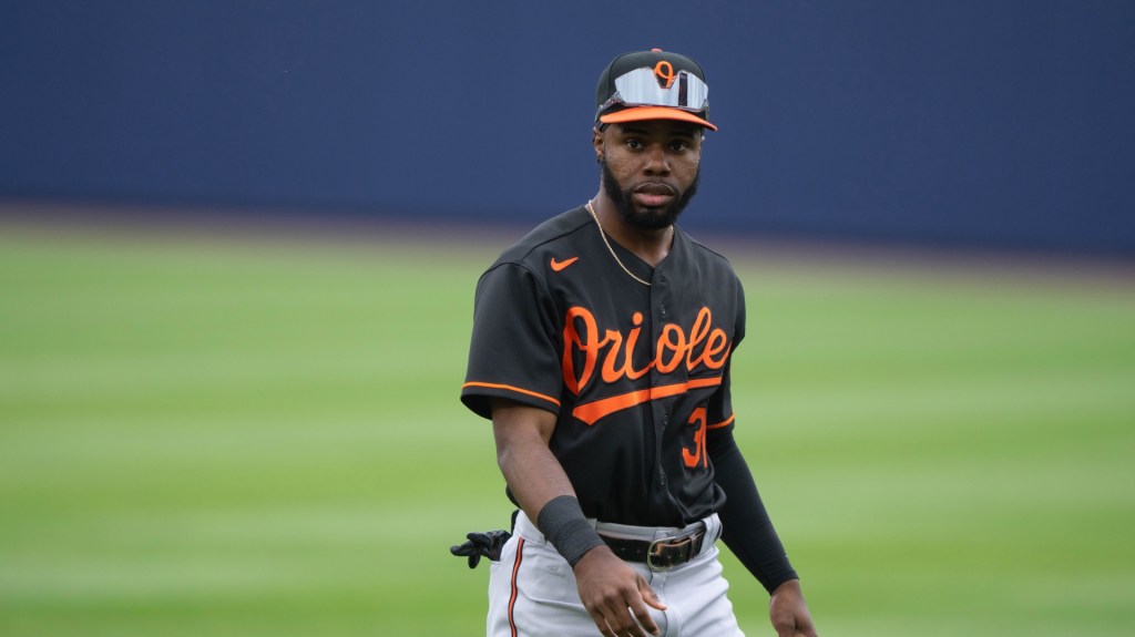
I think this is due to some shuffling but I also am glad they moved up. The O’s have a very nice set of uniforms. One issue: they have the same colors as the Giants. They are a classic franchise with a ton of history. Why are they this low again?
Something just does not connect here. Like their Beltway mates, the Nationals, they have a lot going right for them but just barely miss. I love the colors, I love the script, I love the orange jersey, I love the home whites. I cannot quite put my finger on it, but I just do not love these as much as I probably should. Hmm. I will think about it this year.
The Good
16. San Diego Padres (Last Year: 17)
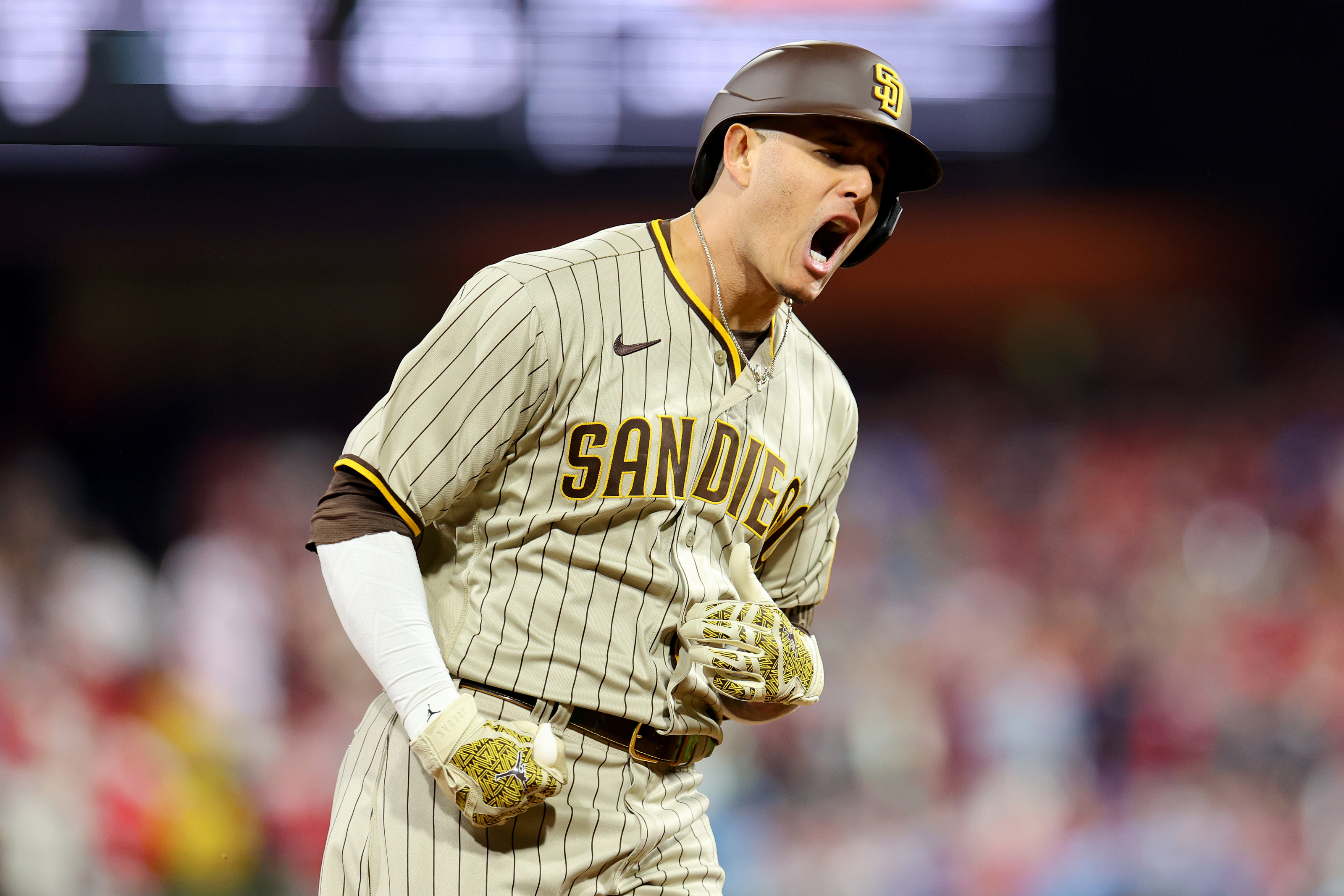
Up a spot but no change, the Padres are the first set I consider good without any if’s, and’s, or but’s. I was so skeptical when they went back to mustard and brown until they revealed an awesome set that I immediately fell in love with. Home white is damn-near perfect. Away browns? Yes, please. The brown alternate? Thank you very much.
While it might sound like they should be higher on this list, trust me, there are too many better uniforms in front of them to put them anywhere but here.
15. Colorado Rockies (Last Year: 15)
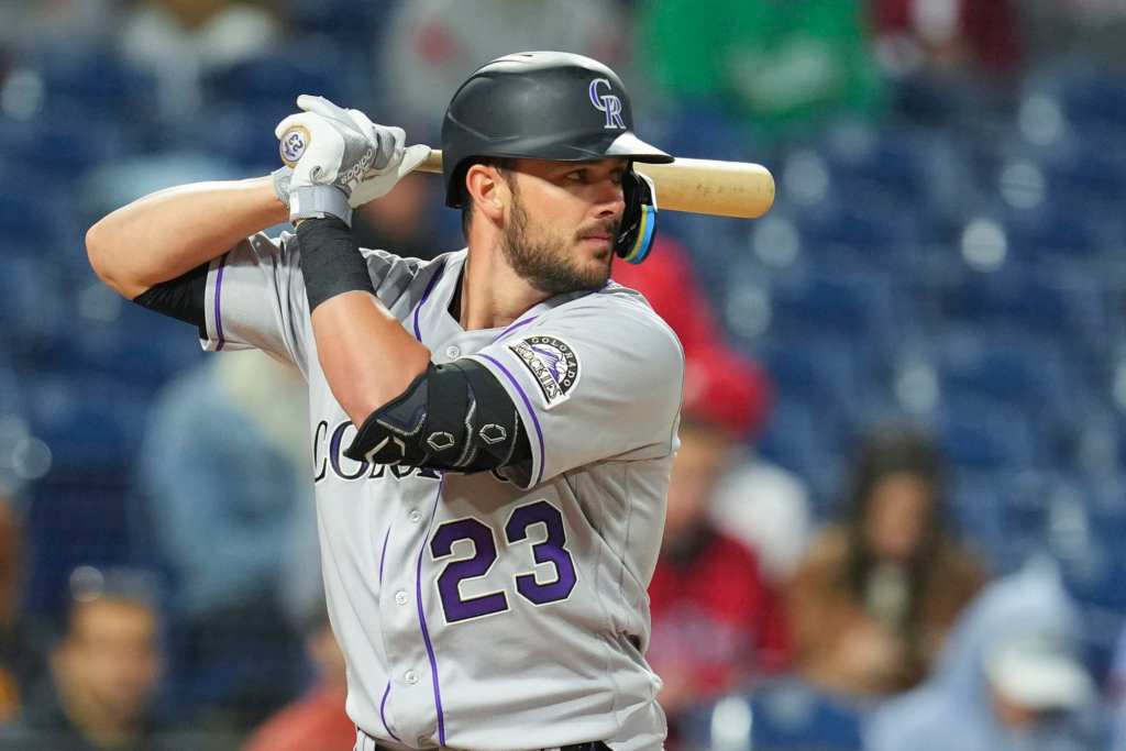
I had a lot of debate in my head when making this list about where to put the Rockies. In fact from the Padres forward about three or four spots is where I spent most of my time debating. The Rockies have a great home uniform. I love anything pinstripes and the silver, purple and black is a great touch. I think these road grays are really underrated, and that purple. That beautiful purple. I think it has a great shout for best non-baby-blue alternate in the league.
The black vests are classic and great and they connect us all to a better time in baseball. They are good, but should be better. They are not “should be better” enough to harm the Rockies ranking here because they still rock. Have you ever noticed how many cool players played for the Rockies and made these uniforms look awesome? If not, you should go look up The Blake Street Bombers.
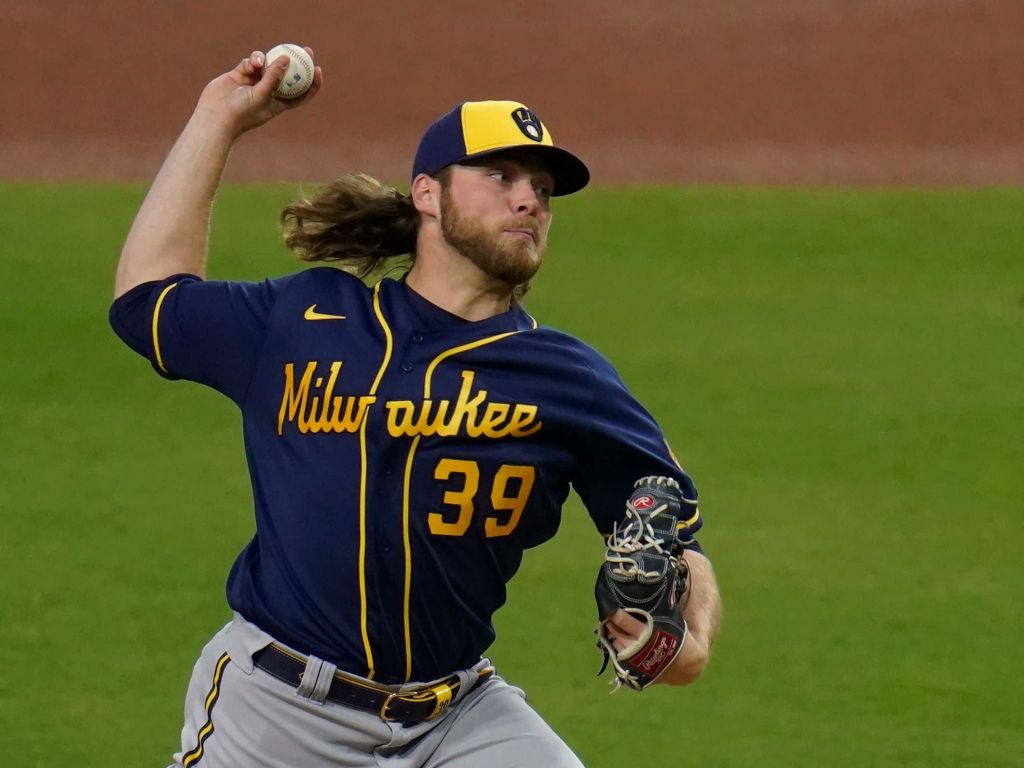
14. Milwaukee Brewers (Last Year: 14)
Now this is how you rebrand. The Brewers brought a classic look into the modern world and absolutely nailed it. The cream home jersey is phenomenal, the pinstripes might be even better, the grays are great and I love the script on the navy jersey. This is actually a spot where I like the block lettering better than the script, though. They nailed this. My only detraction is the two-tone hat they wear with the navy alternate. I know it is a throwback to the Robin Yount days, but it is just not my taste.
13. Blue Jays (Last Year: 13)
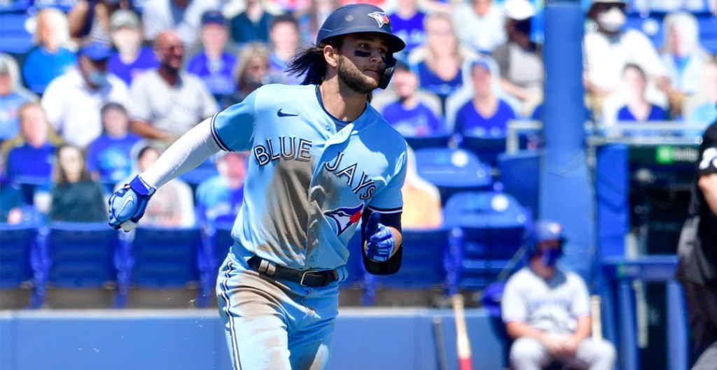
These are so good. I absolutely love the iconic Blue Jays numbering and font, especially the simplicity of the blue and white. I cannot lie I long for the jerseys from the Roy Halladay and Carlos Delgado days, but these are so much better. Another team that went classic with a rebrand and did it beautifully.
You know which jersey I do not think gets enough love in this set? The alternate reds. Those are absolutely fantastic and I love that they wear them on special occasions. The alternate blues are also great and I think the home white is just so clean. And of course, the baby blues. There is only one team in the league that got baby blue wrong, but the Jays nailed it. I also love how the bird logo is under the text on each jersey. Not enough teams do that.
12. White Sox (Last Year: 16)
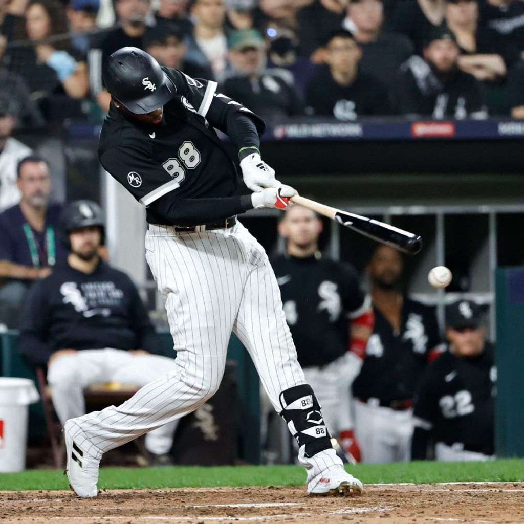
From the Padres to the White Sox is where I probably had the most debate with myself. I like all of these sets pretty much equally and it was hard to determine where to put which. One thing became clear to me though: I underrated this White Sox set. In fact, I wrote the White Sox blurb then realized I ranked them too low and jumped them above the Blue Jays. It is hard to mess up black and white, and the ChiSox certainly did not.
I love the pinstripe home uniforms and I especially love the road gray’s with the black and white cuffs. One thing I really love about the home uniform is the breast logo instead of a script “White Sox” or “Chicago” across the front. It took me a long time to realize the White Sox logo said “Sox” and was not a skunk (yes, I thought it was a skunk for about 20 years), but once I did, it instantly became a favorite of mine.
The black alternate rules and the City Connects are even better, though they did not factor in my rankings. These jerseys are great, the only problem is they are not better than the next set.
The Great
11. Seattle Mariners (Last Year: 10)
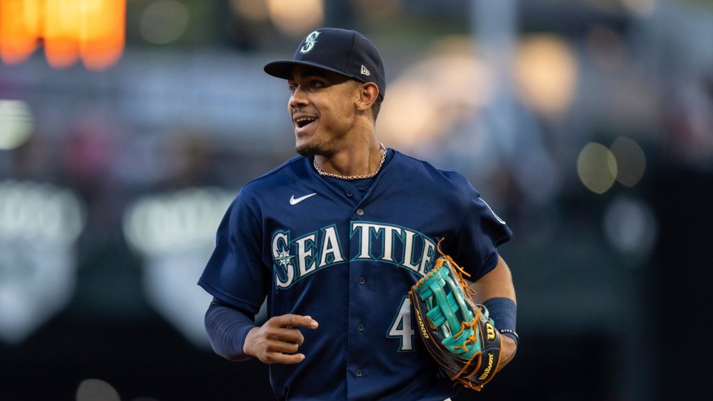
Now we are getting to the real beauties, folks. I think the M’s color scheme is very underused in sports. Aqua and navy is such a nice combo and they use it to perfection. The home white is splendid and the road gray is super underrated. There is not a single jersey in this rotation that I do not love.
What really elevates this set is the alternate uniforms. That aqua alternate is up there with the Rockies’ purple uniforms as one of the best in the game. Their navy alternate is just as good, and the cream throwback to the early Griffey days with the blue and yellow is just delightful. I love a well-done throwback and it does not get much better than these. The M’s are actually one of those teams where as good as their throwback look is, their current look may be even better. These rule.
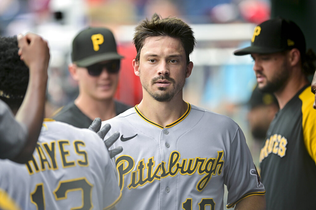
10. Pittsburgh Pirates (Last Year: 11)
This is a set I felt deserved more love. They had one of those very minor rebrands a few years ago and they absolutely nailed it. The script lettering is so much better than the old block font, though those were still great. As always when it comes to Pittsburgh, it is important to note just how awesome it is that the city has one combined identity for its teams. They also just so happened to pick one of the best color schemes. All of their teams look good, and the Pirates absolutely nail their look.
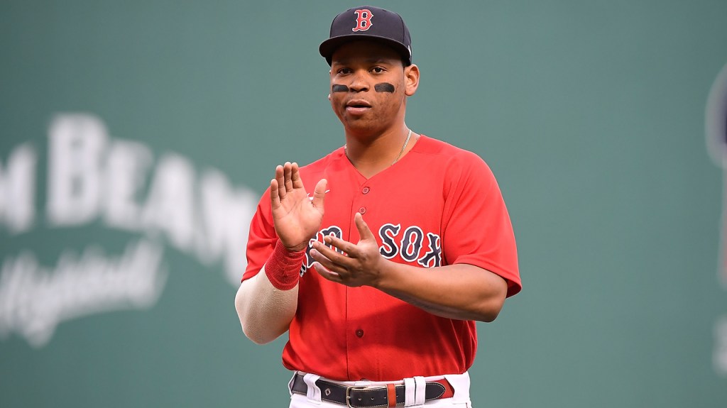
9. Boston Red Sox (Last Year: 10)
I really thought about jumping these up over the next team in line because I thought I did not give enough credit to an iconic uniform. They are not as good as some of the iconic uniforms you will see at the top, but it is hard to not look great when you are the Red Sox. The home white is a classic, the road grays look really nice, and those alternates are just beautiful. I am a sucker for a good red uniform and the Sox nail it. The navy is also a great look that I wish they included more in their rotation. It is a shame we will not enjoy Xander Bogaerts in these great threads anymore.
8. Philadelphia Phillies (Last Year: 9)
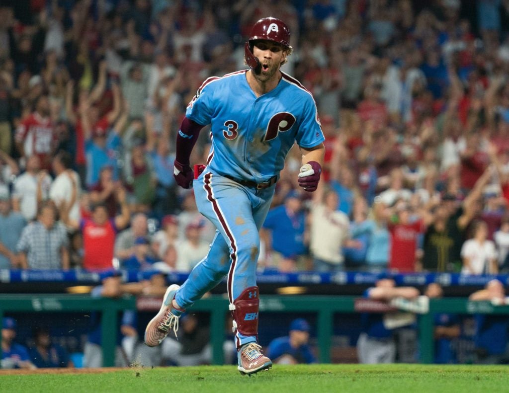
I was really close to dropping the Phils below the Red Sox, but I held strong. The main reason I considered dropping them is because I like the red alternate, but not as much as I thought. I also love the red pinstripes and the road grays, but I thought Boston’s may be better.
Then I looked up the Phillies set and I remembered: the baby blues.
I could write a dissertation about those baby blues. They are far and away the best throwback/alternate in the sport. I love that claret and baby blue combo–think West Ham or Aston Villa in the Premier League–and I think it needs to be used more in America. That old Phillies look from the Mike Schmidt days is unbeatable. I also remembered those cream alternates with the two-tone hats and how beautiful those are. The alternates carry this set to a very deserving spot in the top 10.
7. Atlanta Braves (Last Year: 7)
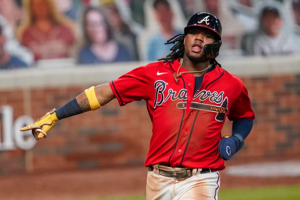
This may be a hot take but I think the Braves have the best road uniform in the sport? I have not decided if I 100% believe that but I am workshopping that take. Something about their script logo and the red and navy goes perfect with the gray. I absolutely love that uniform. Of course the throwback alternates from the Hank Aaron Braves days are phenomenal and really elevate this set.
They are just on the edge of breaking into the top tier, but the Braves look is just not as iconic as the sets you will see in the next tier up. The navy and red alternates are immaculate. I would probably argue they have the best red alternate in the sport. The home whites and the cream alternate they added a few years ago are also really clean and well done. Just a really, really good set of uniforms that nearly cracks our top tier.
The Great
6. Los Angeles Dodgers (Last Year: 4)
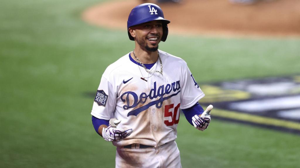
A lot of people are probably going to be really upset about this, but I am prepared to stand my ground. I should preface this by saying I absolutely love the Dodgers’ uniforms. Their home white may be the best in the entire sport. The red number is a great touch, and like I said that home white may just be the best. Road grays are simple and delightful. Lucky for them, I do not count City Connects, because I really think those are rough. I would love a blue alternate, but with white pants. The all-blue look is just a no go for me.
The only reason I dropped them–after much thinking–is because I just could not put a two-uniform set above the two teams in front of them. I do have a two-uniform set above this, and I think you will understand why when I get there. I thought about this for a long time and it felt wrong to do, but I just could not reasonably have the Dodgers over the next two sets considering the variety coming up in each.
5. San Francisco Giants (Last Year: 5)
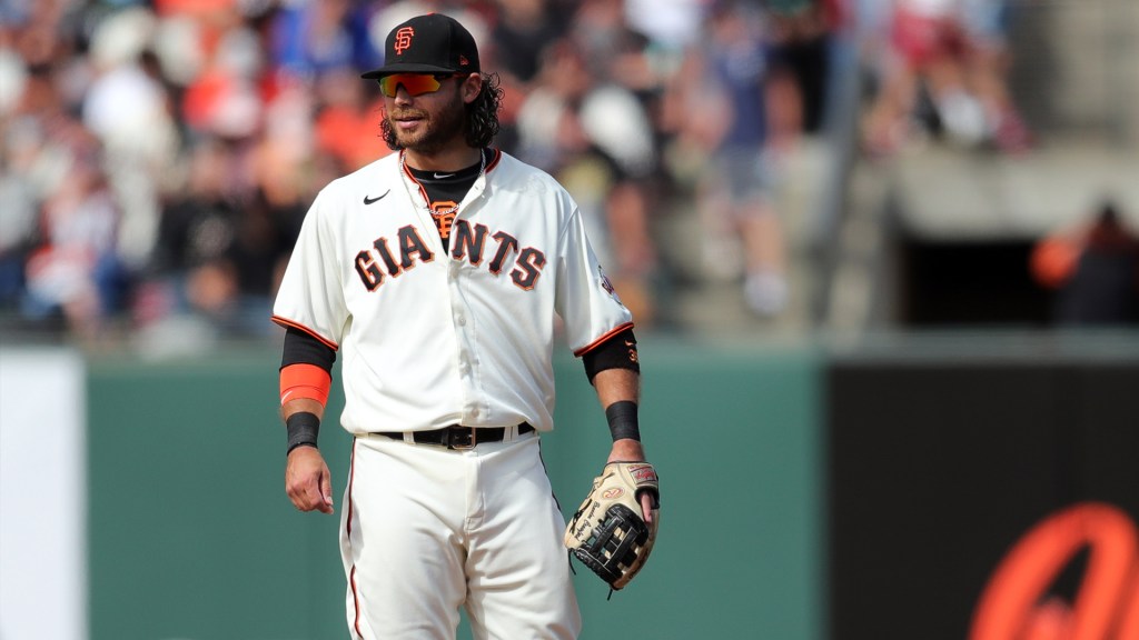
Deciding between the next two sets on this list was nearly impossible. The one that won out does so based solely on history. If the Giants were still rocking the same look they had for basically their entire history, they would probably be higher. However, this look is not as iconic as some, but still fantastic nonetheless. The only team with an off-white home uniform, it is an absolute beauty. I went to four games in San Francisco last year and let me tell ya, the Giants look absolutely fantastic no matter what they wear.
It only feels right the Giants and Dodgers are right next to each other, considering the two have always been attached in history. Did you know the Mets are orange and blue because they took the primary color of the New York Giants and Brooklyn Dodgers after they left?
What helps the Giants win out over their arch nemesis is the variety in the set. First of all, the road gray is so much better than you realize. Then there is the orange which is done so well, unlike the Astros or the previous Marlins look. The black alternate is also perfect. One thing that can take the Giants into the top three is adding a throwback alternate. Maybe something paying homage to the Will Clark days by the bay? Would love to see that.
4. Chicago Cubs (Last Year: 6)
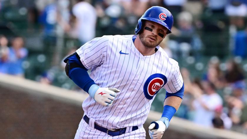
I ended up basically flipping the Dodgers and Cubs, but I also had to pick between the Cubs and Giants. If you know me, you know that is a very tough decision. The reason the Cubs win out is because there is nothing like that pinstripe look on a sunny July day at Wrigley Field.
These are beyond iconic. The road grays are underrated, and the blue alternate is just a perfect uniform. A great color, no detail needed, and just the big ‘C’ with the bear walking through it. A perfect logo. Ultimately, having a third jersey in this set is what puts them over the Dodgers. If they did not, I would probably have LA ahead of them.
3. New York Yankees (Last Year: 3)
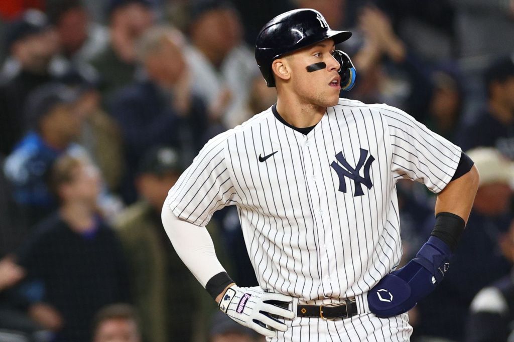
What is there to even say about the Yankees uniforms? They are the most iconic uniforms in sports. All pinstripe uniforms are great, but the Yankees’ are just a tier above all the others. So many greats have accomplished so much in these uniforms and they have basically never changed. I remember going to Yankee Stadium a few years ago and being in disbelief watching those pinstripes run out there. I think that was when it hit me the history I was surrounded by in that beautiful stadium.
The road grays also deserve a shoutout here! They do not get a lot of love as maybe the best road uniform in the game. I love the cuffs on the sleeves and they are just so simple and perfect. The no names on the back is always a great touch. This might sound absolutely insane, but would a navy alternate not be awesome?
2. Oakland Athletics (Last Year: 1)
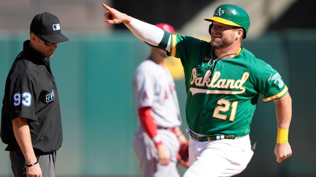
About a year of thought went into this move but I realized it had to be done. Putting the A’s in the top spot last year turned out to be very controversial. It also turned out to be wrong. I let the beauty of the home whites, road grays and dark green alternates get to my head. The problem is, I really like the lighter green alternates, but not as much as I thought I did. Nevertheless, this is basically a perfect uniform set. Everything about it, right down to the white cleats with the home uniforms.
The road grays do not get nearly enough love, and somehow people forget that those home whites are a top-three home uniform in the sport. In the end, the main reason I moved the A’s down is not anything to do with the A’s. It is way more about who I decided to put above them.
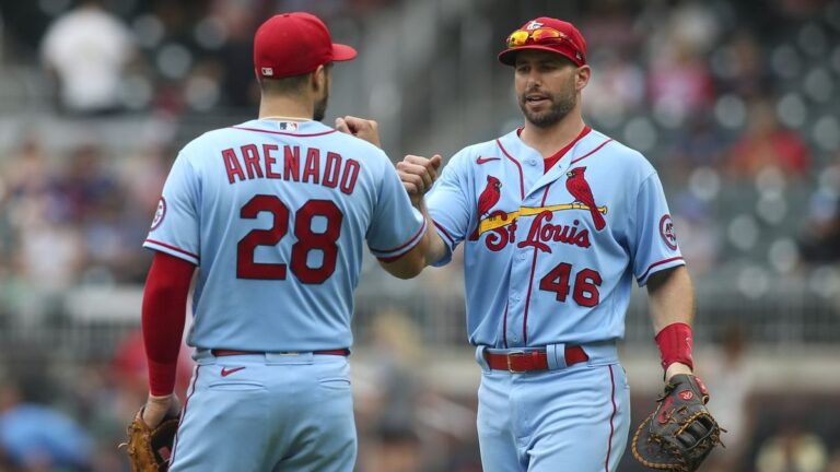
1. St. Louis Cardinals (Last Year: 2)
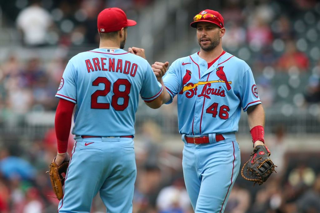
I have to issue an apology for not putting these first last year. That was the wrong choice. I thought about it for a long time, I nearly did it, but for some reason I could not bring myself to do it. I was wrong and I will be better in the future. This is the most perfect uniform set in the game. I do not have a single complaint about any uniform the Cardinals wear.
The home whites: perfect. Road grays: perfect. Cream alternates: perfect. Baby blues: majestical.
Every single uniform is nailed and a 10/10 when compared to others like them. The only way these could be possibly be any better is if they threw a red alternate into the mix every once in a while.
Can we please talk about these baby blues more? Every single team should have a baby blue alternate. It should be mandated by Congress. Even if every team did, nobody–excluding the Phillies–could ever match the Cardinals baby blues with the red. There is something just so perfect about it.
Congratulations, Cardinals. You now take your rightful place atop Ethan Budowsky’s MLB Uniform Rankings. I hope you hang a banner, because you guys definitely do not have enough of those.

Written by
Ethan Budowsky is a University of Florida graduate with a degree in telecommunications. He currently works as a Multimedia Journalist for WCJB TV20 in Gainesville. Before…