Ranking All Five Current Brewers Uniforms From Worst to Best
The Brewers have clean home uniforms and a great throwback look, but the latest jerseys they unveiled are a letdown, to say the least.
After two fairly disastrous uniform sets in a row — especially the ones worn from 1995-1999 — the Milwaukee Brewers returned to their roots with a refresh in November of 2019.
At the forefront of the look was the ball-in-glove logo, one of the most popular in MLB history, coming back on a full-time basis. However, there were some modern twists added to the four-uniform set, which were generally well received.
In June of 2022, the Brewers added a fifth uniform to their set — the max allowed under a new Nike rule — as part of the City Connect program.
Here’s a ranking of the five current uniforms in Milwaukee’s set from worst to best.
No. 5: City Connect Uniforms
People do actually refer to the Brewers as the “Brew Crew,” but that doesn’t mean they needed to have an alternate uniform to reflect that.
Everything about these uniforms — from the unreadable MKE/414 cap to the charcoal grill on the right sleeve — feels like something you would see in an adult baseball league that didn’t have the rights to wear the Brewers’ actual licensed uniforms. The only nice thing we can say about these is that the Brewers and Nike resisted the urge to give them matching powder blue pants.
Of the 20 City Connect uniforms that have been released thus far, these checked in at No. 13 on Just Baseball’s countdown.
No. 4: Road Alternate Navy Blue Tops
In theory, the idea of a navy blue uniform with yellow piping and a hat that features yellow as the primary color on the front sounds awful. But in practice, these road alternates for the Brewers actually turned out really well. These would be too much if they were a primary uniform, but they fit well into the rotation as an alternate.
No. 3: Gray Road Uniforms
The Seattle Mariners and Tampa Bay Rays have altogether eliminated their gray road uniforms, but it still feels like the primary look away from home for most teams should be gray. The key is to give the rest of the uniform enough color not to look dull, and yellow trim certainly has that effect for the Brewers.
The yellow patch on the left sleeve that features an “M” inside an outline of the state of Wisconsin, a patch that is also featured on the navy blue road alternates, is excellent. Part of us thinks that an all navy blue cap might look better with this look, but the hat that includes bright yellow certainly adds a contrast to the gray uniforms.
No. 2: Throwback Pinstripes
From 1978-1993, the Brewers wore pinstripes at home, later mixing them in as alternates in the 2010s. Those pinstripes were more of a royal blue, which we prefer to the concord, navy-ish blue that the Brewers turned to in 1995 and utilize in these throwbacks.
Still, these are excellent, and they evoke memories of Hall of Famer Robin Yount and the 1982 American League Champion Brewers.
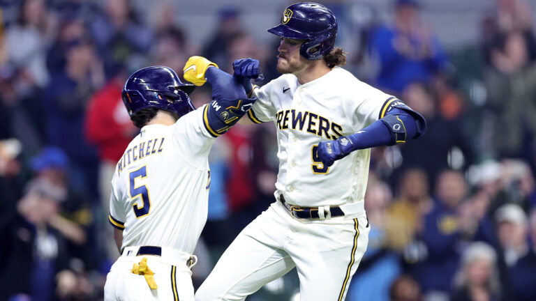
No. 1: Cream Home Uniforms
One of the best things that the Brewers did as part of their new uniform set in 2020 was ditch white home uniforms — which typically aren’t very good if they don’t have pinstripes — for these cream uniforms.
The wide piping on the sleeves pays homage to the Brewers’ original uniforms, and the wheat baseball logo on the left sleeve adds another cool patch to Milwaukee’s uniform mix. This is one of the cleaner home jerseys in baseball right now.

Written by
Tim Kelly is a contributor to Just Baseball. Tim has been on the Philadelphia Phillies beat since 2020, serving as the Editorial Director for PhilliesNation.com. Additionally,…