Ranking All the Pittsburgh Pirates Uniforms From Worst To Best
The Pittsburgh Pirates are rocking four different uniforms in 2023, and the City Connects are set to drop soon.
It is not often that a color scheme becomes synonymous with an entire city. In fact, there is only one city in the entire country where this is the case: Pittsburgh. The Steel City has three sports teams, and every single one of them shares that iconic color scheme: black and yellow. So good in so many ways, it is reserved only for one of the toughest, most hard-nosed cities in America.
The colors just scream Pittsburgh. They reflect so well upon that city’s tough, blue-collar mindset. So often their teams have reflected the city as well; just think about the Steel Curtain defenses of the 1970s. I am also just now realizing that not only do they all have the same colors, they are also the only teams in the four major professional sports that wear black and yellow. It really is one of the coolest things in sports that not a lot of people talk about.
When it comes to the baseball team, that black and yellow look has changed plenty throughout the years. I would say they have iconic uniforms because of the black and yellow, but they have changed too often over time to be truly iconic. The jerseys the Pirates wear now look nothing like the “We Are Family” Pirates and are even pretty different from the Pirates I grew up with.
That doesn’t mean the Pirates don’t still look amazing, because they do. They went with one of those awesome modernized vintage looks back in 2020, and whew buddy. It is one of the better rebrands in recent memory around Major League Baseball. They are good enough to have earned the 10th spot in my MLB Uniform Rankings this year, towards the top end of “The Good” tier.
This year the Pirates are rocking four known jerseys. I say known because the City Connects are coming in late June. I’ll update these rankings once those drop. For now, these are the ones on the docket: home white, road grey, home black and road black. We also have a never-before-seen honorable mention for one of the great uniforms EVER.
4. Road Black
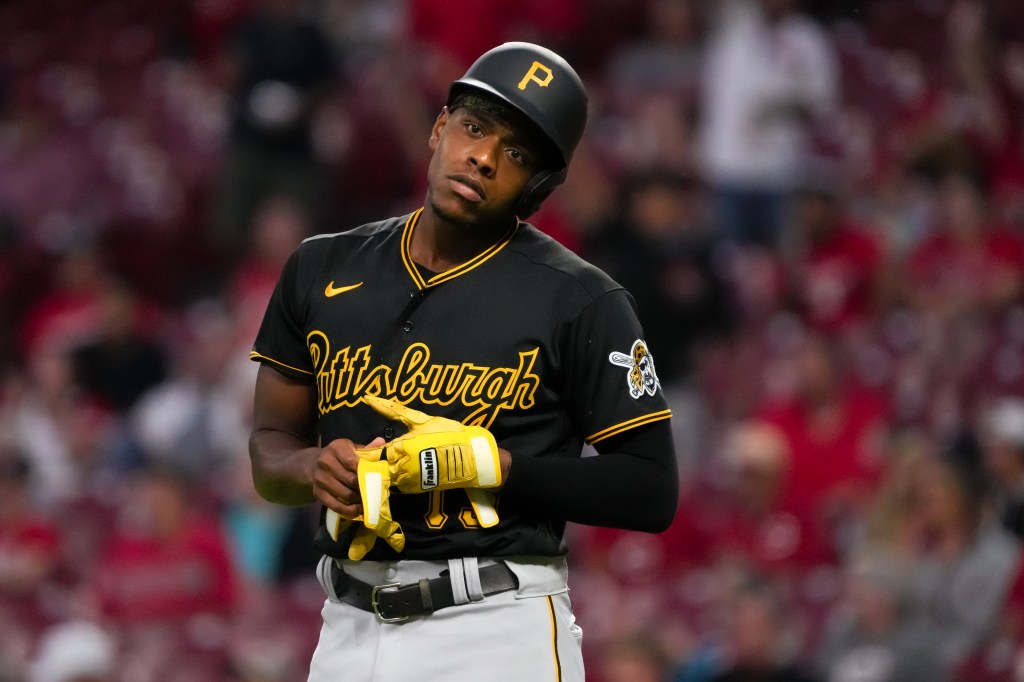
Yes, the Pirates really do have two black alternates. It’s a little bit ridiculous, but we will let it slide because they are both good. Again, this is one of those rankings where just because I rank a jersey low doesn’t mean I don’t like it. I do love these black uniforms, just not as much as the others. The script Pittsburgh across the chest is absolutely fantastic. Just wonderful. It throws it back to the days of Bonds and Bonilla. Here is the issue: the script is black on a black jersey! Dumb! The Pirates made the same mistake the Marlins made with their black jersey, the lettering is too hard to read. Making the script yellow like they were in the Pops and Parker days would have these fly up the rankings.
3. Road Grey
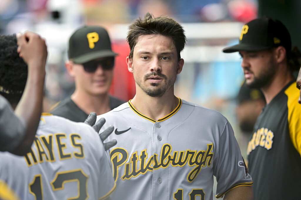
I was really close to moving these up a spot, but I just couldn’t bring myself to do it. Again, good, just better in front of it. I don’t think the grey mixes as well with black and yellow as some other combos, but it is still really good. The Pirates also mixed in the script “Pittsburgh” for these, which really puts the look all together. I looked up pictures of Barry Bonds with the Pirates, and the road uniform he wore looks exactly like these. As you can tell, I like classic looks, especially with classic franchises. This is a good grey uniform, but not one of my favorites. It would probably be somewhere between 10-15 if I were to rank road uniforms, which I probably will one day.
2. Home White
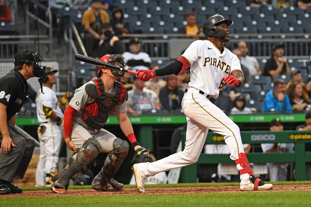
This might seem blasphemous, but just trust me on this one. These are an absolute classic look. You really just can’t go wrong with black and yellow on white. Thankfully the Pirates did not do something outlandish and mess these up. I kinda wished these had “Pirates” written in script across them, but I looked back at classic looks, and their home uniforms have always had this word mark. Staying true to tradition is a vital part of putting together a classic baseball look, and the Pirates do a really good job at that. I almost ranked these below the road greys because I wish there was the script, but I just couldn’t do it. These are too good.
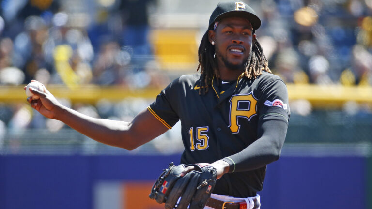
1. Home Black
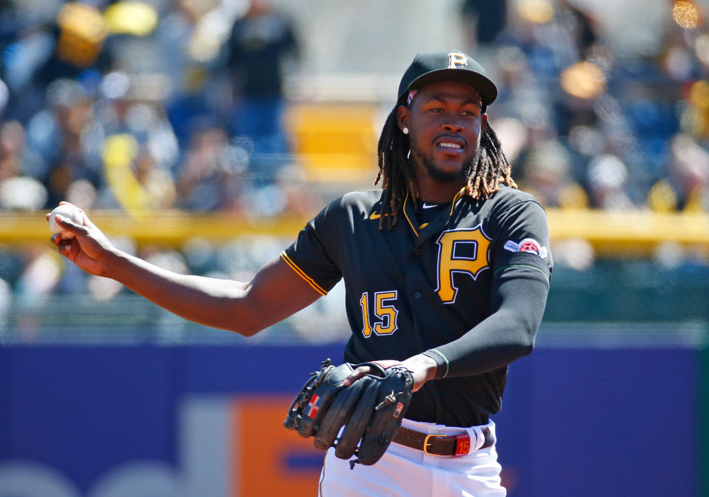
These are simply delightful. Probably one of my favorite alternate uniforms in the league. Now listen, there are absolutely ways to mess up a black uniform. Don’t let anybody tell you differently. There are also ways to nail one, and this black uniform is nailed straight on the head. The Pirates “P” logo is so classic, and it is the perfect breast logo for this kind of jersey. They also got the coloring right on this one with yellow numbers, names and logo on a black uniform. I also love the actual Pirate patch that they wear on the sleeve of these. On the road black, the bandana is yellow, and I think that’s wrong. The red bandana adds a nice touch and is much better. These are just so far and away the superior black uniform the Pirates wear.
HM. Yellow Throwbacks
Listen. Anybody that tells you these are anything other than awesome is WRONG. Completely and utterly WRONG! I know the flat hat for absolutely no reason is ridiculous, but it was the ’70s! So many things back then made no sense! Either way, the stripes around the hats rule, and the rest of the jerseys are as good as it gets. The yellow with the black and white stripes on the cuffs is perfect. This is also an example of the very few times that colored pants work in baseball. It is only right that the Pirates would wear an actual uniform that is one part black, one part yellow. These are the exact uniforms that Pops and Parker wore, and they were just as good then as they are now. These rule, and do not let anybody tell you differently.
Note: I originally thought the Pirates were actually wearing these this year but realized I had gotten mixed up with an article from 2016. That was after I finished writing a blurb about it. I left it in because I felt like it, and also because these are too good not to be mentioned. Just thought I should be fully transparent here. I had them ranked as the best look in the entire set. The Pirates need to connect to the days of yonder and bring these back in some fashion. The Marlins are wearing their throwbacks every Friday, why can’t the Pirates do the same?

Written by
Ethan Budowsky is a University of Florida graduate with a degree in telecommunications. He currently works as a Multimedia Journalist for WCJB TV20 in Gainesville. Before…