Ranking MLB’s 22 City Connect Uniforms From Worst to Best
Two more City Connect uniforms have been revealed in 2024. Here's a ranking of all the concepts from worst to first.
Editor’s Note: This article has been updated from its original published date of April 29, 2024, to ensure added accuracy and relevance. We have incorporated the latest information, insights, and opinions to provide you with the most up-to-date analysis and perspectives. Thank you for reading!
Regardless of whether you think MLB’s new uniforms are the coolest fits ever worn on the field, or if you feel they’re absolute duds, Nike’s City Connect program has entered its fourth year in the Bigs.
The Philadelphia Phillies and New York Mets were the latest teams to unveil their respective new alternate uniforms, meaning most of the league has now adapted to occasional flashy new looks.
Before the year is out, the Detroit Tigers, St. Louis Cardinals, Tampa Bay Rays, Toronto Blue Jays, Minnesota Twins and Cleveland Guardians will all release City Connect designs of their own. The Los Angeles Dodgers will also become the first team to unveil a second City Connect uniform set.
By the conclusion of the 2024 campaign, the New York Yankees and Oakland Athletics will be the only teams that don’t have City Connect uniforms. The Yankees haven’t ruled out ever getting one, but owner Hal Steinbrenner suggested last summer that the team doesn’t have any plans to mess with their iconic two-uniform rotation.
The A’s, of course, don’t really have a city at this point thanks to the disastrous management of owner John Fisher.
So far, there are 22 MLB City Connect uniforms for 2024. Here’s a ranking of all the concepts from worst to best City Connect jerseys.
No. 22: Los Angeles Dodgers
To this point, the Yankees have sat out the City Connect program. The Dodgers — another one of the most storied franchises in baseball — should have done the same thing.
Instead, they were one of the first teams to unveil City Connect uniforms in August of 2021, and whether they went with blue tops and blue pants or blue tops and white pants, these uniforms were an abomination.
These are now retired, but instead of Los Angeles altogether dipping out of the City Connect program, they are set to get a second design. There’s nowhere to go but up, right?
No. 21: Texas Rangers
When the Rangers put so many Easter eggs in and around their uniforms, is it lazy if we say there is simply nothing redeeming about them?
The gothic lettering on the hat is so busy that you have to really squint to realize it’s a “TX”. It’s not a hat that looks good with the uniform — because nothing about it looks good — and it’s also not something that a regular person (at least one with any fashion sense) would just wear with normal clothes.
No. 20: Cincinnati Reds
Given that the Reds’ current uniform mix is, at best, stale, it’s especially disappointing that their City Connect uniforms stink.
The Reds billed these uniforms as “leaning into the future,” but the reality is they are just another unnecessary black alternate in a sporting world oversaturated with such jerseys, and the “infrared” script is disastrous. We can’t help but think how hot — and therefore, impractical — black pants with black tops and a black cap are during the dog days of summer.
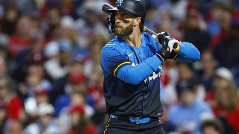
No. 19: Philadelphia Phillies
The Liberty Bell hats have caught on in Philadelphia, but the uniforms as a whole don’t make you feel like you’re watching a Phillies game. Catcher Garrett Stubbs recently referred to the City Connect uniforms as making the Phillies look like a “sexy men’s beer league softball team,” which is probably the kindest framing you can come up with.
The uniforms feature a ton of easter eggs, including the fact that the script font is inspired by the crack in the Liberty Bell. Ultimately, though, these just don’t look very good and feel beneath one of the older franchises in the sport.
No. 18: Milwaukee Brewers
People do actually refer to the Brewers as the “Brew Crew,” but that doesn’t mean Milwaukee needed a uniform that utilized the nickname across the chest.
Additionally, the 414 area code being featured inside the MKE – which is the abbreviation utilized for Mitchell International Airport in Milwaukee – creates a jumbled mess. And while some of the greatest sausage in the world is produced in Milwaukee, grilling in the summer is hardly unique to that area.
No. 17: Pittsburgh Pirates
We aren’t family. For as great as the yellow tops and pillbox caps that the Pirates wore in the late 1970s were, these are a disaster on so many levels.
The “PGH” utilized across the chest on pinny-looking tops is uncreative. It looks even worse on the matte batting helmets, which seemingly drew inspiration from the much-maligned black and gold helmets that the Jacksonville Jaguars wore from 2013-2017.
No. 16: Chicago Cubs
As you’ll see throughout this list, we’re not particularly fond of navy blue as a primary jersey color. When you add matching navy blue pants and a navy blue cap with a powder blue brim, it’s overkill.
Both the cap and sleeve patch pay homage to the red stars in Chicago’s flag, but to someone not from the Windy City, the connection could easily go over their head. Meanwhile, “Wrigleyville” might look fine on a hoodie, but it feels amateurish for an MLB team to wear.
No. 15: Kansas City Royals
We appreciate the association fountains have with Kansas City, but the execution of the fountain “KC” logo isn’t very pleasing to the eyes.
The Royals’ City Connect uniforms look slightly better with baby blue longsleeves underneath, but ultimately, if these were never worn again, they wouldn’t be missed.
No. 14: Baltimore Orioles
Four of the five current uniforms that the Orioles have in rotation are strong. This would be number five.
Introduced in May of 2023, these jerseys are bland, with a boring “B” on the hat and a generic “Baltimore” script across the front of the uniform. Sure, there’s some color on the inside, and the Orioles have seemingly adjusted the sleeves to show it more. But a black uniform isn’t especially practical in the summer, and the Orioles already have their tremendous black alternate tops with “O’s” hats.
For all the interesting logos in Orioles’ history, there’s not a bird in sight on these uniforms. So yes, some wings you can clip.
No. 13: San Francisco Giants
Make no mistake, these uniforms aren’t good. But the concept of a Golden Gate Bridge with fog-inspired uniform is at least creative.
The Giants are another team on this list that has an elite uniform set, complete with both black and orange alternate tops. The City Connects didn’t enhance the team’s appearance in any way. But, they are much less offensive than some of the other uniforms that this program has produced, and the matte creamsicle batting helmets are actually kind of cool.
No. 12: Boston Red Sox
In April 2021, the Red Sox became the first team to release their City Connect uniforms. The uniforms — which are yellow and blue because they are inspired by the colors used in the Boston Marathon — have caught on, at least partially because they’ve been good luck.
The “racing bib” on the left sleeve was an interesting idea, but the 617 area code doesn’t do much for us, especially considering that very few people outside of Boston could tell you what region that area code belongs to.
All in all, these aren’t terrible. They do run the risk of making the Red Sox look like, well, not the Red Sox. But with the iconic “B” still on the cap, these are passable, if not slightly better.
No. 11: New York Mets
The Mets City Connect uniforms received mixed reviews, with some suggesting that an “NYC” jersey with pinstripes looks more like a Yankees uniform.
However, while the Yankees are the team most associated with pinstripes, the Mets are one of many others in the sport that rock them. And there’s an old-school nostalgia feeling with the “NYC” across the chest here that makes it feel much more like an actual MLB jersey than the ones listed above.
New York also did a good job of mixing in the color purple, as they paid homage to the 7 line, without letting what is a very bold color overtake the whole uniform. Even if you don’t love these, they certainly aren’t offensive.
No. 10: Houston Astros
The hats are actually pretty cool, but again, there’s just too much navy blue here. If the Astros wanted to make the uniforms look like something astronauts would wear, wouldn’t it have made more sense for them to go white-on-white?
The Astros already have another (and especially ugly) navy blue alternate, so why did they need a second navy blue set?
If you’re just ranking the hats produced in the City Connect program, these would be near the top. But the full uniform would have been better in another color.
No. 9: Seattle Mariners
The Mariners ditched their road gray uniforms altogether in 2023 to comply with Nike’s controversial “4+1” uniform rule and unveiled the +1 in the form of a City Connect uniform in April of that year.
These uniforms do a good job of paying homage to the past – the iconic trident “M” is back on the caps – while looking modern, which apparently was by design.
Yet we’ll admit, we’re still not sure about the black pants. Black longsleeves underneath the tops look clean, but we’d be interested to how these would look with blue pants that match the uniform tops.
Regardless, the Mariners have one of the best uniform kits in the league, and these don’t change that one way or another.
No. 8: San Diego Padres
These are definitely among the most polarizing City Connect sets.
If you go to the beach in San Diego and see someone wearing a Padres City Connect jersey, it probably looks pretty cool. But the full uniform set is too much and feels like a poor attempt to match the Heat’s “Miami Vice” uniform set.
These are such a departure from San Diego’s brown and gold color scheme — which got excellent new uniforms in 2020 — that you’re almost not sure which team is playing when the Padres don them on Friday evenings at Petco Park.
However, if the goal of the City Connect program was to attract some younger viewers to the sport with interesting color schemes, these definitely serve their purpose.
No. 7: Atlanta Braves
If these were new, perhaps they would be rated higher. The color scheme is excellent and pays homage to one of the most classic uniforms in MLB history. But the Braves had their actual throwbacks in rotation (pictured on the right in the tweet above) as recently as 2022, and the lowercase “a” looks much cooler on the cap than the current “A.”
The cursive Braves script featured on the original v-necked uniforms is also superior to the “The A” logo on the left side of the chest on the City Connect uniforms, which feels like something that someone who isn’t young would design to try to appeal to “the youth.”
No. 6: Chicago White Sox
These have received very strong reviews, and we aren’t entirely against them. However, there are some legitimate criticisms to be made of Chicago’s City Connect uniforms.
First of all, the White Sox already have an elite logo, so ditching the “SOX” (and not replacing it with the alternate logo featuring an actual white sock inside a black baseball diamond) is disappointing.
If the average person saw someone wearing the “Chi” hat that goes with these City Connect uniforms, they would probably have no idea it goes with an MLB uniform, as opposed to just being a cap sold at a tourist trap. Come to think of it, “Southside” kind of feels like something that would be on the front of a Kmart brand White Sox uniform.
We’ll leave the White Sox at No. 6 because these City Connect uniforms are really popular, but there are arguments to be made against them for sure.
No. 5: Arizona Diamondbacks
In many rankings of City Connect uniforms, it feels like the Diamondbacks’ “Serpientes” uniforms have been underappreciated. The stated goal in designing these uniforms was “highlighting the team’s desert roots and Arizona’s Hispanic culture,” and we would say they did just that.
Since the D-backs ditched purple and teal as their primary color scheme for the underwhelming “Sedona red” in 2007, these are the best uniforms the Diamondbacks have produced. Moving forward, all Diamondbacks players should be required to wear snakeskin belts to match this set.
No. 4: Los Angeles Angels
*Beyoncé voice* Surfboard!
First unveiled in June of 2022, the Angels’ City Connect uniforms are off-white and invoke the “Southern California beach scene.” These uniforms fit well into the City Connect program and feature some cool Easter eggs, but they also stick to the general color scheme of the Angels and feel like a uniform that could have been designed outside of the City Connect era.
No. 3: Colorado Rockies
For the many franchises that are one of multiple teams in a state, creating “State Connect” uniforms wouldn’t really work. It does, though, for the Rockies, who play in Denver but are still called the “Colorado Rockies.”
Since they entered the league in 1993, the Rockies have generally only made minor tweaks to their uniforms. But these uniforms — inspired at least partially by Colorado’s beautiful license plate — are drastically different, and in our eyes, are a hit. While we prefer the green pants that match the uniform tops, the Rockies have also worn white pants with their City Connect uniforms, which work well too.
No. 2: Washington Nationals
The idea of gray home uniforms featuring cherry blossoms doesn’t sound great, but the actual execution is excellent. The pink accent perfectly complements the anthracite-colored uniforms and hats.
Introduced in March of 2022, the Nationals City Connect uniforms are very clean. Theoretically, they could be worn on the road some days as well, though they are currently limited to home games on Fridays and Saturdays.
The Nationals will retire these threads after the 2024 season, but perhaps if there’s enough backlash, they will reconsider the latest in a long line of disastrous uniform decisions.
No. 1: Miami Marlins
The Marlins would be wise to lean back into teal for their primary look. But even if they eventually do so, their City Connect uniforms — which are worn for “Legacy Saturday” games at loanDepot Park — should be a permanent fixture in their rotation.
Given that the Fish play their home games in Little Havana, it’s fitting that their City Connect uniforms are a nod to the Cuban Sugar Kings, a minor league team that played from 1954-60. The best part of Miami’s City Connect look is the “legacy red” and “Miami blue” caps, which have a matching matte batting helmet.

Written by
Tim Kelly is a contributor to Just Baseball. Tim has been on the Philadelphia Phillies beat since 2020, serving as the Editorial Director for PhilliesNation.com. Additionally,…