Ranking All Five Current Orioles Uniforms From Worst to Best
With some great caps and a couple of gorgeous alternate looks, the Baltimore Orioles have an excellent set of threads.
From 1989-2011, the Baltimore Orioles donned a realistic-looking bird on their hats, the type you might see if you were looking in a field guide trying to identify an actual bird.
And it was really boring looking.
So in 2012, the Orioles updated their hats and batting helmets — without making any drastic uniform changes — by replacing the scientifically correct-looking bird with the cereal box-looking Oriole that had been their alternate logo from 1979-1988. The refresh was a stroke of genius, as the cartoon Oriole proved to be the cherry on top for a trio of excellent threads.
As we reflect on the modern look of the Orioles, here’s a ranking of the team’s five current uniforms, from worst to best:
No. 5: City Connect Uniforms
For a team with so many great logos in its history, it was surprising to see the City Connect uniforms unveiled by the Orioles in May of 2023 with a bird-free cap and an uncreative uniform. The color palette that can only be seen when the sleeves and/or collar are rolled up adds some brightness to a bland uniform, but don’t confuse that with looking good.
You also have to question the practicality of having two black uniforms in your rotation, especially when the ones the team already had are superior.
No. 4: White Home Uniforms
In 2004, Baltimore changed the “Orioles” script on the front of their home jerseys from being black with orange trim to just being orange, a nice update. As mentioned above, the Orioles changed their hat logo to the cartoon bird in 2012, but much more was done to the primary hat worn for home games.
Rather than the black hat with a realistic bird and an orange brim that Baltimore wore from 2002-2011, the Orioles put the cartoon bird on the front of a tri-colored cap, which is white on the front with an orange brim and black on the sides and back. These maybe aren’t the most-heralded home uniforms, but they are clean.
No. 3: Gray Road Uniforms
In 2011, the Orioles switched to “Baltimore” written horizontally on the front of their road uniforms, rather than “Orioles,” as they had from 1995-2010. A year later, the black hats with orange brims were upgraded from the realistic bird to the cartoon bird.
Teams like the Seattle Mariners and Tampa Bay Rays have altogether ditched their gray road uniforms to comply with Nike’s controversial “4+1” rule, but the Orioles have been wise to keep theirs.
No. 2: Orange Alternate Tops
If you’re going to use orange as a primary color for a uniform top, you better nail it. The orange alternates that the Houston Astros currently wear aren’t very good, and the orange tops that the Miami Marlins mixed in from 2012-2017 were brutal. But the Orioles are a team with a strong orange alternate, specifically when it’s worn on the road with the black caps that have an orange brim.
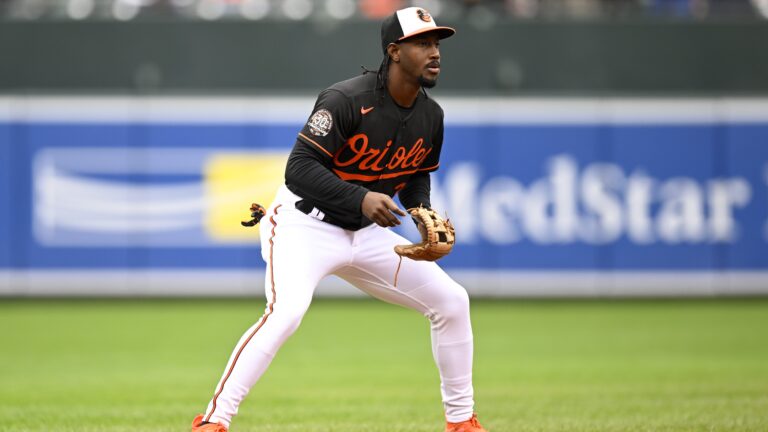
No. 1: Black Alternate Tops
For as much credit as we’ve given to the cartoon bird, the “O’s” caps with orange brims worn with these black alternates are perfect. And the cartoon bird is still worn on the helmets that go with these uniforms.
Too many teams in sports now have black uniforms, but the contrast with the orange “Orioles” script across the chest makes these one of the best alternate uniforms in baseball, perfect for home or away games.

Written by
Tim Kelly is a contributor to Just Baseball. Tim has been on the Philadelphia Phillies beat since 2020, serving as the Editorial Director for PhilliesNation.com. Additionally,…