Ranking All the Current Cubs Uniforms From Worst to Best
From the classic blue pinstripes to the "Wrigleyville" City Connects, Just Baseball presents our ranking of all four Chicago Cubs uniforms.
It’s your boy, Ethan Budowsky, back for more uniform talk here at Just Baseball. It is a lovely day, and what better way to spend it than talking about some threads?
Today we’re going to size up one of the most iconic uniform sets in the league: the Chicago Cubs. One of the things I love so much about the Cubs’ uniforms is that they have seemingly never changed. Of course, there have been minor tweaks as styles have gone in and out over time, but from Ernie Banks to Ryne Sandberg to Sammy Sosa to Kris Bryant and all the way to Seiya Suzuki, they all have pretty much worn the same look.
That is what makes a truly awesome baseball jersey among the best: timelessness. If you look at my uniform rankings for this year, you will notice the top tier is entirely made up of classics. The Cardinals, A’s, Yankees, Cubs, Giants and Dodgers. One thing they all have in common: they have rarely changed throughout the years.
I ranked the Cubs fourth this season, leapfrogging the Giants and Dodgers in part because the pinstripe home look is too good to be true. There is nothing like watching the Cubbies run out there in those pinstripes on a sunny afternoon at Wrigley Field. I think you can tell where I’m headed, but let’s go ahead and see where these jerseys fall in line.
4. Road Grey
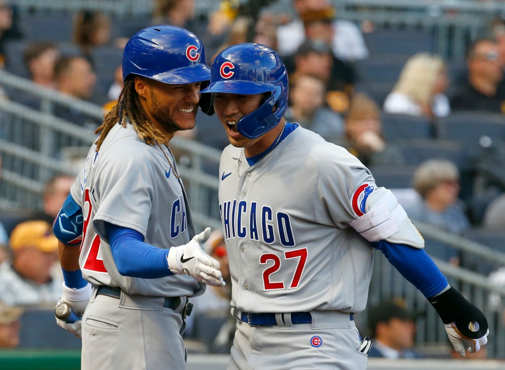
The fact that these come in fourth says all you need to know about the Cubs’ uniform set. I personally liked their road grey better in the early-mid 2000s when they had piping and said “Cubs” instead of “Chicago.” I think without it there is just kind of something missing. However, these are absolutely wonderful. The red number with the blue text on the front is delightful. The font on the “Chicago” is simple and as clean as you’d like. I feel like we see the Cubs in blue on the road more than grey, but I wish we would see these a bit more. The funny thing is, I didn’t even love these until a few years ago. However, with time I have learned to love them more and more. One of the best road jerseys in the league, hands down.
3. City Connect
This is probably going to be unpopular among Cubs fans, but I actually like these a lot. I would probably put them in my top 5 if I were to rank the City Connect jerseys, which will happen once they all have been released. Usually, I am not a fan of colored pants in baseball, but I think the navy look is great. I also just love light blue on navy, and I think it looks great on this jersey. The hat is good, and I love how it is a subtle nod to the Chicago flag, which is a great one.
What brings it home for me is that the jersey says “Wrigleyville” on the front. Wrigleyville is a special place that can only truly be understood by spending a full day there drinking (literally) it all in. I was actually in Wrigleyville for the game they debuted these beauties, and let me tell ya, they were gorgeous. I also had a ton of fun. For the Cubs to embrace their neighborhood and put it on a jersey is truly awesome.
2. Alternate Blue
I’m not going to say these are the best alternate uniforms in the league–that title probably belongs to Rockies’ purple or Mariners’ aqua–but they are certainly the most recognizable. I love the logo on these uniforms so much. The cub walking through the ‘C’ is iconic as it is adorable as it is awesome. The first time I went to Wrigley, I got a Kris Bryant jersey in blue, so it will also always have a special place in my heart. The Cubs wear these a ton, and they are pretty much their main road uniform. I also love when they randomly wear them at home every decade or so, and I wish they would do it more. No stripes, no piping, no numbers on the front, nothing. Just a perfect blue, a perfect logo and a perfect uniform.
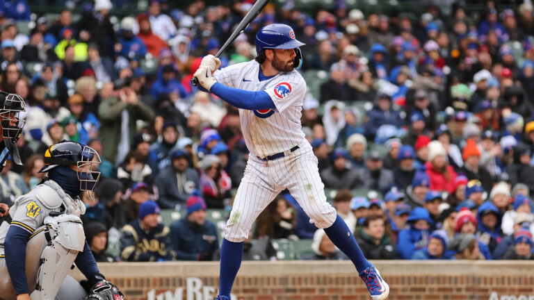
1. Home White
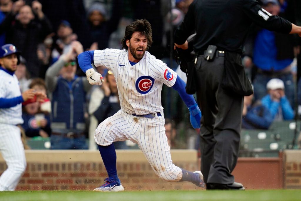
It would be blasphemous to go in any other direction. These are probably the second-most iconic pinstripe uniforms in the league besides the Yankees’. They might also be second among uniforms overall. Pinstripes are the best kind of baseball uniform, and these are perfect. If you look at every pinstripe uniform in the league, there is one thing that sets the Yanks’ and Cubs’ apart: a breast logo instead of a word mark. The pinstripes do the talking, not the logo! Again, these are simply timeless. Look back at photos of any Cubs legend and they are in pinstripes with the Cubs logo on the breast. There is no question these are the best Cubs uniforms, the only question is: where would they rank if you ranked every individual jersey in the league?

Written by
Ethan Budowsky is a University of Florida graduate with a degree in telecommunications. He currently works as a Multimedia Journalist for WCJB TV20 in Gainesville. Before…