Ranking All Five Current Giants Uniforms From Worst to Best
Some of the greatest players in history have donned the iconic threads of the San Francisco Giants, from Mays to McCovey to Bonds.
What makes an iconic uniform? Is it the design? Is it the people that wore it? The history achieved in that uniform? When it comes to the San Francisco Giants’ uniforms, it’s a little bit of everything.
Some of the most iconic players in history have donned the orange and black. Just think of the names: Willies Mays and McCovey, Juan Marichal, Will Clark, Barry Bonds, Tim Lincecum, Thairo Estrada, the list goes on.
The colors and design also stand out. The “SF” logo on the cap, the “Giants” word mark, the off-white home jersey. The Giants are also one of only two teams in the league that wear orange and black, and they have done it dating back to their days in New York.
Of course, there’s the history too. The Giants won three World Series last decade in a set that looks unchanged from the days of Bobby Thompson’s home run. Barry Bonds became the all-time home run king in their home uniform. MadBum willed his team to that third title in five years in Kansas City in the road grey.
I think you get the point: the Giants have all the ingredients for an iconic uniform, and while theirs have changed over time more than some of the other iconic looks–think the Cubs, Yankees, Dodgers, etc.–they remain just as timeless. I ranked the Giants fifth in my uniform rankings for this season, so you can tell I think very highly of them. Let’s see what I think of each set they’ll wear this year.
5. City Connect
When the Giants first dropped their City Connect uniforms, I wasn’t sure how I felt. My immediate reaction was not positive, but I love the use of the Golden Gate Bridge and the fog. I also think the orange they use looks great with the pure white. With time these just kept growing on me to the point where I think I like them? They would definitely be in the upper half of my City Connect rankings–though that’s not saying a whole lot. I actually saw these in person when I went out to SF last year and thought they looked great. The merch they sell with this look is great also. I like these, but not nearly as much as the rest of the set. The fact they’re ranked last says something about how good the other jerseys the Giants wear are.
4. Alternate Black
I used to really not like these, but I think the Giants made a key switch a while back. The names, the numbers and the SF on the breast used to be black with an orange outline. They didn’t pop, and it just looked muted, kind of like the Marlins’ current black uniforms. Then they changed these to have an orange SF, and they became awesome. This is a great black look, especially because orange on black is awesome. The Giants have such unique colors, and they use them very well. This is a perfect example of a jersey that could have gone horribly wrong but instead has gone insanely well. Again, ranking these jerseys this low feels wrong, but the three looks in front are just too good.
3. Road Grey
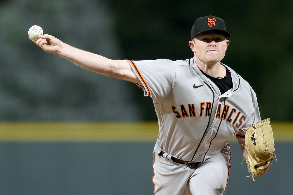
If you’ve read my previous rankings, you will know I am a sucker for a good road grey. These are absolutely top tier. In fact, they probably crack my top 3, along with the Braves and Yankees. This is where you really get into the history of the Giants’ look and crack into iconic. These make you think of Mays and Bonds and McCovey. The orange and black just mixes so well with the grey, and the “San Francisco” makes you feel the history of the franchise. Right next to my computer, I am currently looking at a picture of Willie Mays mid-swing wearing a grey jersey that looks almost the exact same as the one Logan Webb is wearing here. That’s about all I need to say.
2. Alternate Orange
It is not easy to make a good orange baseball uniform. In fact, it is really difficult–just ask the Astros and the Marlins before their rebrand. The Giants’ orange is just slightly more muted than Houston’s, and I think the biggest thing here is the black mixes better than the Astros’ blue. What really makes these uniforms great is the script “Giants” they brought back from the Will Clark days. This is such a classic look, and those 80s jerseys that used it as their main script are just so delightful. The Giants used to use their regular block lettering on these jerseys and they were still good, but the script makes it a lot better. I would not be opposed to San Francisco using it full-time.
Fun fact, I actually had these third behind the road grey when I originally wrote this article. Then I threw on the Marlins and Giants Friday night and saw the Giants wearing these and immediately changed my mind. They look so good under the lights, and the gold trim on the Giants script and SF on the sleeve is such a good touch. These rock. I am sorry for ever underestimating them.
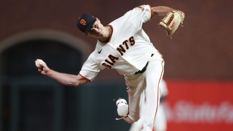
1. Home Off-White
I have been trying really hard not to hyperbolize because of my love for the Giants organization, but is this not the most unique uniform in the league? I mean, you could go with unique in a bad way, but in a good way? No? They are the only team that doesn’t wear a white home uniform. That alone is enough to make it the best of the set, not to mention it is absolutely gorgeous. The off-white cream color just mixes perfectly with the orange and black. The “Giants” on the front is pretty much exactly how it was back at the Polo Grounds. Of course, there is the Oracle Park factor, which makes these look even more beautiful than they already are. This is as iconic as iconic gets, and while there are better jerseys out there, I’d be hard-pressed to find 10 of them.

Written by
Ethan Budowsky is a University of Florida graduate with a degree in telecommunications. He currently works as a Multimedia Journalist for WCJB TV20 in Gainesville. Before…