Ranking the Primary Logos of the Toronto Blue Jays
Looking back through the history of the Toronto Blue Jays, the Jays logo has taken on many different looks over the years.

Aesthetics are a subject of friendly debate within the baseball fanbase. Uniforms have been hit-or-miss (no pun intended), and so have logo designs — which certainly play a part in the overall looks. Some franchises rarely, if ever, have tweaks or overhauls (see Yankees, Dodgers, and Cardinals). But for teams that make branding changes, we’ve critiqued the beauty behind their choices.
We last did the Astros after starting with the Orioles. We continued with birds of a different feather. Like Houston’s franchise, Canada’s first AL club has come pretty much full circle in its logo transformation.
5. The T-Bird (2003)
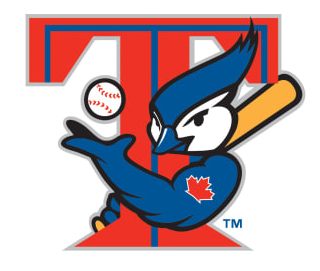
This could have been considered a slow roll-out since it was first a batting practice uniform logo in 2000 before it was elevated to the alternate uniform and then made it all the way to the primary logo – albeit for one season. The bird hugging the “T” while wielding a bat and tossing up a baseball with a maple leaf tattoo on its arm is a bridge from the original blue to the rebrand to come in 2004. They would have been better off keeping this.
Who wore it best: Roy Halladay, Carlos Delgado, Vernon Wells
4. Maple Leaf Prominance (1997-02)

This was the team’s first significant change. The double-blue profile of the blue jay remains, but the obvious alteration is the presence of the nation’s official symbol.
What once was a subtle leaf is now a giant one. Did you know the Blue Jays are in Canada? This logo won’t make you forget it. Just as going from the T-Bird to whatever we call the mid-to-late 2000s logo was a step downward, going from this to the T-Bird was also a demotion.
Who wore it best: Carlos Delgado, Roger Clemens, Roy Halladay, David Wells
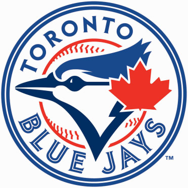
3. Bird Flies Solo (2020-present)
The old bird had migrated back. And while that logo is still part of the team’s imagery, they went with this less busy/no-text version just a few years back. It was first presented as a cap logo and on the front of their uniforms in 2012. The shade of red is adjusted, but even the most loyal Toronto fans may not have noticed that. The two-toned blue profile with a red maple leaf in the upper right corner should be here in permanence.
Who wore it best: Vladimir Guerrero Jr, George Springer, Marcus Semien, Bo Bichette
2. Modernized Original (2012-19)
Why did this ever leave? This and the corresponding jerseys are so well associated with the Blue Jays that it’s weird to have seen them in anything else. This has been a positive trend with many franchises recently, where teams return to the looks that they are best known for and only making slight touches to show some variance and present-day appeal. For the Jays, a bigger maple leaf, a double-lined circle, a darker shade of blue, and a different font for “Toronto.”
Who wore it best: Jose Bautista, Edwin Encarnacion, Josh Donaldson, Marcus Stroman
1. The Original (1977-96)

Of course, it’s hard to beat an original. Technically, this logo was updated in 1994 as part of the digitization of MLB graphics, but it’s so subtle that we’re combining both versions here. The font and consistency of the “Toronto Blue Jays” circle make it more of a consistent look than what they have now, although it’s barely a bother except in rankings like these. It just so happened that they had they haven’t won or been in a World Series since they tinkered with this logo.
Who wore it best: Dave Stieb, Jesse Barfield, George Bell, Joe Carter, Jimmy Key, Roberto Alomar, John Olerud

Written by
Brian is the author of "The New York Mets All-Time All-Stars" and “Mets in 10s: Best and Worst of an Amazin’ History." He also freelances for…