Ranking the Primary Logos of the Detroit Tigers
Looking back through the history of the Detroit Tigers, the Tigers logo has taken on many different looks over the years.
Aesthetics are a subject of friendly debate within the baseball fanbase. Uniforms have been hit-or-miss (no pun intended), and so have logo designs — which certainly play a part in the overall looks. Some franchises rarely, if ever, have tweaks or overhauls (see Yankees, Dodgers, and Cardinals). But for teams that make branding changes, we’ve critiqued the beauty behind their choices.
We last did the Padres, and now we continue with a team that’s existed much longer. It might seem like this franchise has maintained the same iconic design, but there have been subtle (and less subtle) revisions worth noting.
5. White-eyed Tiger (1927-28)
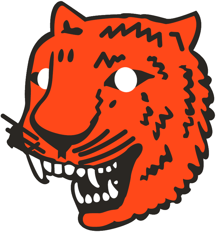
This one gets on the list for hilarity alone. There’s another version where the cat appears more stunned than fierce, but without colorization in the eyes, it’s like the tiger is sending out sunbeams. It’s uncertain if this was the result of a school project.
Who wore it best: Charlie Gehringer, Harry Heilmann
4. Olde English Style with Orange Outline (1929)
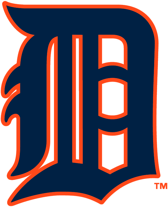
The “D” is what is most associated with Detroit Tigers baseball. It’s one of the most recognized logos in the sport. The bug-eyed head was no more and they went back to the familiar look. While this particular one was the primary logo for only a season, the orange-outlined letter was featured on the batting practice uniforms during the 1980s.
If the present-day Tigers want an alternate look, I’d suggest going here.
Who wore it best: Charlie Gehringer, Harry Heilmann
3. Tiger Through the ‘D’ (1994-05)
The first major rebrand by the club in over three decades saw the introduction of this logo featuring the familiar navy blue Olde English “D” accompanied by an orange tiger with navy blue stripes prowling through it. This is a very creative use of the “D” as a cage. The logo was downgraded to an alternate logo in 2006 before being eliminated altogether after the 2017 season.
Who wore it best: Ivan Rodriguez, Alan Trammell, Lou Whitaker, Juan Gonzalez, David Wells
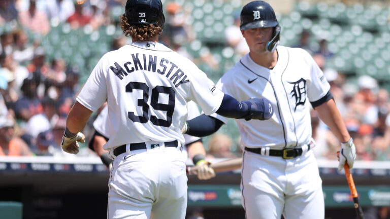
2. Updated Olde English Style (2016-present)
The classic look was first used in this particular style in 1961 as a logo worn on their cap but had existed in other forms since 1905. This design was promoted to become the official primary logo in 2016 more than 50 years after it was first introduced.
It received another promotion in 2018 when it replaced the “D” worn on the front of the home white jersey, giving the Tigers a consistent look across their entire uniform for the first time in nearly a century.
Who wore it best: Miguel Cabrera, Justin Verlander, Justin Upton, Spencer Torkleson
1. Tiger Head in Blue Ring (1964-93)
We don’t factor team success into the ranking. So the fact that this was used during their last two World Series Championship seasons of 1968 and 1984 is purely coincidental.
The tiger head is more realistic than whatever 1927-28 was accompanied by royal blue striping placed within a blue circle and the team name surrounding it is the most aesthetically pleasing look even if it’s not the classic one.
Who wore it best: Allan Trammel, Lou Whitaker, Jack Morris, Kirk Gibson, Al Kaline, Mickey Lolich

Written by
Brian is the author of "The New York Mets All-Time All-Stars" and “Mets in 10s: Best and Worst of an Amazin’ History." He also freelances for…