Ranking the Primary Logos of the Houston Astros
Looking back through the history of the Houston Astros, the Astros logo has taken on many different looks over the years.
Aesthetics are a subject of friendly debate within the baseball fanbase. Uniforms have been hit-or-miss (no pun intended), and so have logo designs — which certainly play a part in the overall looks. Some franchises rarely, if ever, have tweaks or overhauls (see Yankees, Dodgers, and Cardinals). But for teams that make branding changes, we’ve critiqued the beauty behind their choices.
We last did the Tigers, and now we continue with a franchise that has somewhat taken a 360 in its branding. In total, they have had four major rebrands, two of which included subtle logo changes (one happened more quickly than the other). As a note, we’re only ranking Astros logos and not any of them when they were originally known as Colt .45s, which wouldn’t have made it anyway.
5. Keep the Star, Change the Colors (2000-12)
The Astros went through a radical redesign upon their move out of the Astrodome and into Enron Field (now Minute Maid Park) in 2000.
The logo was a brick red star trimmed in black and sand with Astros scripted below in black. The theme was based on the location of the new park being at the old Union Station, and true to their word the stadium came with a train out beyond left center field. The reasoning behind these changes is very valid even if not totally pleasing.
Who wore it best: Jeff Bagwell, Craig Biggio, Roy Oswalt, Roger Clemens, Andy Pettite
4. Blue and Gold Overhaul (1994)
The first major rebrand in team history came in ‘94 when they dropped the orange for gold and slightly darkened the blue and the logo now showed a streaking gold star shooting across the front of the Astros home ballpark, the Astrodome, with the team name in white and gold italics.
This particular design was used for only a season before they removed the Astrodome outline, a change they were better off not doing. Soon the actual Astrodome would be gone altogether.
Who wore it best: Jeff Bagwell, Craig Biggio, Ken Caminiti, Darryl Kile, Moises Alou
3. The Original Look (1965-76)
The new indoor facility, which became known as “the Eighth Wonder of the World,” was a central part of the logo that ushered in a new team moniker four years into its history.
Not only does the name work, the orange and blue color mix works, but the baseballs orbiting the domed stadium is a great touch.
Who wore it best: Joe Morgan, Rusty Staub, Cesar Cedeño
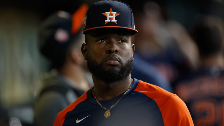
2. Current, More Subtle Style (2013-present)
Perhaps the brightness of the 60s, 70s, and 80s wouldn’t fly today. But reviving the similar concept to coincide with the change of leagues was a tremendous move, especially while the team itself was going through a significant rebuild.
Now it’s a regular part of our Octobers. Whatever complaints opposing fans have for the team itself, it’s hard to complain about the look.
Who wore it best: Carlos Correa, Jose Altuve, Alex Bregman, Justin Verlander, Yordan Alvarez
1. Original with Larger Font (1977-93)
This is the most Astros look of all.
While the basics look similar to the first logo, the font is larger and much cleaner. Before the ’77 season, the Astros retained the same idea of their home stadium the Astrodome in navy blue and white with the club name arched below and baseballs orbiting all around on an orange circle.
Who wore it best: Nolan Ryan, Mike Scott, Glenn Davis, Kevin Bass, Craig Biggio, Jeff Bagwell

Written by
Brian is the author of "The New York Mets All-Time All-Stars" and “Mets in 10s: Best and Worst of an Amazin’ History." He also freelances for…