Ranking MLB’s 2024 Batting Practice Caps From Worst to Best
Major League Baseball has released their batting practice caps for all 30 teams during the 2024 season. Here's our rankings from worst to best.
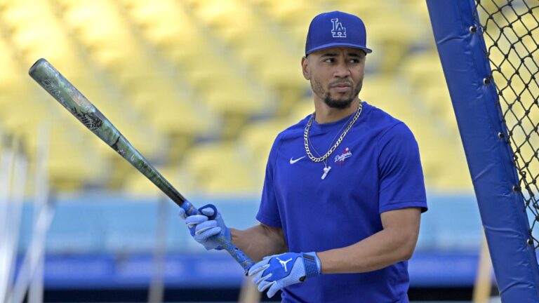
Paul Lukas of Uni Watch obtained what appear to be the official 2024 MLB batting practice caps for all 30 teams, a story that he published Wednesday.
While players often just wear whatever hats their team is going to be wearing for a game that day or just a specific favorite of there’s, these caps are designed to be worn on the field pregame while players are taking batting practice or doing other on-field work.
The bulk of these are actually pretty solid, which isn’t always the case when hats are designed to look different than what’s worn during the game. With that in mind, we’re going to rank all 30 batting practice caps, starting with the few negative ones and working our way up.
30: New York Mets
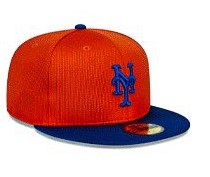
There’s not a lot to say here — this one is just bad. The orange is too bold of a shade to be the primary color on the hat, and there’s nothing else redeeming on the cap to make up for it.
29: Houston Astros
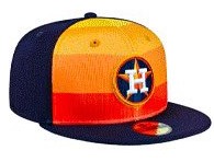
For as iconic as the “Rainbow Guts” jerseys the Astros wore from 1975-1986 were, modern twists on it never seem to go well. This hat will match with both the Astros navy blue alternate tops and their City Connect jerseys. The problem is both of these uniforms aren’t very good.
28: Washington Nationals
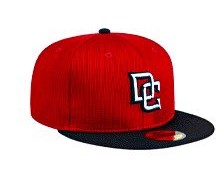
Maybe it’s just us, but the interlocking “DC” logo the Nationals appear to be bringing back to the forefront of their look reminds us of some of the awful teams playing at RFK Stadium in the mid-2000s, shortly after the franchise relocated from Montreal. In hindsight, we probably shouldn’t have made all those jokes about the “curly W” looking like the Walgreens logo.
27: New York Yankees
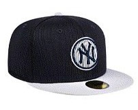
To this point, the Yankees have resisted joining Nike’s City Connect program, and they perhaps should have found a way to wiggle their way out of being part of this as well. The Yankee cap is the most iconic in the sport, and there’s nowhere to go but down when you deviate away from it.
26: Detroit Tigers
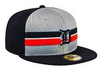
You can essentially copy and paste what we just wrote about for the Yankees here. The Tigers are one of the oldest franchises in baseball, and have wisely kept a pretty similar look for close to 100 years. The “olde English D” is a great logo, but this looks like a hat that the worst guy from your high school would wear.
25. Colorado Rockies
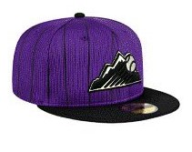
We aren’t against purple, but man, this is like, really purple. When you add in the black pinstripes, it just looks really cheap. You ever just see a cap and know the person who buys it is definitely going to keep the New Era sticker on the brim? Because that’s the vibes this one is giving off.
24: Minnesota Twins
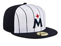
In theory, the idea of a north star logo for the Twins sounds pretty cool. In reality, as many have pointed out previously, it just has ended up looking like the “M” the Miami Marlins used as their primary logo from 2012-2018 with a star on top of it. This has given us an appreciation for the previously-maligned underlined “M” that the Twins had as an alternate logo from 1987-2012.
23. Milwaukee Brewers

We’re not saying this isn’t a cool alternate logo, but it feels like there’s a problem when at least 50% of baseball fans could be shown this cap and not be sure what team it belongs to. When you zoom in, it becomes clear that the “Beer Barrel Man” logo belongs to the Brewers. As something on the sleeve of a jersey or a hoody where the logo would be larger and clearer, this would be cool. But you have to squint at the hat to even figure out what team it represents, especially if you don’t have a masters degree in Brewers logo history.
22. Oakland Athletics
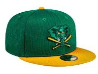
The story of how “white elephant” came to symbolize the A’s — which dates all the way back to 1902, when they called Philadelphia home — is one every baseball fan should know. The problem here is that this elephant is green, which not only does a disservice to the history of the logo, but it clashes with an already green cap.
21. Miami Marlins
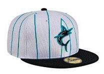
So for those of you scoring at home, the Marlins, by all accounts, aren’t going to be wearing their 1990s teal throwbacks on Fridays again this year, which they did last campaign to celebrate the franchise’s 30th season. But now they have a batting practice cap that sort of seems to pay homage to the teal of the 1990s, but with this era’s eyeless Marlin? No thanks.
20. Arizona Diamondbacks
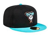
Until rights are wronged, we will continue to bunch the Marlins and Diamondbacks together as teams that had great uniforms and color schemes during their early years in the 1990s, and instead of just going back to those on a full-time basis seem intent on trying to put some new twist on it. Just take yes for an answer. The teal is good, but embrace purple again.
19. Los Angeles Dodgers
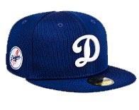
This isn’t a terrible hat on its own, but like with the Yankees and Tigers, the Dodgers have such an iconic hat. Anything other than the blue cap with the “LA” logo feels like unnecessarily complicating things.
18. Boston Red Sox
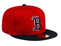
There’s not much to say about this one. It’s feels a bit more like a Spring Training cap given that the primary color is red, but it’s non-offensive to be worn during batting practice. This is the first one on the list that we are agnostic towards.
17. Cincinnati Reds
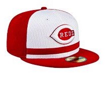
On one hand, you do get some “Big Red Machine” vibes from this cap, and the lifted “Reds” logo looks excellent. On the other hand, the red line underneath the logo is completely unnecessary and takes away from what is an otherwise very nice cap.
16. Kansas City Royals
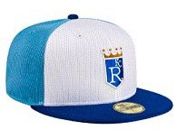
This incorporates the different colors of the Royals uniforms, which is a nice touch. Still, the best part of it is the Royals logo in the center, and it feels like it should be much bigger than it is. Increase the size of the Royals logo and this one would probably shoot up the list.
15. Chicago Cubs
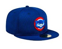
In case you didn’t know, Cubs are baby bears. This logo — which was the team’s alternate one from 1979-1993 — really drives that home. And the bear cub looks appropriately tough, without being menacing, as it likely grows up to be.
14. Texas Rangers
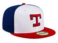
From their inaugural season in 1972 through 1993, the Rangers used some variation of this T as their primary cap logo. The three-toned cap is a nice modern update to the cap, and makes you wonder if some variation of this could eventually be worn in a game.
13. San Diego Padres
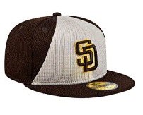
The Padres underwent one of the great uniform refreshes in MLB history prior to the 2020 season, finding just the right balance of brown, yellow and white. This cap specifically fits well with the “sand brown” road alternates, and is another one on this list you wonder if the team would consider wearing for a game.
12. Toronto Blue Jays
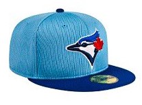
We’re not a huge fan of light-blue-on-dark-blue, but the Blue Jays have as good of a logo as any team in baseball, so it’s hard to be anti this cap. This is also a cap you can envision Blue Jays players actually wearing for batting practice, specifically when the team is slated to wear their dark blue or powder blue alternate uniforms that day.
11. St. Louis Cardinals
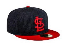
This may not necessarily match with modern Cardinals attire, but there’s an old-school feel to it. That’s because it’s a modern take on the caps that St. Louis wore from 1940-1955. This is a hat you can picture a fan owning and being able to make it look good with a variety of different outfits.
10. Seattle Mariners
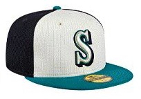
The three tones on this cap are the white used in the Mariners primary home uniforms, the navy blue used in their primary road threads and the “Northwest Green” utilized in their excellent alternate jerseys. Seattle has a tremendous color scheme, and though we prefer their current logo, this “S” is similar to the one that was their primary cap logo from 1987-1992.
9. Atlanta Braves
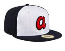
This takes the lowercase “a” that was on the Braves caps from 1972-1980 and updates it to the modern color scheme. We like it quite a bit. The only negative is it reminds us that Atlanta’s City Connect uniforms are kind of just a cheap knock-off of a classic look.
8. Chicago White Sox
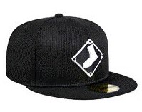
The White sock on a black baseball diamond is one of the more underrated alternate logos in baseball. Chicago introduced it in 1990, and it’s featured on the non-prominent sleeve (right for right-handed hitters or pitchers, left for left-handed hitters or pitchers) of the White Sox black alternate tops and their City Connect jerseys. We would argue this cap would be an improvement over their “CHI” City Connect hats.
7. Los Angeles Angels
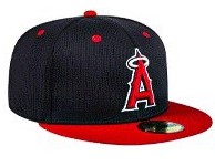
With the departure of Shohei Ohtani, it’s a tough time to be an Angels fan. Fortunately, they at least have this excellent cap to fall back on, which blends different eras in the franchise’s history. Could we see this cap on the field with the team’s 1970s throwback uniforms in 2024? Let’s hope so.
6. Philadelphia Phillies
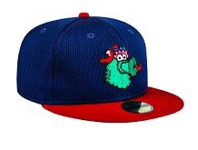
Bryce Harper said last season that the Phillies cream alternates are his favorite, and this cap kind of has a similar color scheme, only with the Phanatic replacing the “P.” Between Harper’s affinity for the creams and the Phanatic, he’ll probably be a big fan of this hat, which should make it a best-seller. This is positive uniform buzz for the Phillies after recent possible City Connect leaks didn’t get very good feedback.
5. Cleveland Guardians
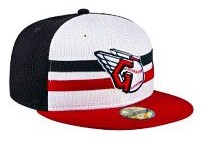
We would argue that when Cleveland rebranded as the Guardians in 2022, they missed an opportunity to try a new color scheme and move away from boring block C. (They also should have just become the Spiders, but that’s another conversation for another time). The best thing that came from the rebrand was this “G” logo that feels straight out of the 1990s (that’s a compliment). This cap, with the navy blue and red stripes behind the logo, is a tremendous pregame look.
4. Baltimore Orioles
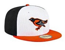
We’re bigger fans of the cartoonish bird that the Orioles have used for much of their history, including as their primary cap logo again since 2012. But the more realistic bird is cool too, including this one, which was worn from 1989-1997. And the Orioles have perfected the tri-colored cap, which is primarily white with black on the back and an orange brim.
3. San Francisco Giants
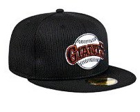
This is another cap that you can actually imagine people wearing in real life, let alone players while they take batting practice. San Francisco has one of the best brands in baseball, and this logo was the primary one used by the Giants from 1983-1993. When you see it, you just think of Will Clark.
2. Tampa Bay Devil Rays
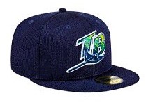
We’ve yet to hear a good reason why Tampa Bay dropped the “Devil” in their name and became just the Rays in 2008. And in recent years, they’ve tried to muddy the waters on whether their nickname refers to stingrays or the sun rays in Florida. These hats draw inspiration from what the Devil Rays wore in their first three seasons from 1998-2000, and remind you of how much cooler their branding was then than it is now.
1. Pittsburgh Pirates
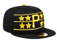
*Chef’s Kiss* This is a perfect modern take on the Pirates “pillbox” caps, which feature the stars that Hall of Famer Willie Stargell used to award to teammates “for important deeds.” As cool as the pillbox caps were, this hat style is more likely to be embraced by modern players and fans. These should definitely be worn during actual games.
