Ranking the Primary Logos of the Los Angeles Angels
Looking back through the history of the Los Angeles Angels, the Angels logo has taken on many different looks over the years.
Aesthetics are a subject of friendly debate within the baseball fanbase. Uniforms have been hit-or-miss (no pun intended), and so have logo designs — which certainly play a part in the overall looks.
Some franchises rarely, if ever, have tweaks or overhauls (see Yankees, Dodgers, and Cardinals). But for teams that make branding changes, we’ve critiqued the beauty behind their choices.
We last did the Toronto Blue Jays, and now we come to the team of Mike Trout and (formally) Shohei Ohtani. The Los Angeles California Anaheim Los Angeles Angels of Anaheim are one of a few teams that have changed names nearly as much as they’ve changed logos. They are also a team that hasn’t had a hideous branding switch to say nothing of the star-crossed nature of this franchise.
5. The Original (1961-64)
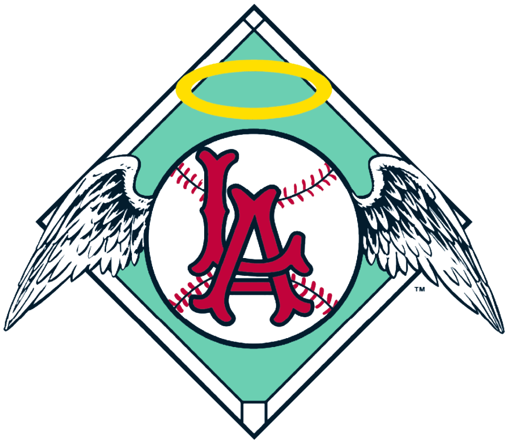
A few years after the Dodgers became the first major league team to settle in Los Angeles, their success prompted a decision to expand further in this burgeoning market.
After one season at another Wrigley Field, the Angels crashed at the Dodgers’ home for a few years (referring to Dodgers Stadium as ‘Chavez Ravine’). You can see an interlocking “LA” that the Dodgers made famous, albeit less blocky. It’s a bit busy, but the wings on a baseball and the halo over it leave no mystery about this team’s name. By 1965, they became the generic California Angels and naturally, the lettering on the logo was altered.
Who wore it best: Dean Chance, Bo Belinsky, Jim Fregosi
4. The Big A (1986-92)
I can’t help but feel that the more distinct halo landed on the ‘A’ during a ring toss game. The “Angels” text that goes down the state is gone and we are left with just the first letter.
The outline of the state is still there from the previous iteration of their logo, along with the star neatly tucked in. The baseball and seams make this a bit distracting and I wonder how it might look if it was just a plain circle.
Who wore it best: Chuck Finley, Mark Langston, Wally Joyner, Bert Blyleven
3. Current Day Big A (2005-present)
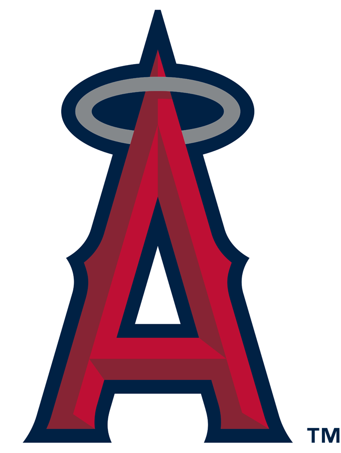
If you drive past Angels Stadium, you won’t be able to miss this enlarged image as a nearby roadside landmark (230 feet tall, actually). It’s been their main logo for nearly 20 years and it’s been part of the team’s images dating back to their one and only championship in 2002.
It’s simple, yet straightforward. But I’d say it’s time for a change. And since Ohtani’s has moved up the freeway, why not soon?
Who wore it best: Mike Trout, Shohei Ohtani, Vladimir Guerrero, Albert Pujols
2. Interlocked “CA” (1995-96)
The 1993-94 version is the exact same with the letters being inside a dark blue circle. That’s fine, but there’s a preference for the simplicity of this one they used for the next two seasons. It’s a call-back to the original logo (with the interlocking “C” and “A”) and less cluttered than that and other previous logos. No wings, no baseball, no diamond. Even the halo is a bit obscured in grey.
Who wore it best: Tim Salmon, Chuck Finley, Jim Edmonds, Lee Smith, Mark Langston
1. Clearly California (1973-85)
Like their first logo said “Angels” loud and clear, there’s no ambiguity here either. If you didn’t know where this team represented after looking at this then you probably haven’t seen a map of the U.S.
If you look at their logo from 1971-72, it will seem almost identical — except for one part: the “A” is an…”a.” As a stickler for proper English, it’s more sensible for the ‘A’ to be capitalized in this case.
The text fits perfectly within the state, the star indicating Anaheim, the halo hanging around the Oregon border. I wouldn’t call it a perfect logo. My preference would be for the halo to be over the ‘A’ instead of the upper northwest portion of the state. It’s more fun to look at than anything.
Who wore it best: Nolan Ryan, Don Baylor, Bobby Grich, Frank Tanana, Rod Carew, Reggie Jackson

Written by
Brian is the author of "The New York Mets All-Time All-Stars" and “Mets in 10s: Best and Worst of an Amazin’ History." He also freelances for…