Ranking the Primary Logos of the Seattle Mariners
Looking back through the history of the Seattle Mariners, the Mariners logo has taken on many different looks over the years.
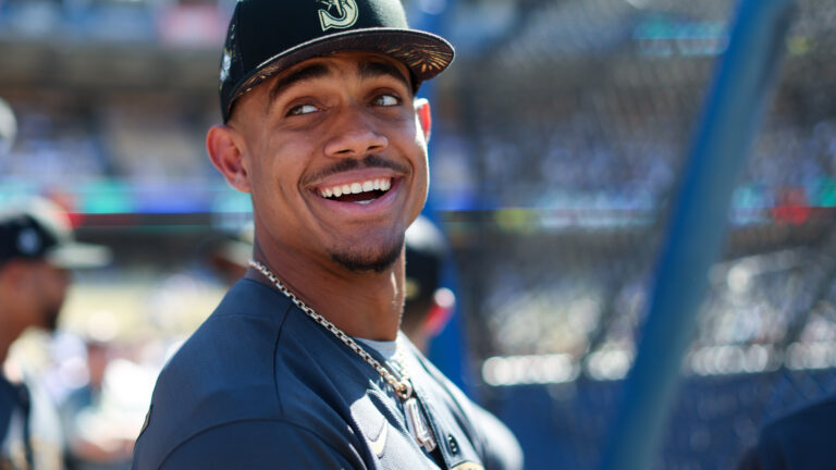
Aesthetics are a subject of friendly debate within the baseball fanbase. Uniforms have been hit-or-miss (no pun intended), and so have logo designs — which certainly play a part in the overall looks.
Some franchises rarely, if ever, have tweaks or overhauls (see Yankees, Dodgers, and Cardinals). But for teams that make branding changes, we’ve critiqued the beauty behind their choices.
We last ranked the team that is currently in Milwaukee but began in Seattle. Now, we continue with the current Seattle franchise. The Mariners may be the only current team without a World Series appearance, but they are one of a few teams with a pretty strong logo history from start to present.
We’re only ranking four since that’s how many primary logos have been used according to SportsLogos.net
4. Bronze Letters and Green Bats (1994-99)

Just 10 years after playing their first game, the Seattle Mariners introduced their third logo in franchise history while still maintaining the royal blue and yellow color scheme.
This logo features a royal blue M’s trimmed in yellow and blue on a royal blue and white baseball. Relatively speaking, compared to the others you’ll see, this is pretty boring. Luckily, the Mariners thought better of it after six seasons and went with a whole new pallet as well.
Who wore it best: Alvin Davis, Harold Reynolds, Ken Griffey Jr
3. The Nautical Look (1993-present)
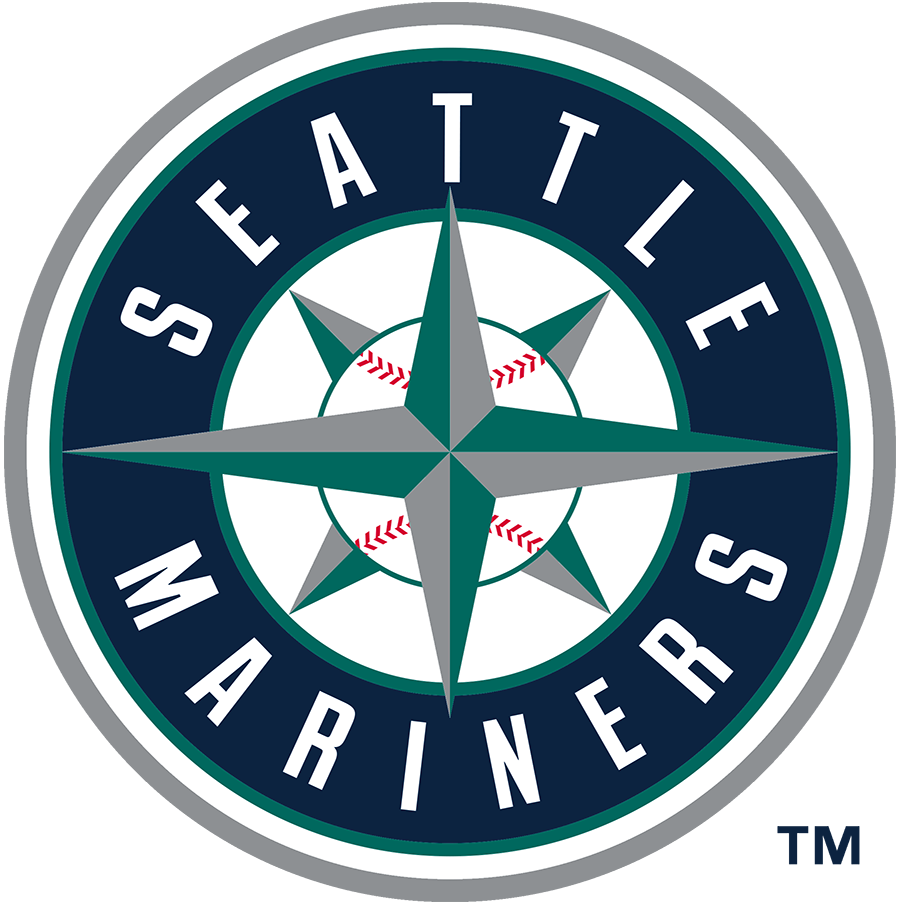
How can you not look at this and not think about Griffey, Edgar, The Big Unit, A-Rod, and Ichiro?
Even as the present-day Mariners still use it with star players of their own, there’s an easy connection to their past.
For its 17th season, the team exchanged royal blue and yellow for teal (aka northwest green) and silver. Now this logo is over 30 years old. There’s really no reason to abandon it yet. But the colors pale in comparison to what they had before.
Who wore it best: Ken Griffey Jr, Edgar Martinez, Randy Johnson, Alex Rodriguez, Felix Hernandez, Julio Rodriguez
2. The Trident (1981-86)
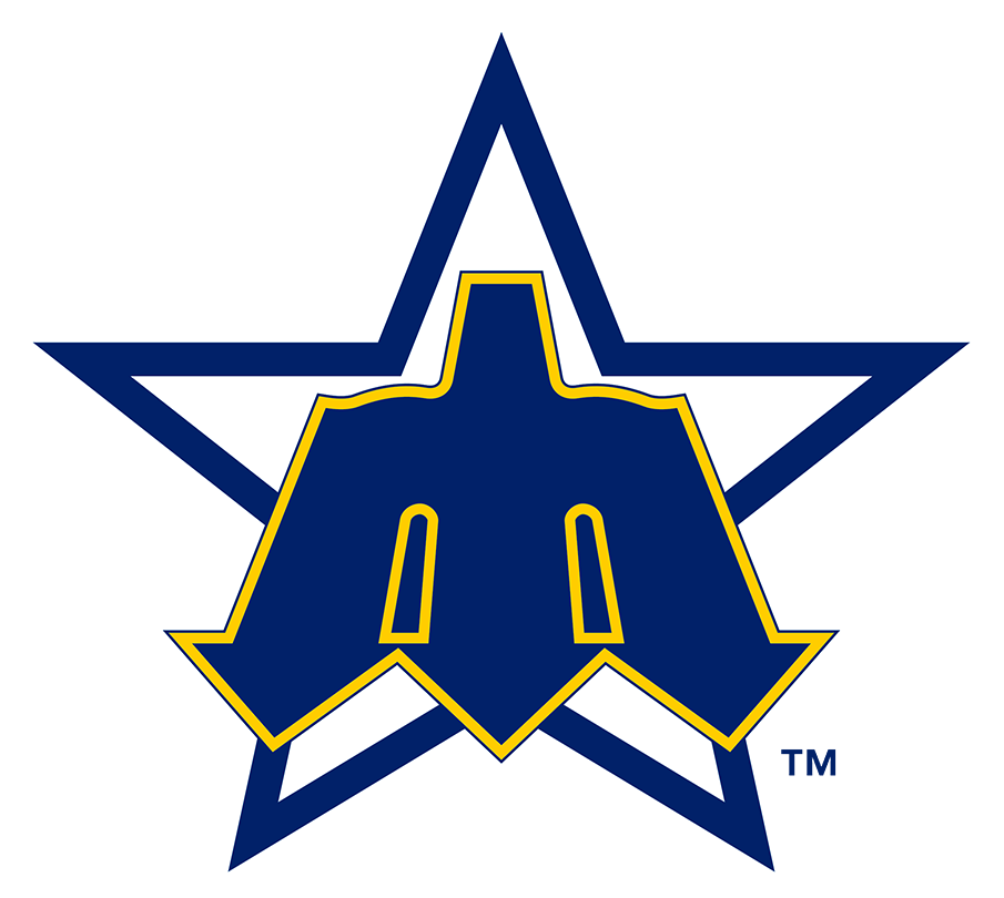
The Mariners’ second logo technically debuted for their fifth season in ’81, was the logo was also used for the 1979 MLB All-Star Game at the Kingdome. Turning around the trident and making it into a lowercase “m” and having it trimmed in yellow is beautiful.
The star might be a little extra, but others might say differently. This came during some pretty rough times as the franchise was still searching for relevancy. At least they were winning at logos!
Who wore it best: Alvin Davis, Mike Moore, Matt Young
1. Maiden Voyage (1977-80)
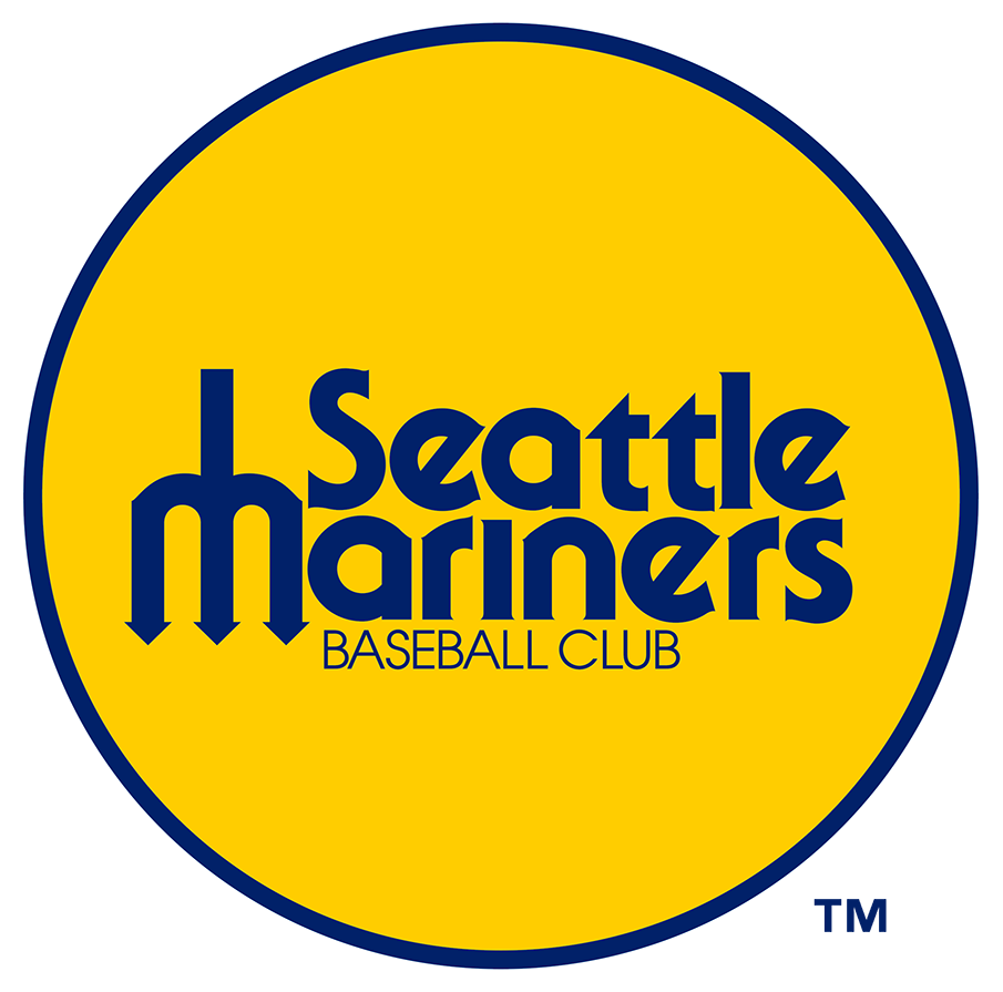
The early Mariners had little to show for themselves except being a brand-new franchise for fans in the northwest and sporting a unique look. Again, the upside-down trident is what makes this work so well. Not only does this “m” look more realistic, but having it be accompanied by the entire “Seattle Mariners” text as opposed to standing alone makes it add to this logo’s appeal.
The font is also very late 70s. Unfortunately, this was dropped after four seasons even if it had a pretty good replacement
Who wore it best: Ruppert Jones, Floyd Bannister, Bruce Bochte
