Ranking the Different Team Logos of the Baltimore Orioles
Dating back to 1954, the Orioles have changed their logo many times across their history. Which version of the Orioles logo has been the best?
Aesthetics are a subject of friendly debate within the baseball fanbase. Uniforms have been hit-or-miss (no pun intended), and so have logo designs — which certainly play a part in the overall looks. Some franchises rarely, if ever, have tweaks or overhauls (see Yankees, Dodgers, and Cardinals). But for teams that make branding changes, we’ve critiqued the beauty behind their choices.
We begin with the various bird calls in Baltimore since 1954, ranking the top five primary logos. The titles and images are courtesy of the team’s website.
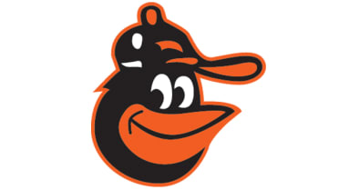
5. The Lifelike Bird (1998-2008)
Die-hard birders will appreciate the authenticity even as most may find the subtle changes insignificant. It’s an update of the ornithologically correct bird that debuted eight years before this one arrived. According to the team website, the Orioles found this bird a more lifelike interpretation. The mood this bird brings is one of seriousness and sternness as opposed to the joyful nature you see today and in the past. There would be no opposition to bringing this back as an alternate.
Who wore it best: Mike Mussina, Cal Ripken, Jr, Melvin Mora, Miguel Tejada
4. The Lead-off Bird (1954-62)

This realistic-looking bird adorned the team’s caps for the Orioles’ first nine seasons since moving from St. Louis. The former Browns managed just two winning seasons with this logo, but our rankings have no bearing on team success. The later versions of the lifelike bird are an homage to this design.
Who wore it best: Hoyt Wilhelm, Jim Gentile, Brooks Robinson
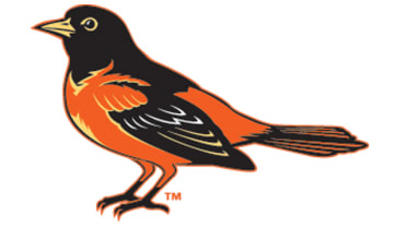
3. The Cartoon Bird (1966-89)
Which legendary Oriole didn’t have this on their cap?
This logo encompasses the glory years of the franchise. The colors of the caps may have changed: black, orange, and white. But the bird was a symbol of excellence. Whatever intimidation is lacking from this feathered friend was made up for as the Orioles began their reign over the American League. As far as their opponents were concerned, there was nothing funny about this look.
Who wore it best: Brooks Robinson, Frank Robinson, Jim Palmer, Earl Weaver, Boog Powell, Cal Ripken, Jr.
2. The Ornithologically Correct Bird (1989-97)
After a dreadful 1988 campaign, it was a given that the Orioles would undergo a significant change. Who knew the rebuild would include their look? While the colors stayed the same, the bird was far more realistic. As someone who grew up in the 90s, there is a fondness for this design. It was what they wore when Memorial Stadium closed and Camden Yards opened.
A note about the ’89 Orioles: they had a spectacular turnaround and nearly won the division. Can we say for certain it was because of the logo change? Sure, why not?
Who wore it best: Cal Ripken, Jr., Mike Mussina, Rafael Palmeiro, Brady Anderson
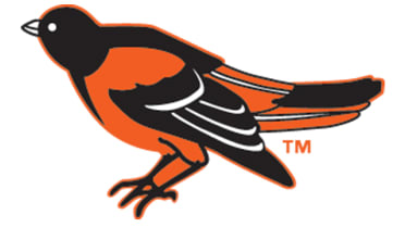
1. The “New” Cartoon Bird (2012-present)

This is not recency bias. It’s a tribute to those glory days of Brooks, Frank, Jim, and Earl. Except they made it better. The new bird borrows elements from the cartoon bird of the 60’s and 70’s, with refined details.
Except for the few disappointing days/nights when “O’s” is on the hat, you can see this in just about every Orioles game. It’s all the more pleasing now that Baltimore is an American League contender again. Never change these feathers.
Who wore it best: Manny Machado, Cedric Mullins, Adley Rutchman, Gunnar Henderson

Written by
Brian is the author of "The New York Mets All-Time All-Stars" and “Mets in 10s: Best and Worst of an Amazin’ History." He also freelances for…