Ranking the Different Team Logos of the San Diego Padres
Looking back through the history of the San Diego Padres, the Friars logo has taken on many different looks over the years.
Aesthetics are a subject of friendly debate within the baseball fanbase. Uniforms have been hit-or-miss (no pun intended), and so have logo designs — which certainly play a part in the overall looks. Some franchises rarely, if ever, have tweaks or overhauls (see Yankees, Dodgers, and Cardinals). But for teams that make branding changes, we’ve critiqued the beauty behind their choices.
We continue with the Padres, who have done something of a 360 since starting in 1969. In between, they’ve not just changed logos but colors as well.
5. Brown and Orange Script (1985-89)
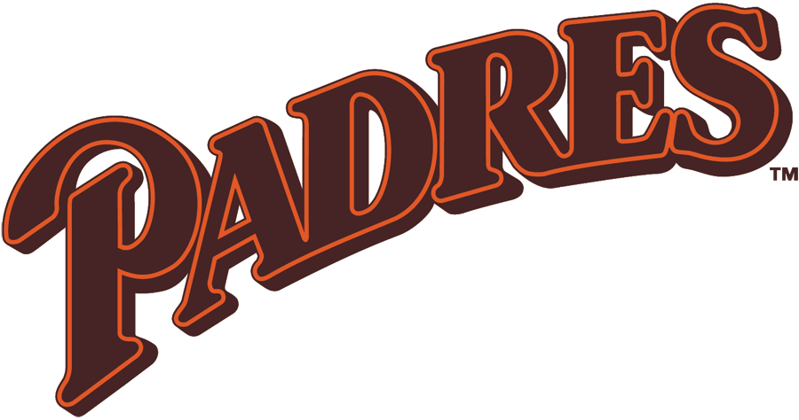
After their pennant-winning year of 1984, the Padres decided against keeping the same mojo and instead went for a total rebrand. Gone was the yellow. In came the orange outline. Gone was the swinging friar (he’s a favorite of ours as you’ll read about). In came…letters.
If we were to judge this among all logos beyond the Padres, this doesn’t sit very high. But in terms of what the Pads provided, it makes its way on the list.
Who wore it best: Tony Gwynn, Kevin McReynolds, John Kruk, Mark Davis, Roberto Alomar
4. Primarily Navy (2012-14)

Sometimes a logo looks much better because of the eyesore that precedes it. Here we have a straightforward, clean look that leans heavily on the navy. Nothing special, but when you see what they used before — a script “Padres” with a large wave beneath it and accompanied by a set of uniforms that includes a tan outfit, I’ll take this any time. The city’s heavy military presence makes this an even more fitting logo.
Who wore it best: Cameron Maybin, Chase Headley, Chris Denorfia
3. Dark Blue and Orange (1992-03)
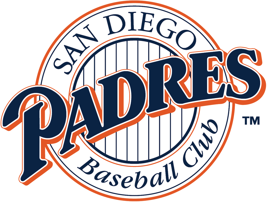
Take that brown and orange script logo from the mid-to-late ’80s, change the brown for dark blue, put a crest around the text with “SAN DIEGO” and “Baseball Club” around it and…viola! If you look at the franchise’s logo history, they did have one season with the same design but holding on to the brown-and-orange combo (1990) before eventually getting what you see here two years later.
Who wore it best: Tony Gwynn, Fred McGriff, Gary Sheffield, Trevor Hoffman, Ken Caminiti, Greg Vaughn, Kevin Brown
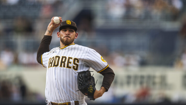
2. Updated Classic Look (2020-present)
A common practice, especially lately, among franchises is to turn back the clock with their look but put a modern spin on it. In other words, go forward while paying tribute.
The interlocking “SD” has been the staple of the Padres since the start and has always been a part of the hats, only varying in shades. The logo doesn’t do their current scheme any justice. The nod to the past is not for everyone, but we’re here giving it a standing ovation.
Who wore it best: Manny Machado, Fernando Tatis, Jr, Juan Soto, Blake Snell
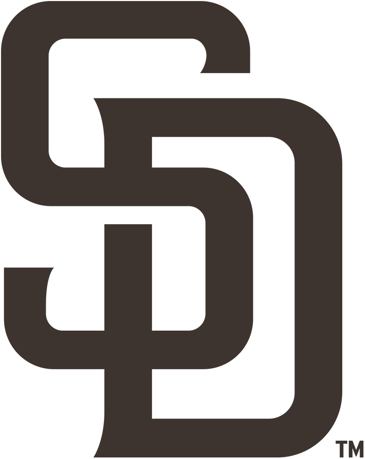
1. The Swinging Friar (1969-84)
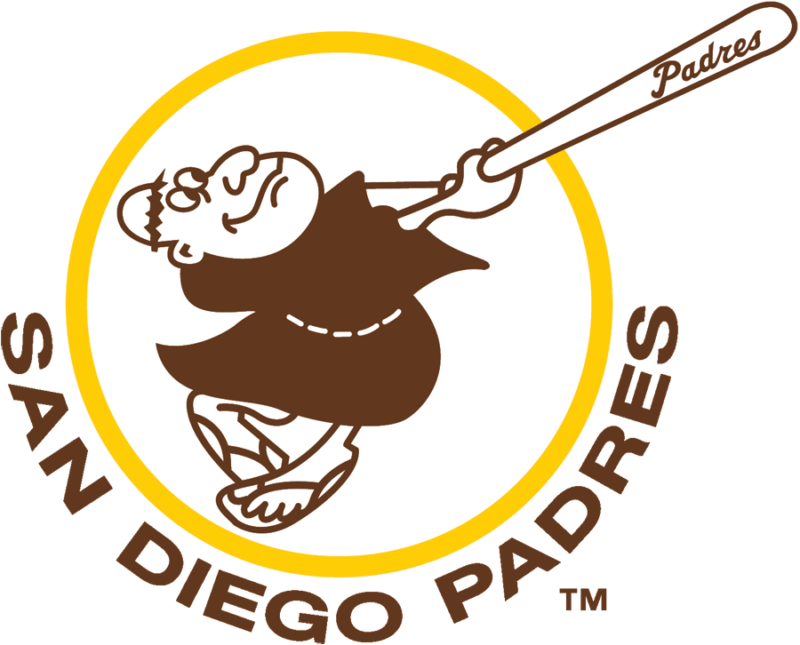
Brown and yellow don’t sound like it would make for a satisfying color combination. And in fairness, it’s not for everyone. I can understand if you detest brown as a main color, but there’s something about the original and the rather tacky uniforms that usually went with them.
It’s from this era that the present-day Padres have honored and I couldn’t be happier. And in proving that what’s old is new again, the current Padres uniforms include this logo as a sleeve patch.
Who wore it best: Dave Winfield, Randy Jones, Ozzie Smith, Steve Garvey

Written by
Brian is the author of "The New York Mets All-Time All-Stars" and “Mets in 10s: Best and Worst of an Amazin’ History." He also freelances for…