Ranking All Five Current Nationals Uniforms From Worst to Best
From the reds, whites, and blues to the cherry blossom City Connects, Just Baseball ranks the uniforms worn in our nation's capital.

In 36 seasons, the Montreal Expos weren’t a particularly successful franchise in terms of wins and losses, finishing with a record of 2,753-2,943-4 (.483) and just a lone playoff appearance in 1981.
However, between 1969-2004, the Expos donned one of the greatest logos in sports history on their caps. Montreal also had tremendous road uniforms, including a powder blue one they wore from 1969-1991 and one of the best road grays baseball has ever seen from 1992 until their final season as the Expos in 2004. In 2005, the Expos relocated to Washington, D.C. and became the Nationals.
On July 6, 2019, the Nationals did wear the aforementioned powder blue Expos uniforms for a home game in D.C., but since relocating, the Expos brand has largely been retired in favor of the “Curly W” once associated with the Washington Senators. While we hope that one day the Expos brand will return to baseball on a full-time basis, here’s a ranking of the Nationals’ five current uniforms from worst to best:
No. 5: White Home Uniforms
Though they sometimes drew comparisons to the drugstore Walgreens, the white home uniforms that the Nationals sported from 2011-2021 — which featured the Curly W on the left chest and a player’s number just below their right rib — were pretty clean.
In 2022, the Nationals made these their primary home uniforms, and while the matching navy blue road alternates have drawn rave reviews, these white home uniforms feel like something that shouldn’t be worn outside of Spring Training. The three-toned hats with a “W” inside two stars and over top of the outline of the United States Capitol building are especially amateurish.
No. 4: Red Home Alternates
With the Cincinnati Reds, Philadelphia Phillies and St. Louis Cardinals, the National League didn’t really need another team with red as their primary uniform color. But these red alternate tops with the Curly W on the front are non-offensive, especially since they are worn at home with the red caps instead of the current primary home ones mentioned (critiqued) above.
No. 3: Gray Road Uniforms
Teams like the Seattle Mariners and Tampa Bay Rays have altogether ditched their road gray uniforms to comply with Nike’s controversial “4+1” rule. Thankfully, though, the Nationals haven’t.
Introduced in 2009, these grays have a classic feel because of the horizontal cursive “Washington” script across the chest. In 2011, the Nationals topped it off perfectly by adding a red brim to their blue road caps, so no one can suggest that there’s not enough color in the primary road look for Washington.
No. 2: Navy Blue Road Alternates
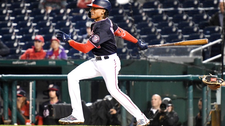
We know, we trashed the matching white tops above. But as a road alternate, we’re big fans of the matching navy blue versions. The best part is that the Nationals matte navy blue batting helmets with a red brim really pop with these uniform tops. And the navy blue tops will forever be remembered as being good luck during D.C.’s 2019 World Series run.
No. 1: City Connect Uniforms
Nike’s City Connect program has probably produced more duds than hits, but the Nationals CC jerseys are tremendous. The light gray uniforms with “WSH” across the chest and cherry tree blossoms underneath are excellent, and while CC uniforms have only been worn at home to this point, these could very easily also be mixed in on the road. As is, the Nationals are “back in bloom” for Friday and Saturday home games, which includes the excellent matte gray batting helmets.
