Ranking All the Current Royals Uniforms from Worst to Best
Royal blue is a fitting color for Kansas City, but the Royals' uniforms look their best in a different shade of the team's signature hue.
The Royals have it easy. Royal blue has been a color for centuries, and a gorgeous one too. Plenty of sports teams wear blue these days (perhaps too many), but few deserve their signature color more than Kansas City.
Royal blue is a great baseball color, and Kansas City wears it with style. It’s a big reason why the Royals’ uniforms have remained so consistent over the years. There’s no need for a rebrand if what you’re already rocking works so well.
The Royals might not be very good in 2023, but at least they have some exciting young players to keep an eye on. To that point, watching guys like Bobby Witt Jr. and Maikel Garcia is even more fun when they’re wearing their nicest clothes. There’s nothing like watching two young studs turn fantastic defensive plays in their powder blues.
But more on those in a moment. First, we have to talk about all the other looks in the Royals wardrobe.
5. City Connects
I’m not from Kansas City. I’ve never been to Missouri. So if any locals are reading this who disagree with my rankings, please feel free to explain what I’m missing. But these are just… weird.
White pants with powder blue belts are cool. The white-blue-white trim on the sleeves is fun and quirky, in a candy stripe kind of way. But the jerseys themselves are super strange.
First things first, the number looks weird on the left side. It draws your eyes to the number before the logo, when the opposite should be true. The Royals aren’t the first team to try this layout (the Pirates, for example, have numbers on the left side of their home black uniforms), but there’s a reason the vast majority do it the other way. Besides, the Pirates still make it work with a logo that’s so much bigger and more interesting than the number.
This brings me to my other primary criticism: The logo is bland. It’s bland as dry toast. It’s supposed to be inspired by the fountains of Kansas City (a fantastic idea, by the way), but it’s about as majestic as a drinking fountain.
The fountain at Mill Creek is iconic. The Henry Wollman Bloch Fountain is remarkable. The Boy And Frog fountain is ridiculous and adorable. And I’m positive someone who actually lives in Kansas City and didn’t just google “best fountains KC” could probably tell you a whole lot more.
I’m also positive that a few white lines shaped into letters don’t do any of those fountains justice.
Oh, and don’t get me started on the caps. The Kansas City Royals have used the same logo for more than fifty years, and this is what they abandon it for? George Brett must be so disappointed. Either that, or he’s just glad he never had to wear one of these things.
4. Dark Blue Alternates
I like solid-colored alternates, and I like royal blue, but I don’t like these. Simply put, they’re boring! The lettering is dull, the curved text is uninspired, and, to be honest, they look more like high school jerseys than MLB apparel.
To make things worse, these are road alternates, which means the Royals wear them with gray pants. Solid-colored alternate jerseys always look better with white pants, and I stand by that.
To top it all off, the Royals used to have such excellent road alternates, and they threw it all away. Such a shame, such a shame.
3. Road Grays
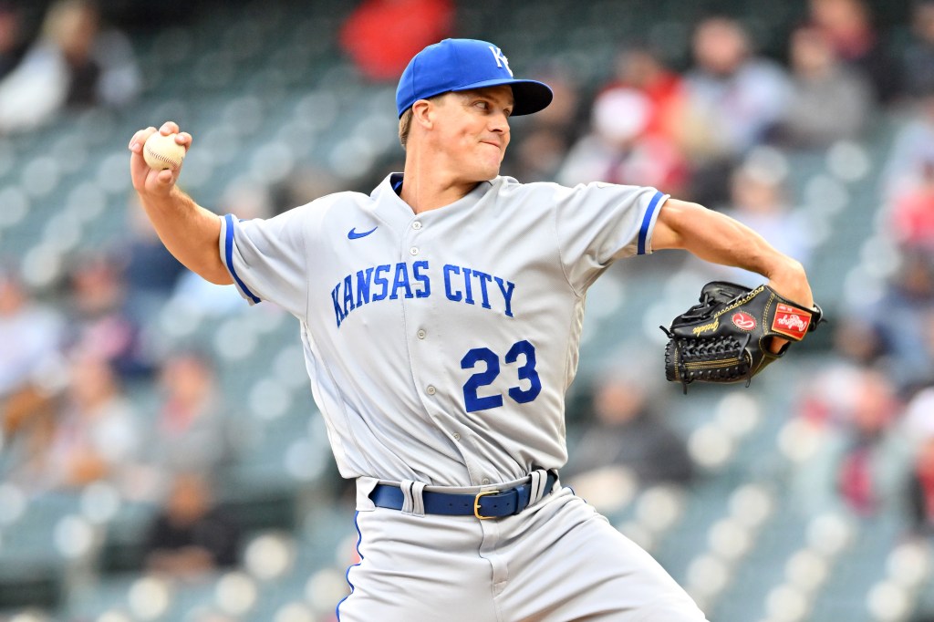
This look is pretty boring too – it’s the same style as the dark blue alternates – but it’s not quite as offensive in full gray. After all, gray road uniforms are allowed to be boring; it comes with the territory.
What’s more, at least gray jerseys look good with gray pants. I’d go so far as to say gray is the only color of top that should be paired with gray bottoms. (In baseball, that is. Please don’t take any real-world fashion advice from me.)
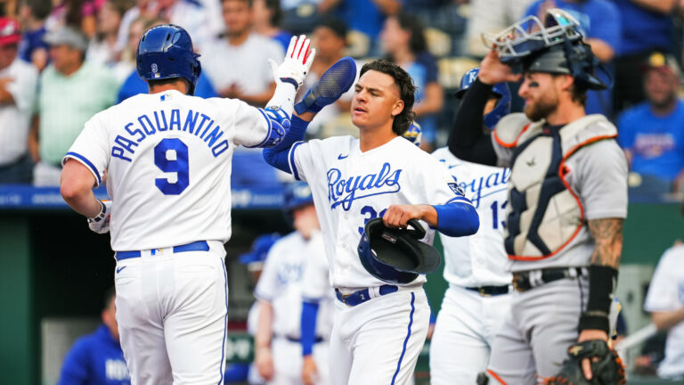
2. Home Whites
White uniforms can be some of the best in the game, but there’s a thin line between clean and boring. Thankfully, the Royals keep it sharp with a gorgeous royal blue accent color, a dignified cursive script, and blue stripes along the pant legs and shirt sleeves, which really tie the whole look together.
I’m not wild about the “KC” logo on the caps, but I do respect that the Royals have worn the same caps since their inaugural season in 1969. Still, if it were up to me, the Royals would turn their spring training hats from 2016 into their regular home headwear. Keep the KC, but spice it up a bit, you know?
1. Light Blue Alternates
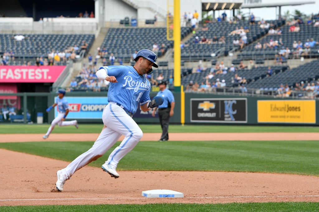
I have mixed opinions about powder blue jerseys. When they work, they really work. Just look at the Phillies and the Blue Jays. On the other hand, when they don’t work, they can be a major eyesore. I rest my case with the Twins, and yes, the Cardinals. (Controversial, I know.)
Powder blue isn’t white or grey. It doesn’t go with every color. Moreover, a powder blue jersey is at its best when it isn’t overcrowded; let the powder blue be the star of the show, and everything else will fall into place.
The Royals keep it simple, with white lettering and white pants, and it works so well. The stripe down the pants – a classic Royals touch – looks extra sharp in powder blue. In fact, I like the stripe so much more than the full powder blue pants the Royals used to wear.
If I could change one thing, it would be the caps once again. As I said, I respect the consistency, but I think it would look nice if Kansas City switched things up to accompany a great alternate look. How about powder blue hats with dark blue brims? Or royal blue hats with the full team logo? I’m just spitballing here!

Written by
Leo Morgenstern is one of the managing editors for Just Baseball. He is also the managing editor at Jays Centre. His writing has appeared all over…