MLB Uniform Rankings for 2026
Our annual top MLB uniform list ranks every team's baseball jerseys (from worst to best) for the 2026 season!
As a kid, did you ever pick your favorite team solely based off their uniform? Be honest. I know this is fairly common based on the amount of Oregon Ducks gear I saw in the early to mid-2000s in my home state of Kentucky.
Whether it’s iconic staples that never change and ooze tradition or the new flashy jersey, sports uniforms matter.
They catch your eye, establish your wardrobe, and serve as the focal point of your team’s historic moments. Major League Baseball, historically, has been rather conservative and traditional in its uniforms over the years.
Pinstripes with the Yankees, simple but bold Dodger knits, the old English D in Detroit.
Recently, with the introduction of the city connect series, MLB has dipped its toes into more vibrant and youthful designs as a way to sell more merchandise attract a younger crowd.
Haven’t seen the 2026 edition? We have you covered here. While some have been atrocious over the years, overall, the City Connect implementation has been a success. A welcome change.
No matter how long a team’s uniform has been around or how frequently they change, the same question comes up: Who has the best?
Today, I’ll rank the uniforms, from worst to first, to settle the questions. At least for now.
MLB 2026 Uniform Rankings: Worst to First
30. Miami Marlins
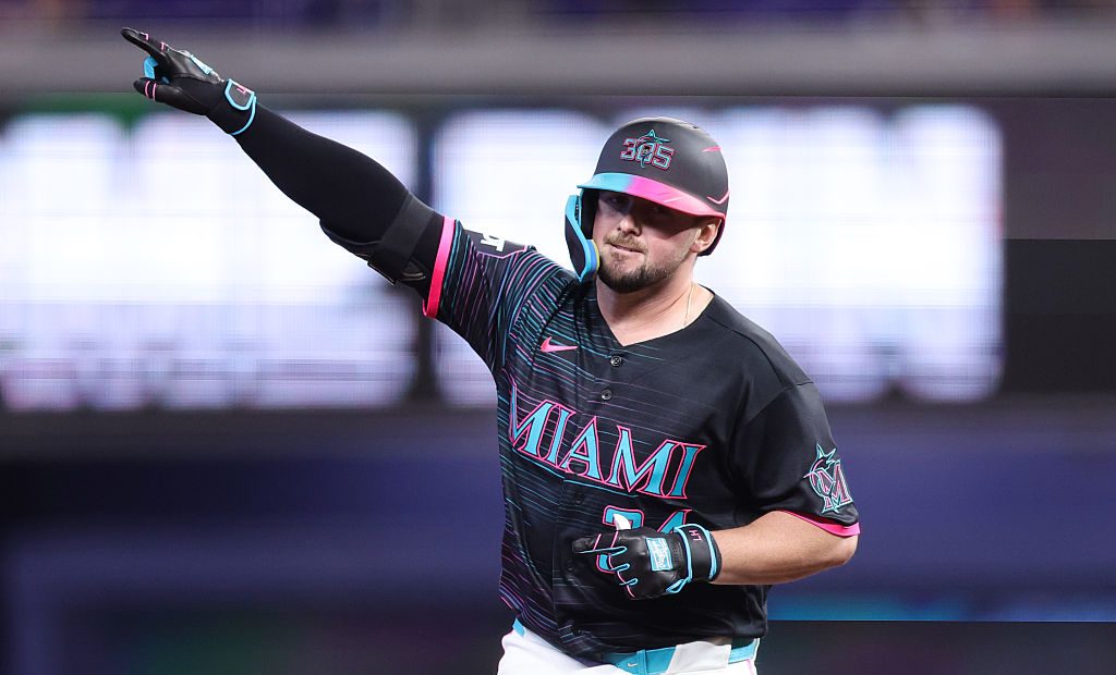
The Marlins’ moving away from their old school teal and fish logo was a mistake, and they know it. I’ll give them credit for bringing it back as an alternate, but it should be primary.
The current uniforms have too much emphasis on black, and the script across the jerseys is outdated. Does anyone like the “M” logo? Overall, these are better than the 2012-2018 era, but far from good. The fix is easy – go back to the original “Florida” Marlins look.
29. Cincinnati Reds
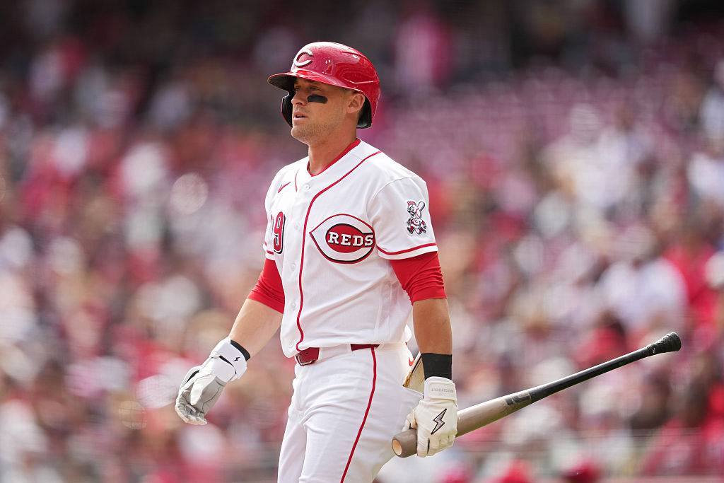
Cincinnati has been due for a jersey redesign for some time. The current look screams 2010 and is outdated enough to be noticeable, but not enough to feel nostalgic.
In 2019, they wore all the uniforms of their past in celebration of 150 years, and all were arguably better. Cincinnati is the home of the first baseball team and deserves a more traditional, timeless look to match. The current uniforms resonate with a bland era of Reds baseball and need to be changed now that the direction has.
28. Cleveland Guardians
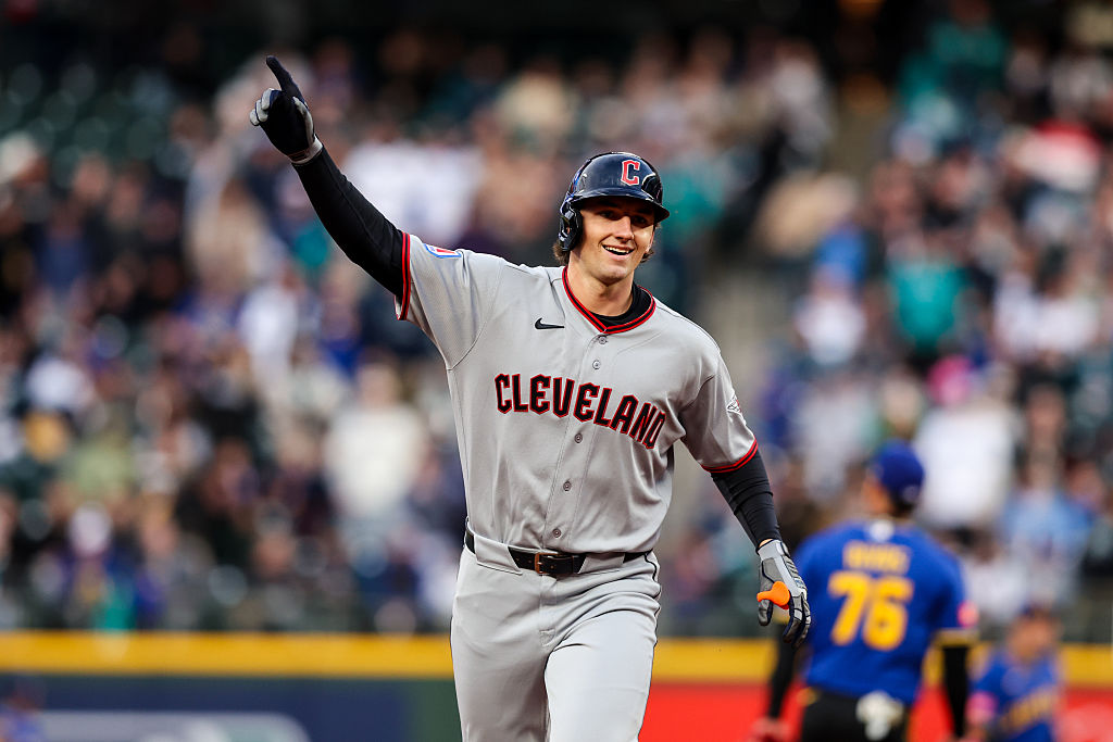
The Cleveland redesign of the Guardians feels like it did not get enough attention.
A rushed product and name that does not seem to resonate with many people. Their City Connects were lazy, which matched their overall theme.
A great color scheme helps, but overall, everything about their uniform is forgettable. What lifts them past the Reds and Marlins is the fact that they at least feel more modern.
27. Washington Nationals
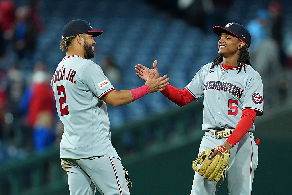
There’s a lot you can do with being the nation’s capital, and the Nationals have not capitalized. The logo notoriously reminds everyone of their corner pharmacy, while the alternate logo falls flat.
Have you ever seen anyone walking the street in a Nationals cap?
That should tell you enough. I do like the even use of red, white, and blue, but feel like they are due for a redesign once the team turns the corner of their rebuild. Let these lay with the World Series team and establish a new look moving forward.
26. Los Angeles Angels
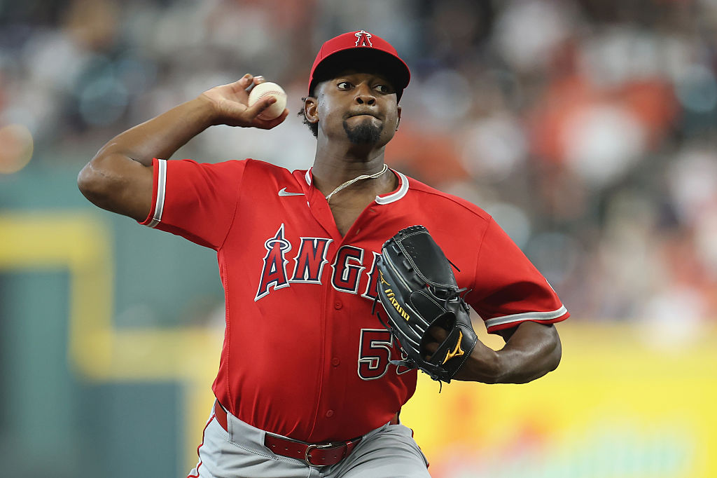
I could be skewed by seeing so much mediocre baseball associated with these uniforms, but perception is reality, right? I prefer the throwback uniforms with the simple “Angels” across the chest and the use of the red and navy belt.
They could get away with a little more navy and an updated font. The current color scheme is very one-color-centric and the move away from any yellow, which at one point was used for the halo, is disappointing.
25. Chicago White Sox
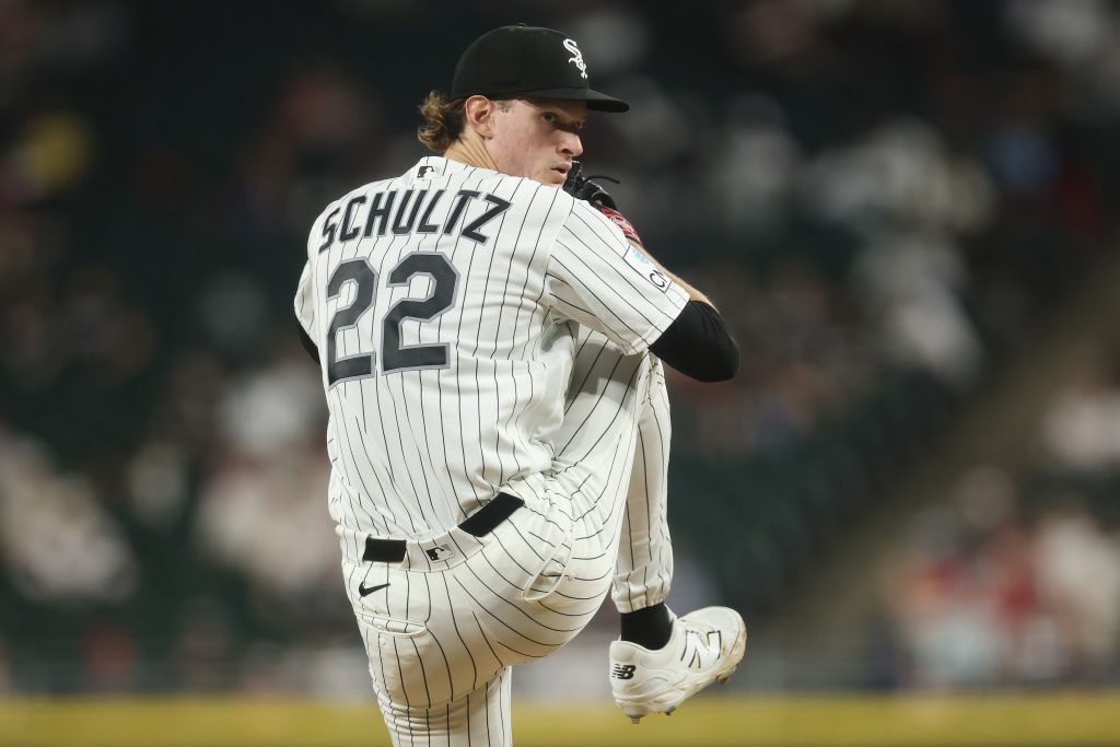
We have reached our first pinstripes of the list and a new tier in the rankings. The Chicago White Sox have a clean look with that fine jersey, paired with a logo that is due for an update. Nothing about their uniform is necessarily bad, but nothing catches your eye. You could say that about some other teams who are higher in the rankings, but the traditional and historical relevance carries value.
24. Kansas City Royals
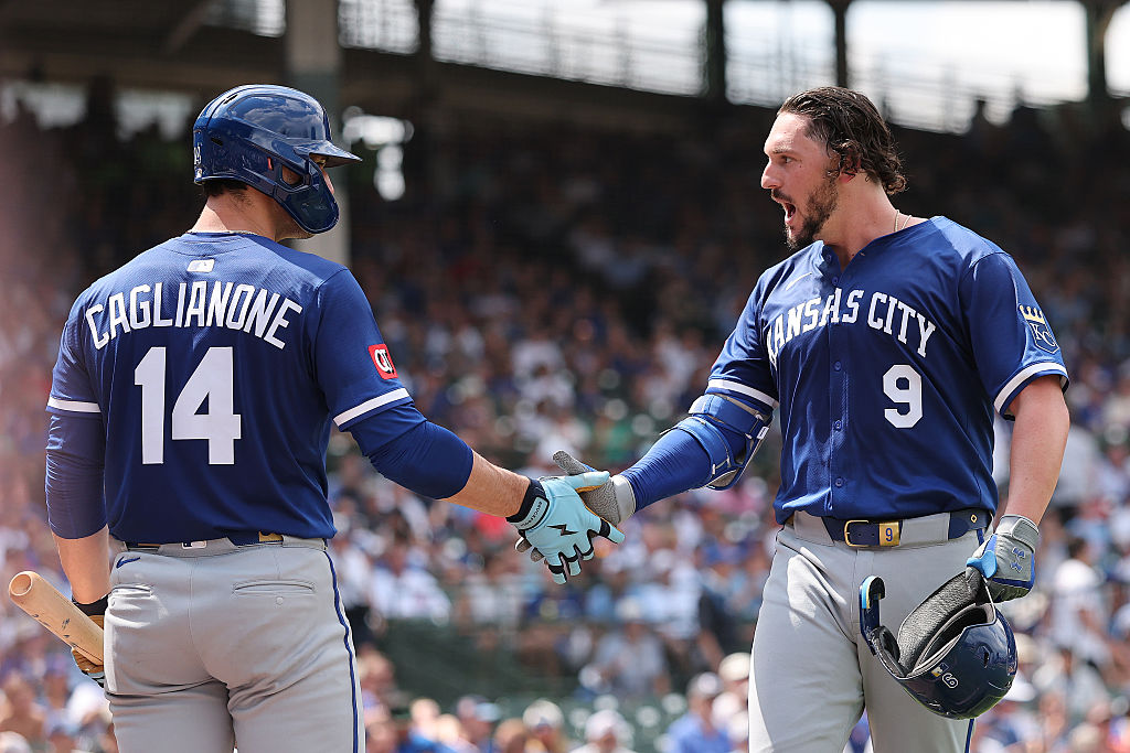
Kansas City checks the box of having alternate jerseys that I, and many others, appreciate. Similar to the White Sox, the Royals do not need major changes and fall into the perfectly fine category without much significance. For a team that is named the Royals, and does use a crown, I wish the crown/gold was a bit more emphasized within their uniform.
23. Tampa Bay Rays
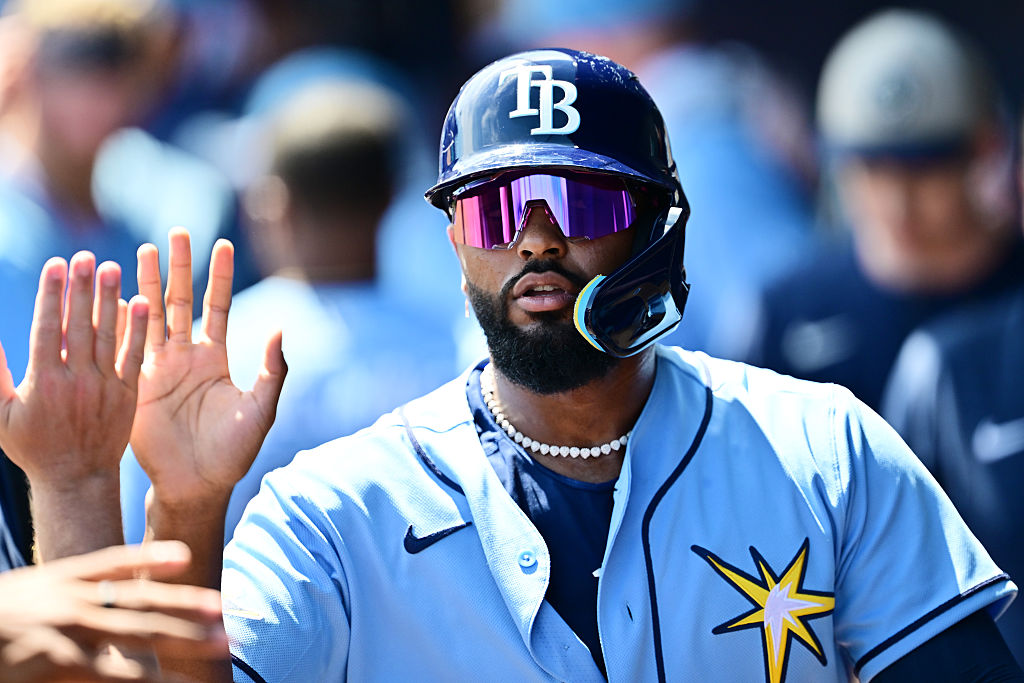
Tampa Bay moving away from the Devil Rays aesthetic was a major step in the right direction. While their font is outdated, the way they have used the star (if you will) to add something to their jerseys and lift their alternate logo. I love the powder blue, which you will hear more than once in this article. The contrast with their navy is a good look. While I do not dislike their logo, it certainly could be bolder, considering how safe their jersey design is.
22. Texas Rangers
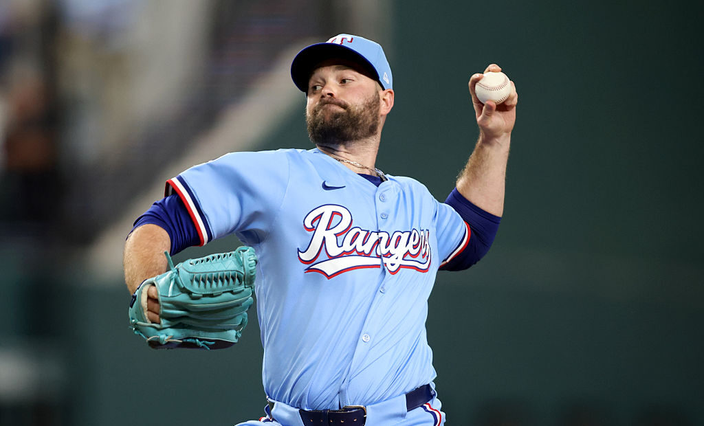
Welcome to the next tier. The Rangers have done a great job of feeling very Texas, both with their font and color scheme. I don’t like the script “Rangers” on their home uniform, and the newest city connect is a flop. The alternate uniforms, both red and powder blue, are nice. You might notice we are currently having a run on powder blue alternate uniforms.
21. Minnesota Twins
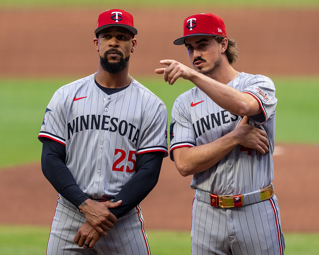
The Twins do a few things well. The red, navy, and….yes, powder blue… are all aesthetically pleasing looks. The script Twins across the jersey have managed to bridge the gap from classic to modern in a way few scripts can.
However, the “TC” logo is a mess. The same “C” as Cincinnati, layered with a “T” that has no character, doesn’t do it for me. The state of Minnesota is shaped in a way that works for sports logos, yet it is not used nearly enough.
20. Seattle Mariners
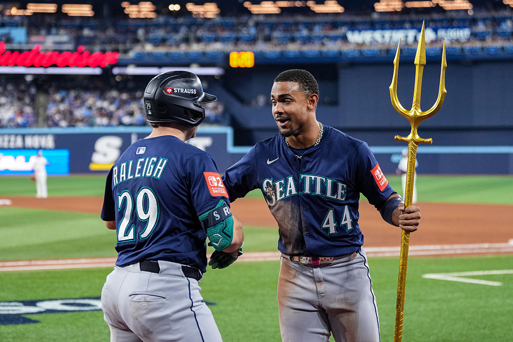
I’ll say the Mariners were the hardest team for me to rank. Ask me on a different day, and they would be much higher. I love the color scheme and their use of it in their alternate jerseys. I don’t love the silver in their name, even if their logo is great. The Mariners are seesawing between classic and outdated, which makes it difficult for me to place them.
19. Colorado Rockies
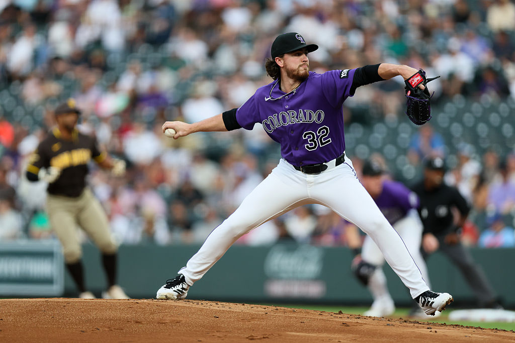
You will see mixed reviews on the Rockies, but I probably like them more than most. I tend to have a soft spot for teams with a color scheme that goes against the grain, and the Rockies have that with purple, and they lean into it.
I would prefer a logo that incorporates the iconic mountains, but the pinstripes help lift the Rockies up the list. A rare situation where I like the current look enough, but would welcome a redesign.
18. Pittsburgh Pirates
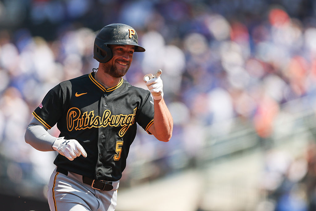
The city of Pittsburgh has all of its sports teams aligned in color, which gives them bonus points.
Something about these jerseys feels like the city, and I can appreciate that. The “P” logo matches the pirate theme, and the alternate logo of the pirate head is great. I would like to see it used in a bigger way, and the Pittsburgh script is a bit too long to work, in my opinion. A solid uniform, but not spectacular.
17. Baltimore Orioles
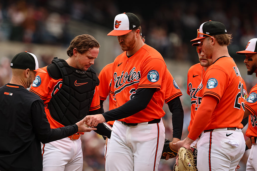
We have entered the next tier of jerseys. You could argue the “Orioles” script is one of the best in the game. However, “Baltimore” does not hit in the same way.
A fantastic color scheme and perfect use of both orange and black, but the current bird logo is too cartoonish for me, and I’m also not a big fan of the hats. A couple of small adjustments would shoot Baltimore up this list.
16. Milwaukee Brewers
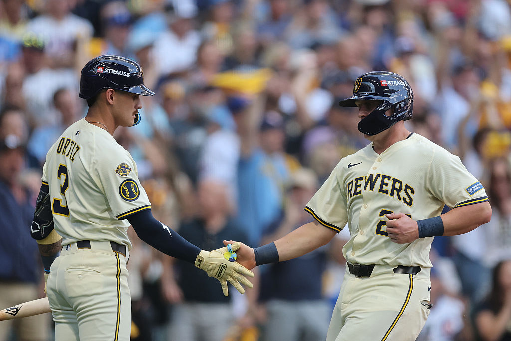
The Brewers have a little bit of everything. Pinstripes, a retro logo that works, a nice color scheme, and a font that doesn’t work. I think these would be better if the name/city across the front had a few changes, maybe using the glove logo on the chest. As far as their city connects go, yikes.
15. Arizona Diamondbacks
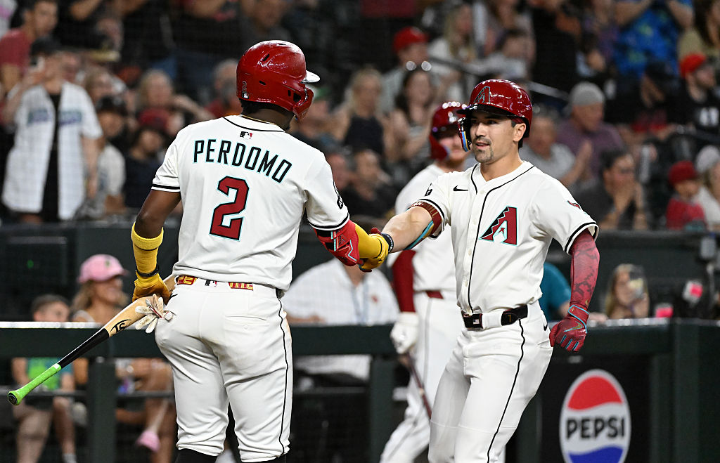
Arizona is where I’m sure I’ll get the biggest disagreement. Many people dislike this look, but I think it works. The color scheme is different and matches the desert feel and their “A” logo is perfect.
I’m not big on the “D-Backs” across the chest, but I’ll give them credit for the creative use of snake fangs in the font. Improvement on their secondary logos would go a long way.
14. San Diego Padres
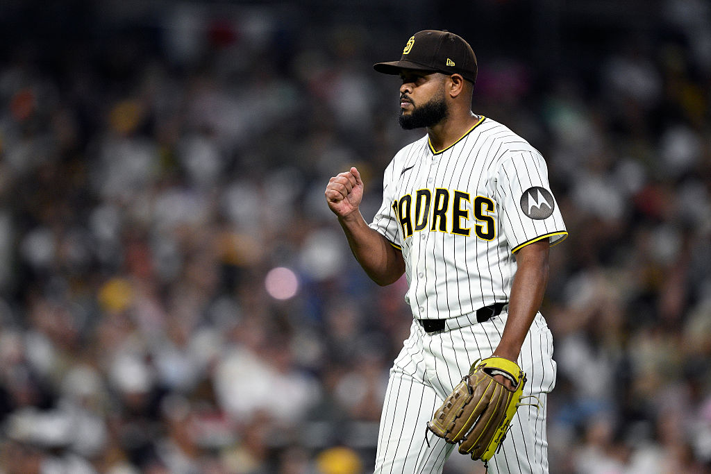
The Padres logo is one of my favorites in baseball. It’s simple, but it fits so perfectly. I really like the Friars logo on their sleeves, and the pinstripes go so well with their color scheme. I have always appreciated their military uniforms, which connect well to their city.
However, I’m not the biggest fan of the brown uniforms. I don’t hate it, but it reminds me of UPS, which always gives me a strange feeling.
13. Houston Astros
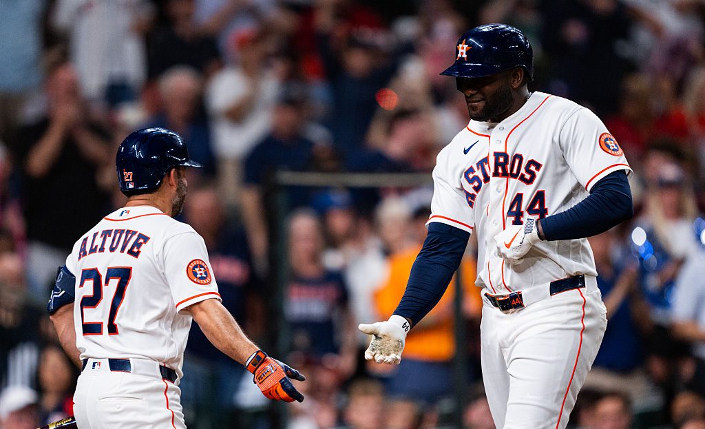
The Astros might be much lower on your list, but I really like what they have going on. The color scheme is so, so good, and the orange alternate jerseys are one of the more underrated in my mind. The logo works, the hat is great, and the simplicity works.
I get it if it doesn’t do enough for you, but for some reason, these always stand out to me. Although a font change wouldn’t hurt my feelings.
12. Atlanta Braves
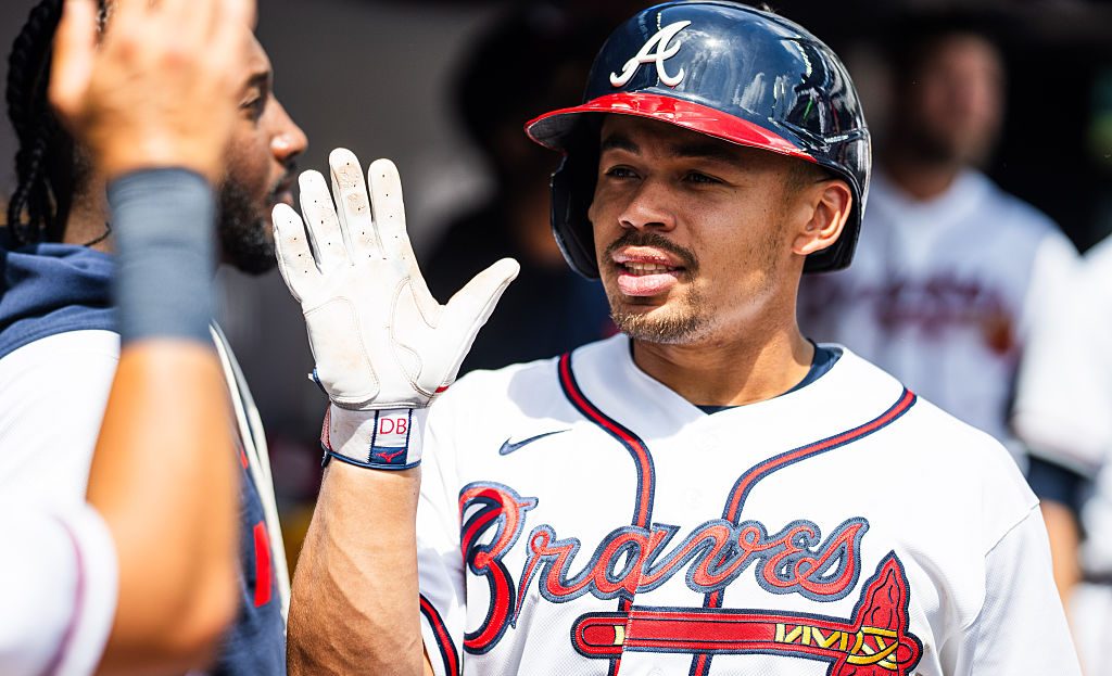
Another great script that works both for “Braves” and “Atlanta”, these fall under the iconic category. The piping on the jerseys and up the front is great and the “A” logo is timeless.
Alternate jerseys are also tasteful, but the tomahawks get mixed reviews. While I don’t feel strongly one way or the other, I do think the Braves script works standing alone.
11. Athletics
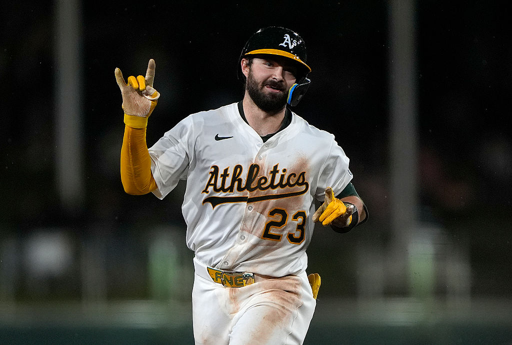
I think this is the best color scheme in the game. I love the contrast between the yellow and green, the logo is great, and the script is perfect. However, their use of Sacramento has dropped them from near the top to outside of the top 10. We’ll see how the Vegas move changes the jerseys, but for 2026, they get knocked for a lack of a true city.
10. Toronto Blue Jays
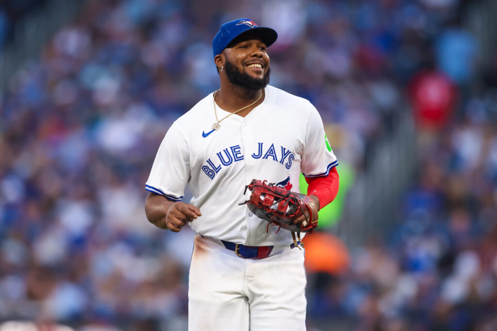
We have now reached the next tier. Think of how far the Blue Jays have come since the Carlos Delgado uniforms. The red maple flag really makes their sharp logo pop and adds something to what would be a somewhat dull color scheme. The font is unlike anyone else, and it works for Toronto. Oh yeah, the powder blues, chef’s kiss. To be honest, I wouldn’t change a thing.
9. San Francisco Giants
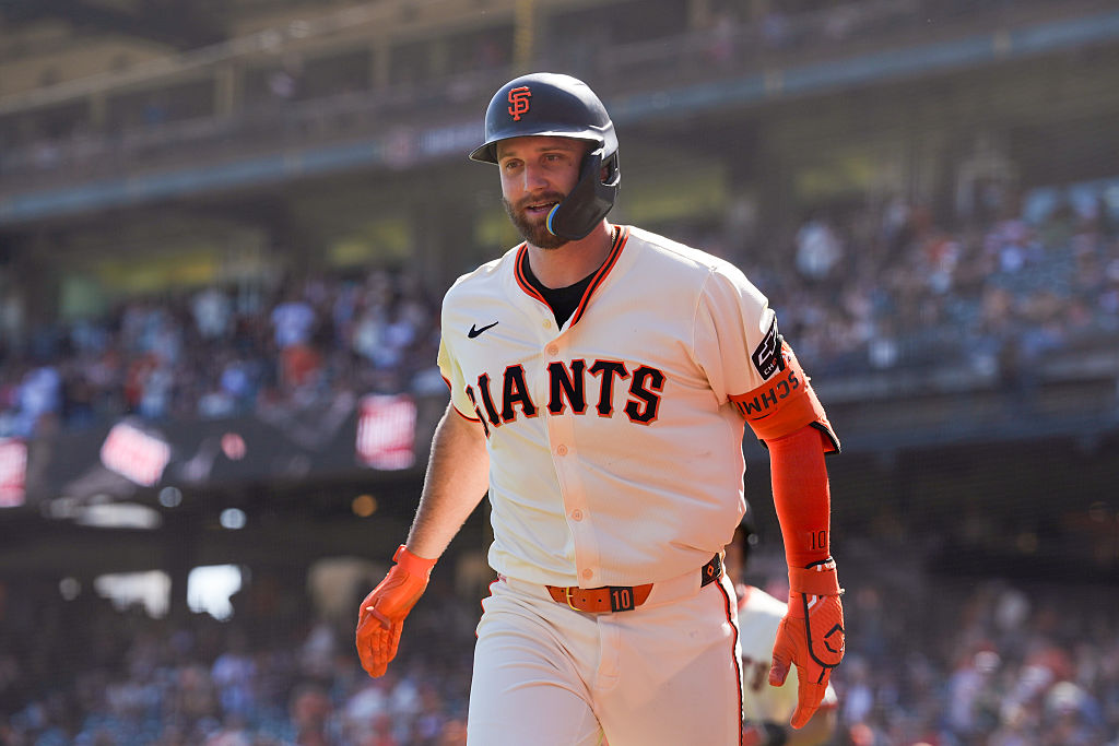
I have to say, the Giants’ “SF” logo is great and makes their hats in the upper echelon on the sport. I’m not crazy about the secondary logo, of “Giants” on the alternate jerseys, but the off-white/cream home jerseys and the black alternates are so good. Simply put, these are iconic enough to never have to be changed.
8. Boston Red Sox
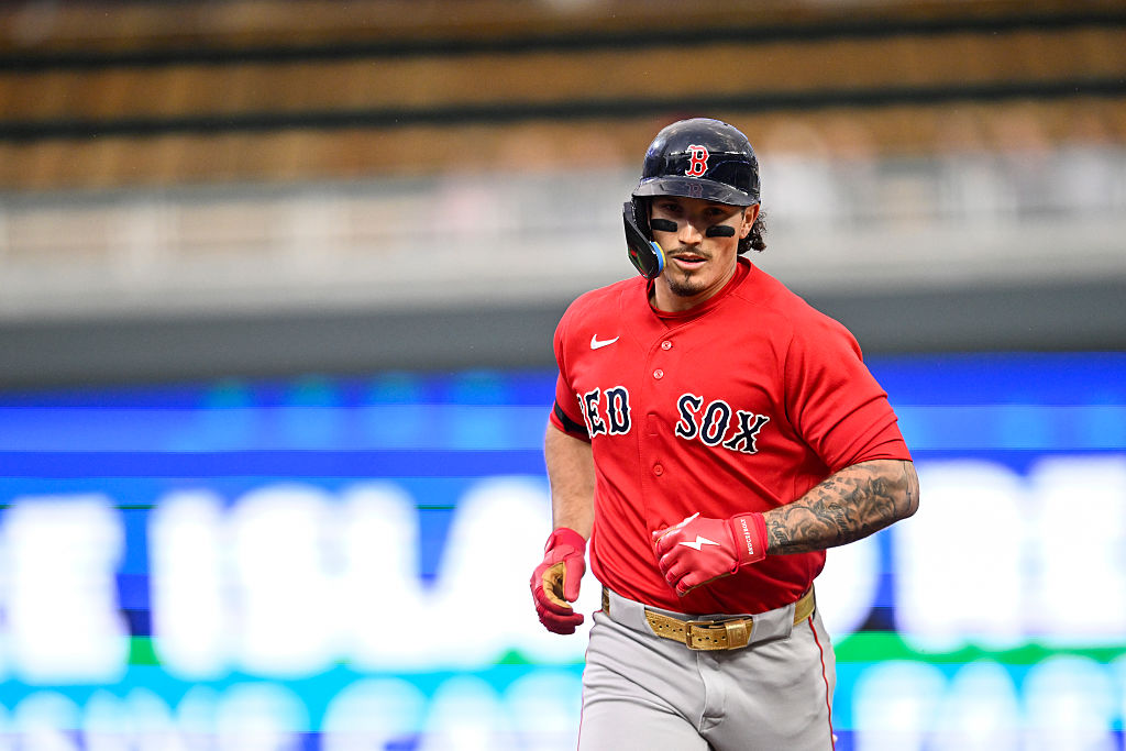
Let’s go ahead and address the yellow City Connect jerseys. They are awful, but the rest of the jerseys are classic. An old school look that matches the team’s history and iconic ballpark has always been a favorite of mine. A logo so simple, but so unique across the sports landscape, that it tends to play up.
7. Detroit Tigers
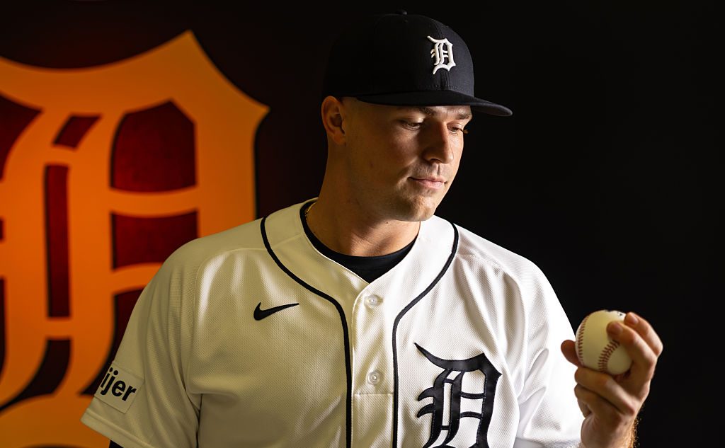
The Tigers’ old English D is a reminder of baseball history. A true throwback look, it is simple but works even with their slight redesign several years ago. I love the color scheme and somewhat new alternate logo of a tiger facing you head-on. For the 2026 season, they have introduced both orange and navy alternate uniforms that truly lifted their overall offering.
6. New York Yankees
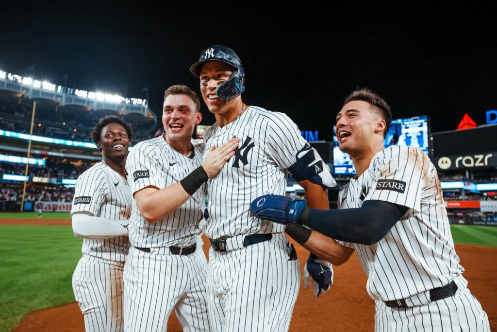
Is there a more recognizable logo in sports? How many logos have become true fashion statements to people outside of the sport? If I say “pinstripes”, you think of the Yankees.
Sure, their history carries a lot of weight you associate with these uniforms, but isn’t that the point? They are almost intimidating, as looking at them reminds you of so much dominance. Unless you are younger than 25.
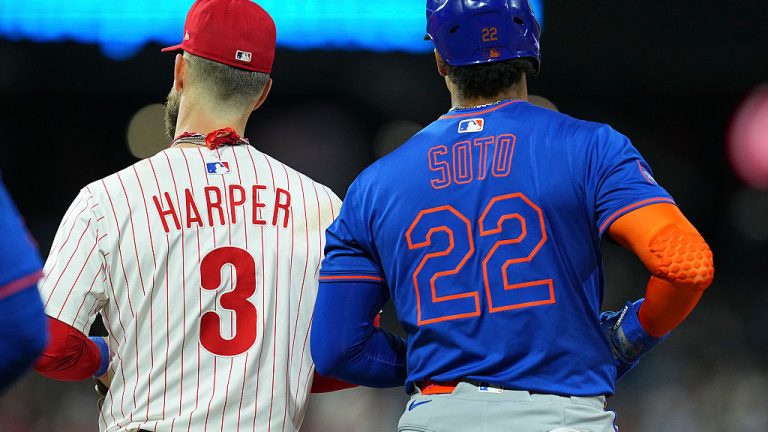
5. Philadelphia Philles
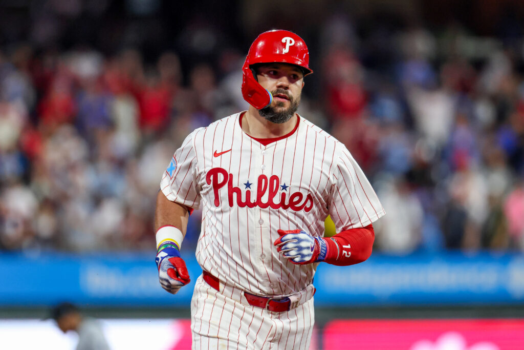
We have now entered the top tier of uniforms. What’s not to love about the Phillies? A perfect and level script which pops with the blue dotted “I” paired with a cream and powered blue alternate? The numbers on the sleeve are a fun touch that no one else does. Like the ones coming next, I would not change a single thing.
4. New York Mets
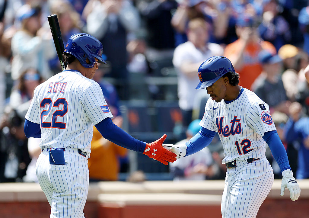
To me, you could not pair a better shade of blue and orange. The logo has a classic look, while the secondary logo highlights the city in a way that sets them apart from the Yankees. Pinstripes, front numbering, and a blue alternate all simply work for what the Mets are going for.
3. Los Angeles Dodgers
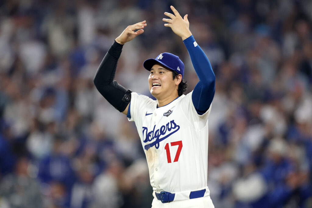
Like the Yankees logo, the Dodgers have a fashion statement logo. A timeless uniform with a perfect script, all elevated by the bold red that emphasizes the number and elevates the jersey. For a team that doesn’t truly use red or is associated with red, the number pops and gives these jerseys more than other blue and white teams.
2. Chicago Cubs
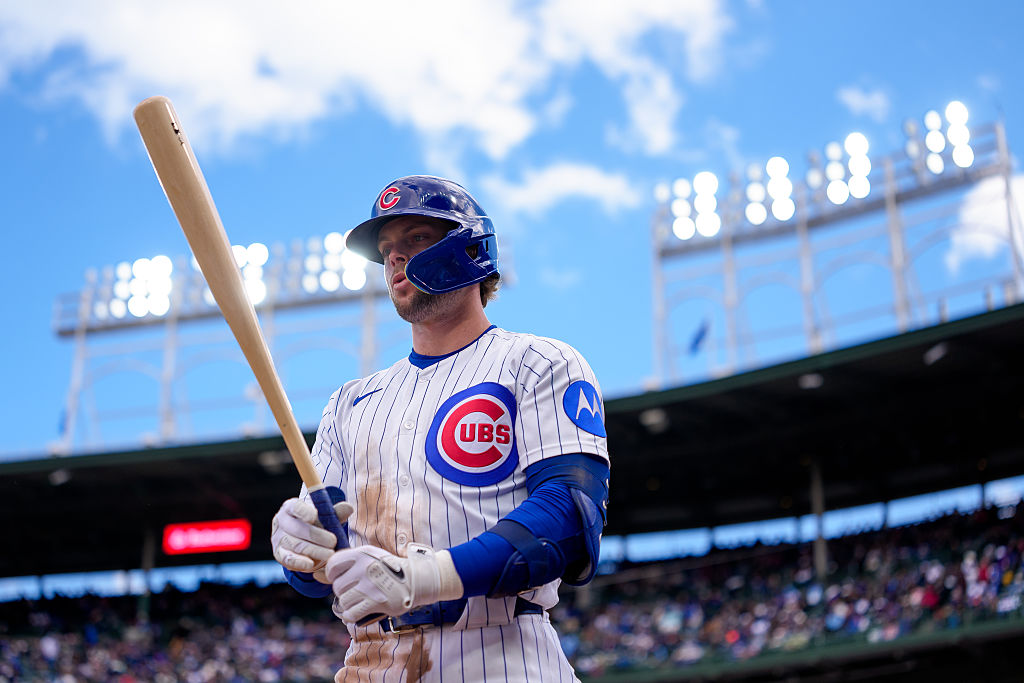
The Cubs essentially have three logos, and it somehow works. The “C” is bland but historic, the Cub within the “C”, and the Cubs’ chest crest are all recognizable and used, which goes to show how strong their brand is. The home jerseys are perfect, and the road jerseys are balanced.
What is there to say? These are flawless.
1. St. Louis Cardinals
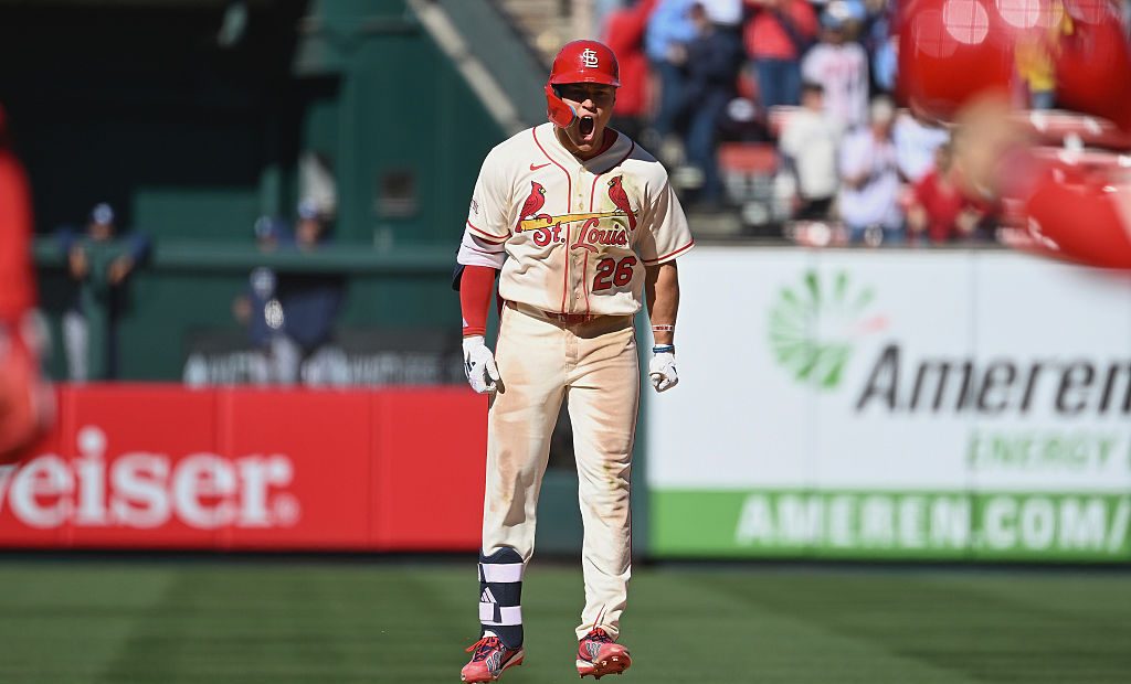
The pair of cardinals balancing the bat across the front of the jersey above a script “Cardinals” is such a good look. It all works because of the yellow in the bat, balancing out what would have been a lot of red, but instead makes everything pop. St. Louis is a short enough city name not to feel crowded and the STL on the hat blends together so well. A truly perfect uniform.
Become a Member of Just Baseball
Subscribe and upgrade to go ad-free!
* Save 25% by subscribing annually.

Written by