Ranking the Primary Logos of the Milwaukee Brewers
Looking back through the history of the Milwaukee Brewers, the Brewers logo has taken on many different looks over the years.
Aesthetics are a subject of friendly debate within the baseball fanbase. Uniforms have been hit-or-miss (no pun intended), and so have logo designs — which certainly play a part in the overall looks.
Some franchises rarely, if ever, have tweaks or overhauls (see Yankees, Dodgers, and Cardinals). But for teams that make branding changes, we’ve critiqued the beauty behind their choices.
We last ranked the Angels logos, now we’ll get into the franchise that began in Seattle and quickly transferred to Wisconsin. Unlike what we did with the Houston Astros (who began as the Colt 45s), we’ll consider the original team’s look. And with that, we start with the first franchise logo.
5. Pilots Pilot (1969)
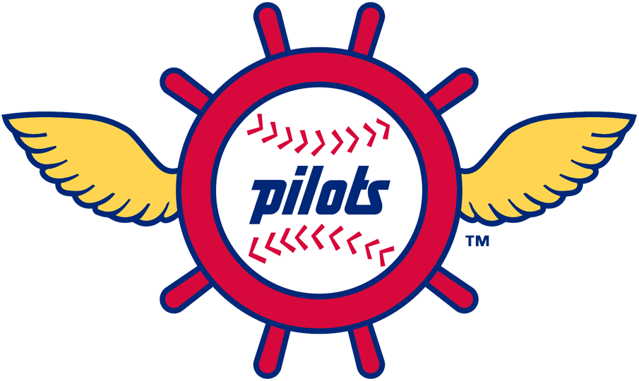
It would be a disservice to recognize the single season of existence for the Seattle Pilots. Fortunately, after Bud Selig packed up the franchise so hastily and transferred to his home state, the city was rewarded with the Mariners less than a decade later.
The logo is a terrific depiction of the seaport region it represented. However, with the wings and steering wheel, I’m a bit confused whether this is acknowledging the pilots of the sea or air or both.
Who wore it best: Mike Hegan, Wayne Comer, Don Mincher, Diego Segui
4. Bronze Letters and Green Bats (1994-99)
The Brewers celebrated their 25th anniversary in Milwaukee with a change nobody wanted. Green was incorporated as a color for the first time in franchise history. The logo resembled an industrial stamp, which paid homage to Milwaukee’s industrial history. The modern yet old-fashioned look looks better when you understand the reasoning behind it. But compared to the logos you’ll see below, this doesn’t measure up.
Who wore it best: Jeff Cirillo, Jeromy Burnitz, Ben McDonald, Rickey Bones
3. Swinging Barrelman (1970-77)
Just a year earlier, the Padres introduced the “Swinging Friar.” Now the beer man is wielding the bat. The barrelman was actually introduced as the identity of the American Association’s Brewers during the 1940s. It was a good use of marketing and branding to bring it back just as the name was resurfacing on the major league level.
Who wore it best: Hank Aaron, Sal Bando, Don Money, George Scott
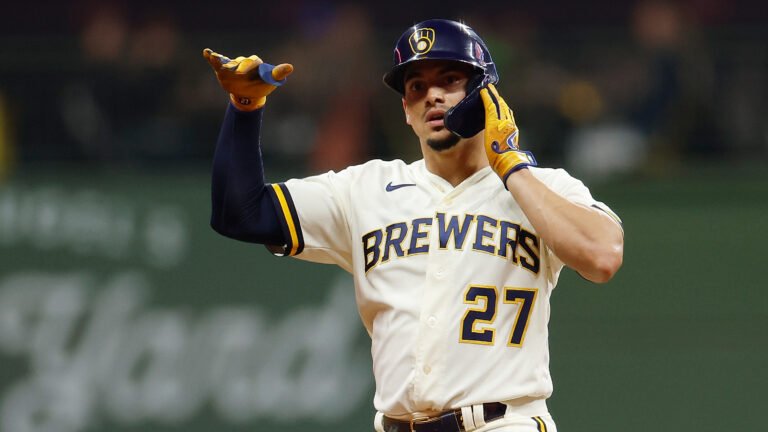
2. Bringing Back the Glove (2020-present)
The Brewers celebrated their 50th anniversary in the best way possible. The team had been using their extremely popular old look on Fridays and other special occasions. Now it was back for good. Actually, great. It’s a contemporary take on the ball-in-glove icon and with it came brand-new uniforms that also resembled the threads of the past. Forget what the team had done, this elevated the Brewers from having one of the least exciting looks to having one of the best. Bravo.
Who wore it best: Corbin Burnes, Christian Yelich, Willy Adames, Josh Hader
1. Glove Love (1978-93)
Long live Tom Meindel. Who’s he? Just the man who initiated this work of art. Before the 1978 season, the Brewers had a contest open for the public to submit renderings for the next logo. Meindel, an art history student at the University of Wisconsin-Eau Claire, came up with not only the best Brewers logo but one of the best logos ever. Safe to say it quickly caught on, no glove pun intended.
Who wore it best: Robin Yount, Paul Molitor, Rollie Fingers, Cecil Cooper, Gorman Thomas

Written by
Brian is the author of "The New York Mets All-Time All-Stars" and “Mets in 10s: Best and Worst of an Amazin’ History." He also freelances for…