Ranking All the Current Rangers Uniforms From Worst to Best
With the introduction of their City Connects earlier this year, the Texas Rangers' uniform rotation now features five solid looks.

I’m back for my third personal edition of the Just Baseball uniform rankings as our amazing staff continues to go one team at a time through the league. These rankings are so different from the variety of baseball analysis we do, which makes it a fun change-of-pace topic to write about from time to time.
This one is particularly fun to write, for a team that has rebranded a lot over the past few years in the Texas Rangers. With their City Connect look debuting earlier this season, the Rangers have five oft-worn uniforms that they’re rocking during the 2023 season.
With a blend of new and old-school design elements, this uniform group is a solid one that may not have the excitement of some others but is strong all around. Let’s get into ranking the Rangers’ uniforms!
5. Road Gray
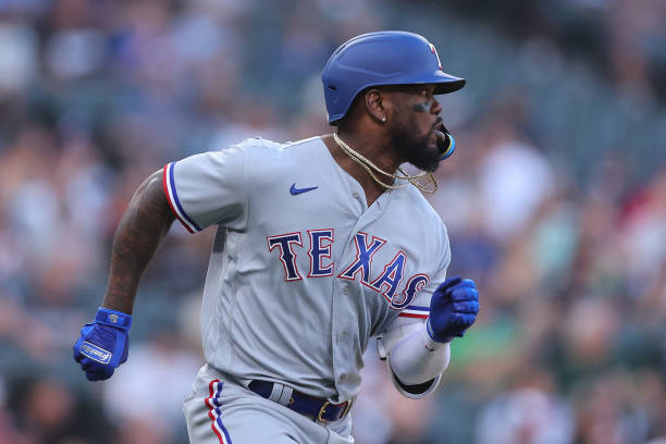
Road gray uniforms are never going to be ranked highly for me because they’re simply just the most boring (usually). However, these ones are actually better than most basic gray sets. The typography sticks out on this jersey with the blue letters and red outline. I also really like the stripes on the sleeves that add a little more pop to the jersey.
This uniform is nothing special in reality, but it’s a solid road uniform in comparison to some others that are extremely bland. For the worst uniform worn by the Rangers, this one is a good start to the list.
4. City Connect
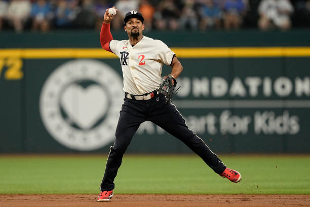
I decided to defer to Just Baseball’s resident Texan Kendall McKee when debating between the 3rd and 4th spots on this list. The two options at this spot are very different and close in ranking in my eyes, but Kendall declared that this one should be the lower-ranked set.
The Rangers incorporated tons of Texas history in this uniform, which is great for a City Connect piece. From the lettering to the 4/21 date to the Peagle and more, they aced the historical significance of the jersey. Yet while the design is unique and sleek, it leaves a little more to be desired given the historical elements.
The logo is fun with a gothic style of letters, but it feels like they could have done more with the hat instead of using the same logo. Kendall wishes they put the arm sleeve Peagle on the hat, which I agree would look ridiculously awesome.
3. Alternate Blue
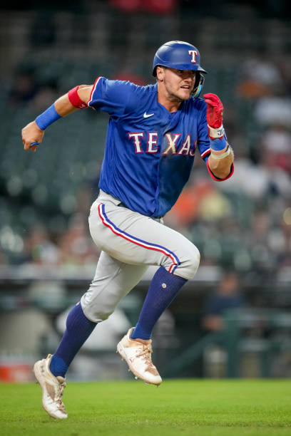
Deciding between this alternate and the City Connect was the only real question for me when ranking these uniforms. This one is a straightforward and clean blue alternative that I have no complaints about, really.
The letters are the same style as on the road uniforms, with white letters on this uniform that stand out well on the strong blue jersey. I particularly like how the pant stripes look in contrast with the blue jersey, as they pop even more on this uniform than the other ones. This uniform also feels just meant to be worn with socks up like Josh Jung is doing in this image.
Overall, it’s just a quality look that fits the team very well.
2. Home White
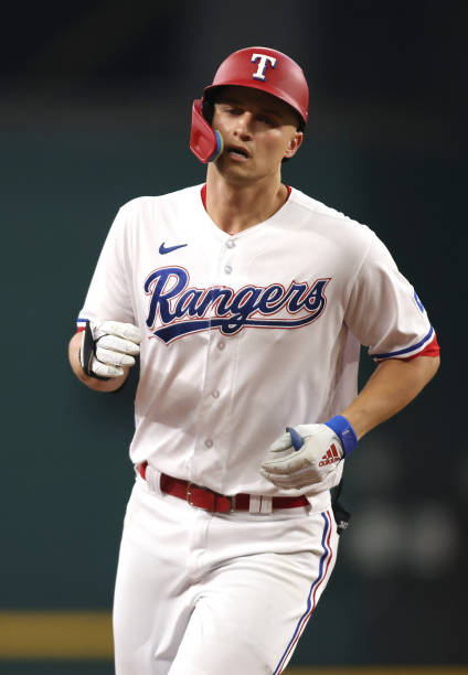
Something about a classic home white uniform really makes me happy when I’m watching a baseball game. And this Rangers one is elite in the world of home uniforms. It has the same elements of their road and alternate uniforms but does it better and adds in the cursive lettering that takes it to another level.
The combination of the blue cursive letters with the red “T” hat is elite and makes the uniform great. The sleeve and pant stripes we see on the other ones work great with the white background, and everything just blends well. This uniform is great, and there would be a strong case to be made for it to be number one if it wasn’t for my all-time favorite uniform color coming up next.
1. Powder Blue
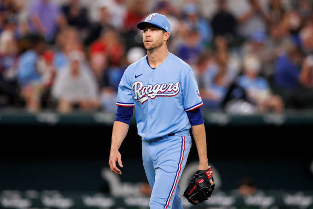
I’m going to declare something, and I don’t really care who disagrees: There is no better uniform than a powder blue baseball one.
I absolutely love every alternate powder blue in the league, and this one is no different. It utilizes the same style as the home white but with an all-blue look and white letters. It’s everything great about the white uniform, but it’s a perfect powder blue. I mean seriously, it’s perfect.
This is the Rangers’ best uniform hands down in my eyes, and probably one they should be wearing more often.
