Ranking All the Current Guardians Uniforms From Worst to Best
The Cleveland Guardians didn't have great uniforms before their rebranding, and they're not much better now.
Uniforms across baseball have a wide variety in their creativity and ability to make a team look more visually exciting. While many teams have changed their designs in recent years to add a more exciting element to the mix, some have failed to do.
When Cleveland finally decided to change their name and branding from the Indians, there was a clear opportunity for them to change their look, but they decided to simply keep it consistent without the usage of their former “C” logo. They didn’t have great sets before, and they’re not much better now than they were then.
I can’t say I think too highly of any of these regularly worn Guardians uniforms, but some are better than others for sure. So, let’s see how they stack up.
4. Home White
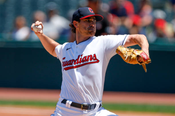
This uniform does absolutely nothing for me. Most teams feature white home uniforms, and this is the same design that Cleveland used prior to their renaming.
The cursive red lettering is the only redeeming quality, as the font is pretty solid all things considered. I think the choice of a Navy hat is the right one here as well, but the basic “C” on it is again nothing special. Otherwise, the all-white uniform has no separation from the rest of the league and represents an old era of Cleveland baseball with no effort to bring the team into the new generation.
3. Road Grey
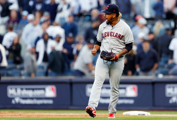
The road set is not much different from the home one. It’s a straightforward all-grey uniform that does nothing to differentiate it from any other jersey in the league. I tend to lean grey over white in many cases, which was why I ranked this one third as opposed to the home uniform.
I think the contrast of the navy letters outlined in red works better on this grey uniform which helps its case. However, I think this home-and-away combination of uniforms is probably one of the worst in the league.
2. Alternate Blue
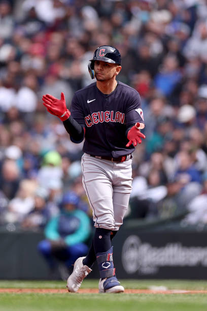
I wish Cleveland wore their alternates more these days. While they follow the same pattern and design as the home/away uniforms, they at least bring an intriguing level of color to the look. This one is the design of the road grey uniform but with a navy jersey and red letters.
These are more interesting thanks to the navy color, but they still lack a level of excitement that many teams in the league deliver, especially with their alternate sets that are supposed to be more creative.
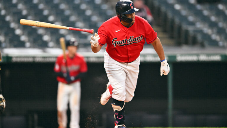
1. Alternate Red

The best of the mediocre is the red alternate for Cleveland. This uniform is the same as the home white, but the red jersey is better than any of the other ones I’d argue. It pops and works well for the team in general, with the navy letters sticking out more clearly on the bright jersey.
As I’ve reiterated throughout, there is nothing special about any of these uniforms, and they missed a chance to seriously upgrade when they rebranded. But these red jerseys are decent comparatively, and they’re better than a handful of others throughout the league.

Written by
Elijah is the Chief Operating Officer for Just Baseball Media. He manages the operations of the company and oversees the management of our staff. Additionally, he…